Brand Identity, Illustration, Packaging, Print
Have a Nice Game makes sporting goods for discerning fans that honor hometown teams and athletes. HANG was started to fill the void between rah-rah generic merch and the team pro shop — offering everyday wear with a casual, authentic spirit.
We love sports. And when sports meets good design, we’re going to jump at the chance. We redesigned their visual identity to strengthen their brand presence regionally, as well as future market and product expansion.
HANG needed a design system that could better communicate its laid-back, less-than-fanatic approach to being a fan. Strategically, they were also looking to the future and found their original design was limited based on its direct references to Tennessee. Hang had become more about a philosophy than a place.
We sought inspiration from the sportswear brands from the 80s–90s that approached design from a place of leisure. We contrasted that vibe with a light-handed and hearted design system that elevated the brand without losing touch with the loyal fanbase they’d built for themselves over the past decade.
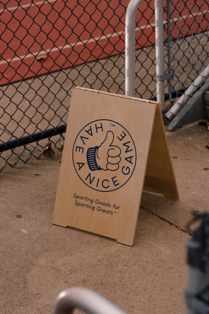
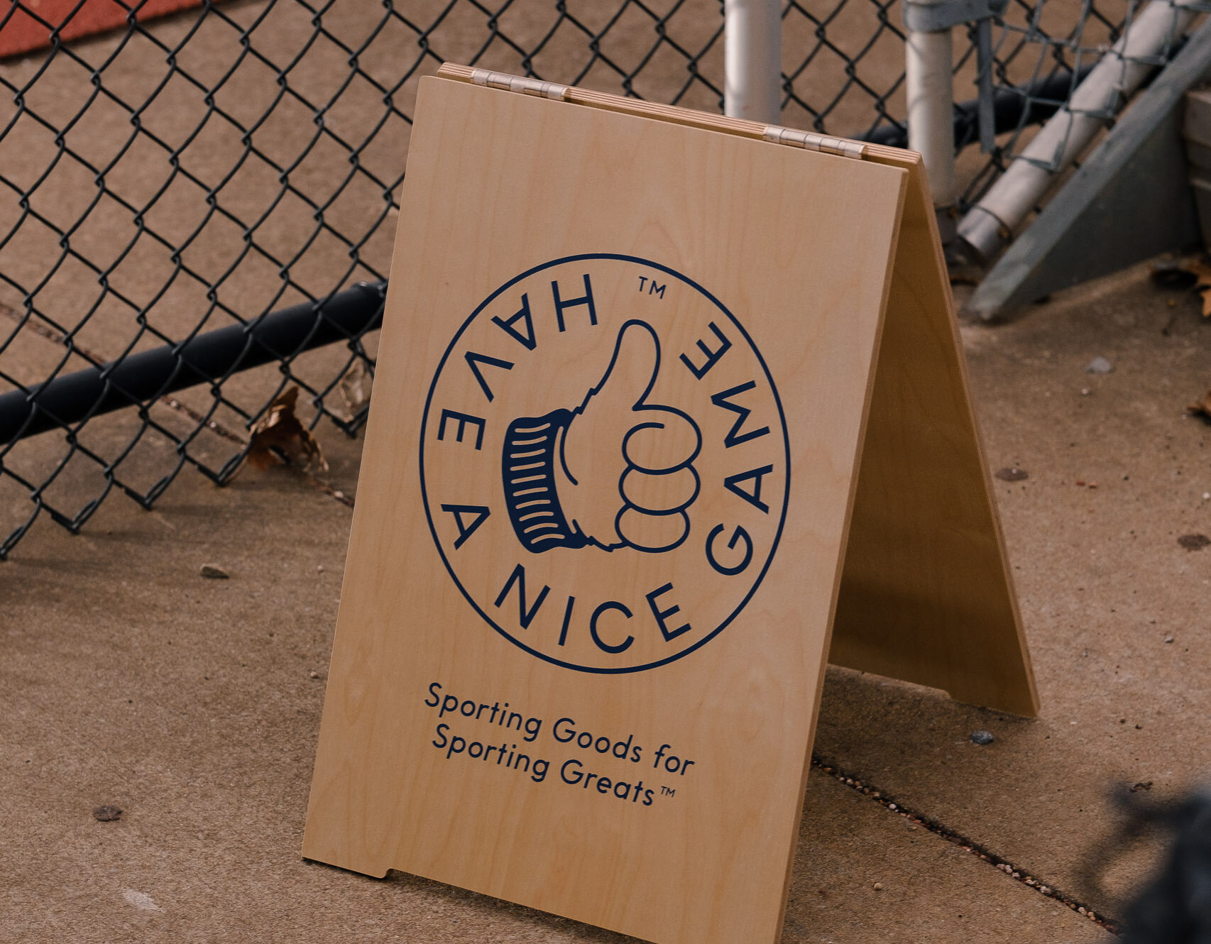
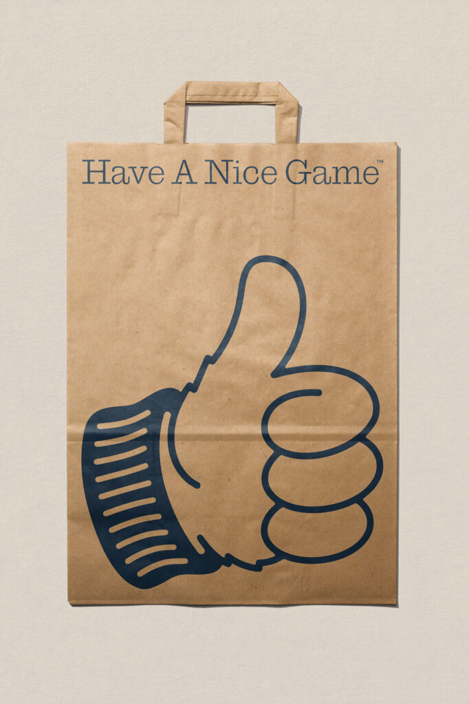
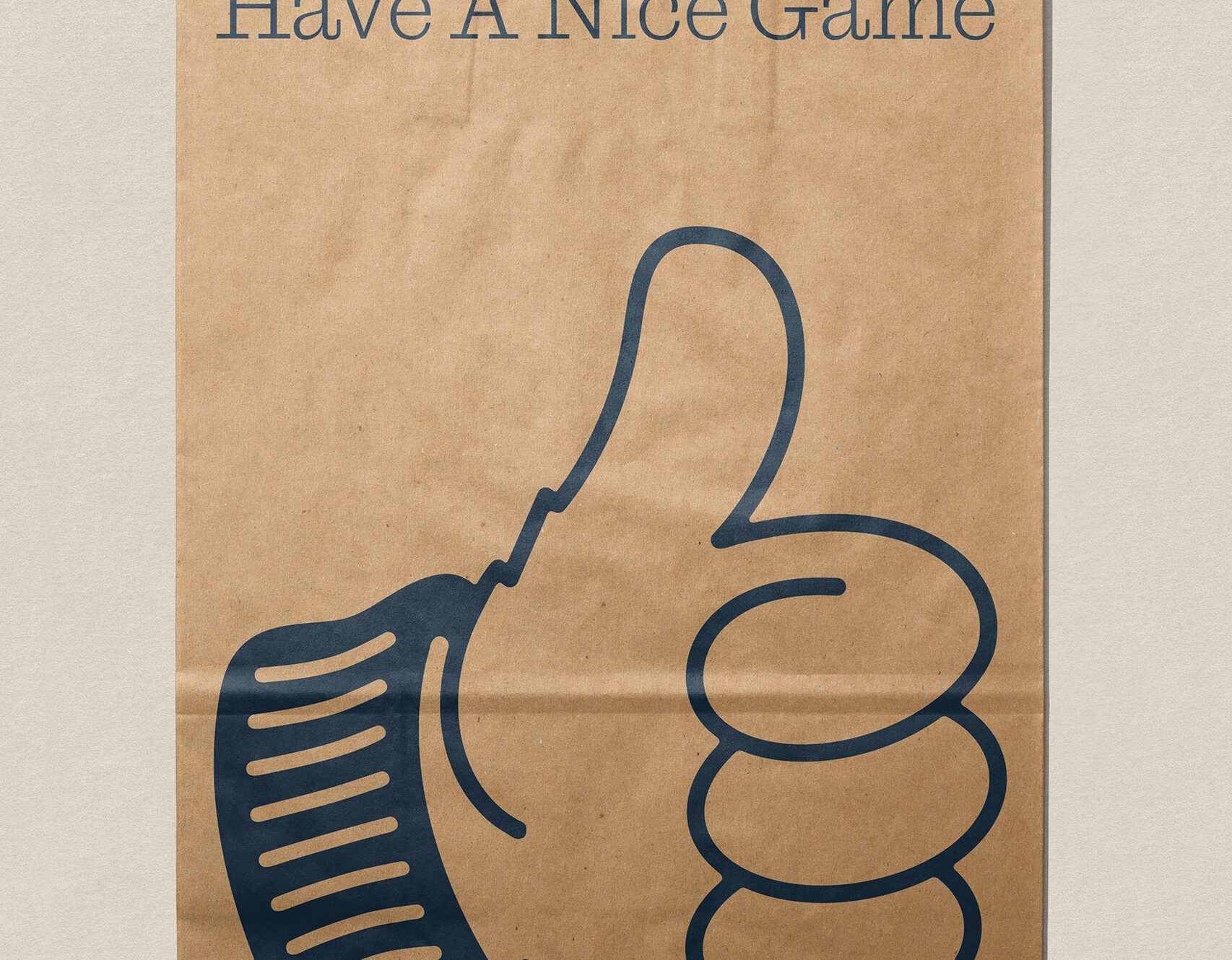
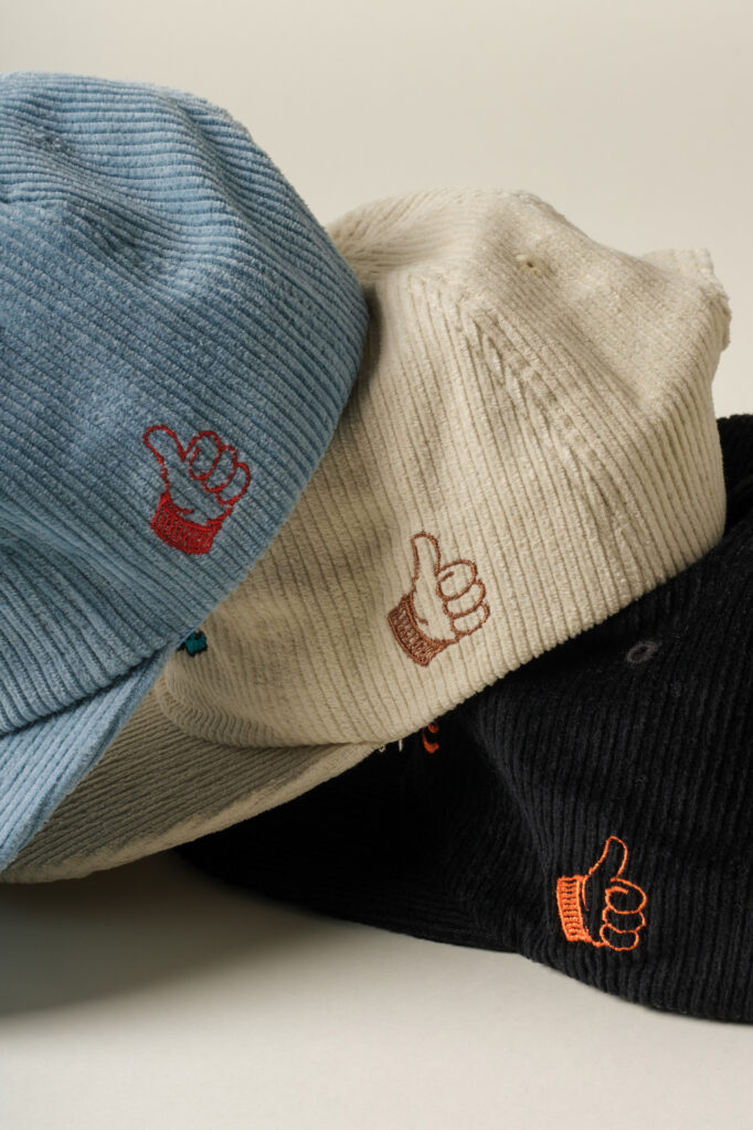
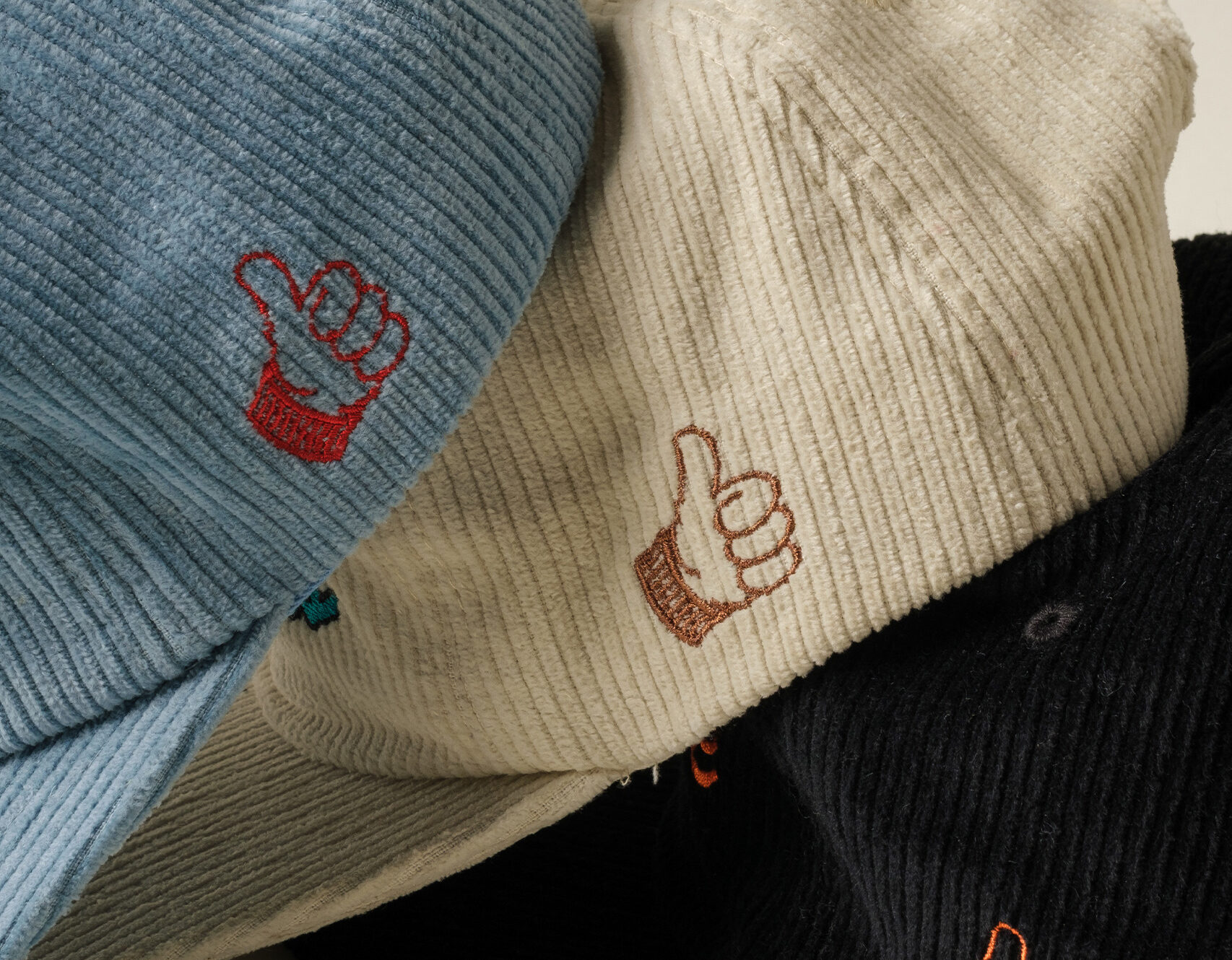
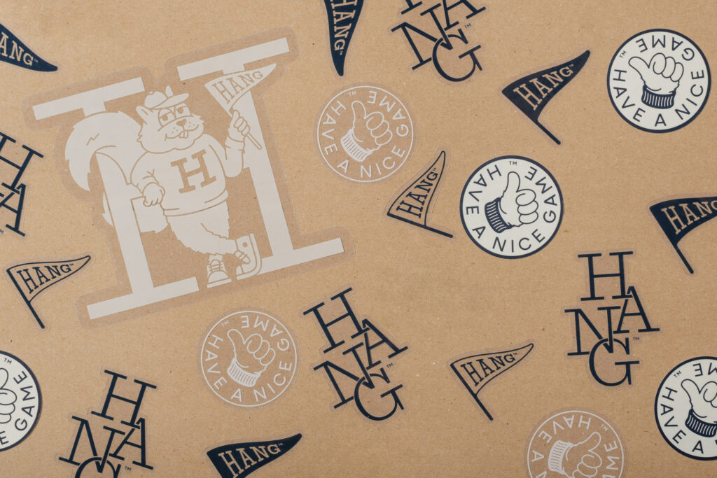
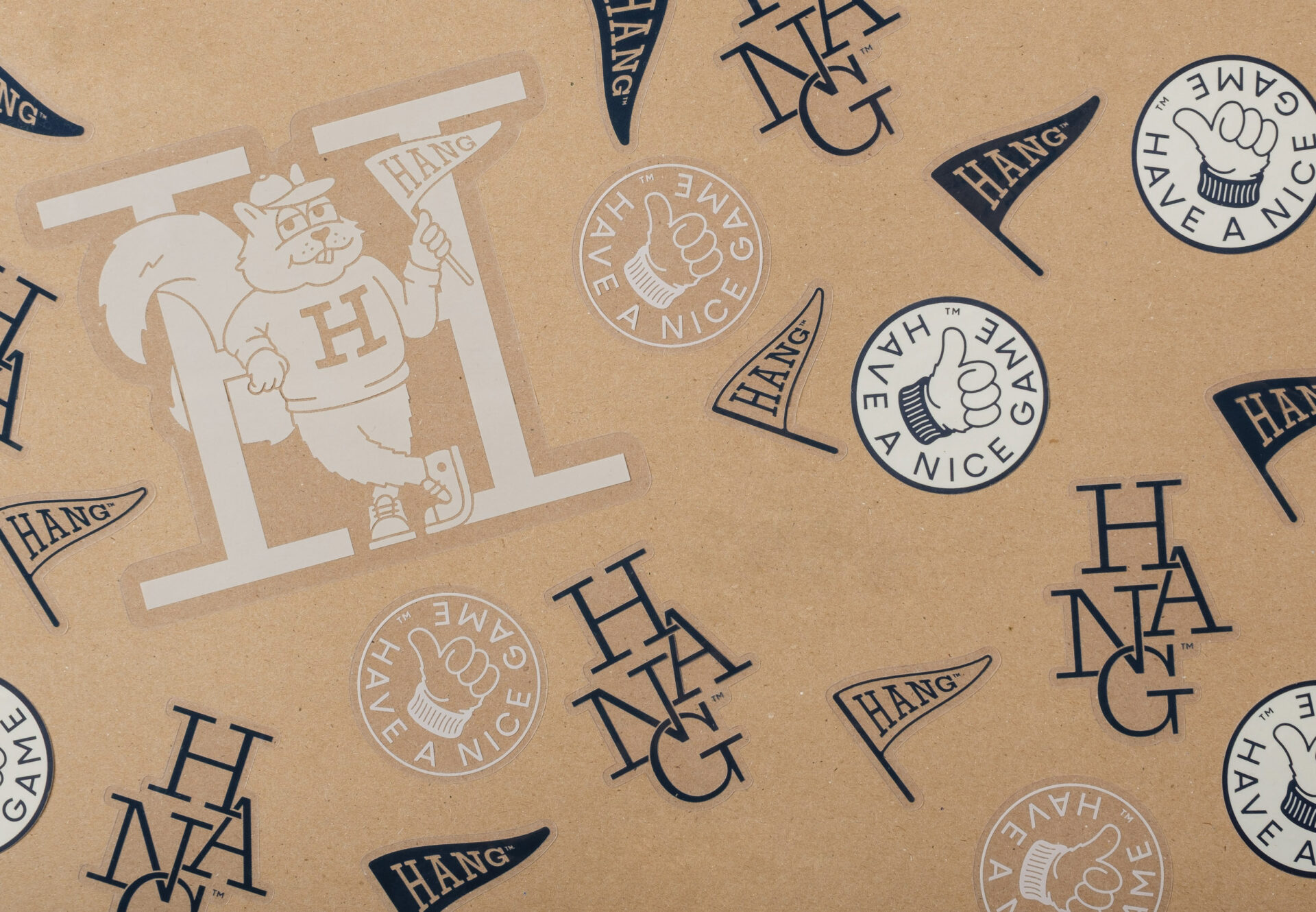
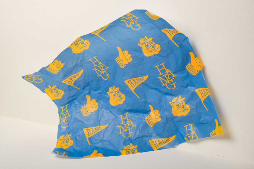
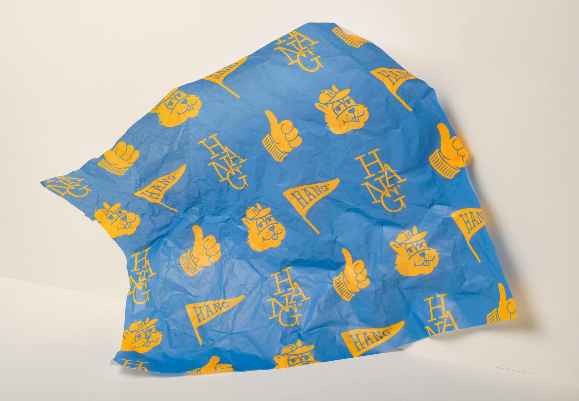
The thumbs-up, the universal gesture for “All Good,” was illustrated to serve as an optimistic symbol suggesting no matter the outcome, we’re here for it (and you).
HANG needed a design system that could better communicate its laid-back, less-than-fanatic approach to being a fan. Strategically, they were also looking to the future and found their original design was limited based on its direct references to Tennessee. Hang had become more about a philosophy than a place.
We sought inspiration from the sportswear brands from the 80s–90s that approached design from a place of leisure. We contrasted that vibe with a light-handed and hearted design system that elevated the brand without losing touch with the loyal fanbase they’d built for themselves over the past decade.
The thumbs-up, the universal gesture for “All Good,” was illustrated to serve as an optimistic symbol suggesting no matter the outcome, we’re here for it (and you).
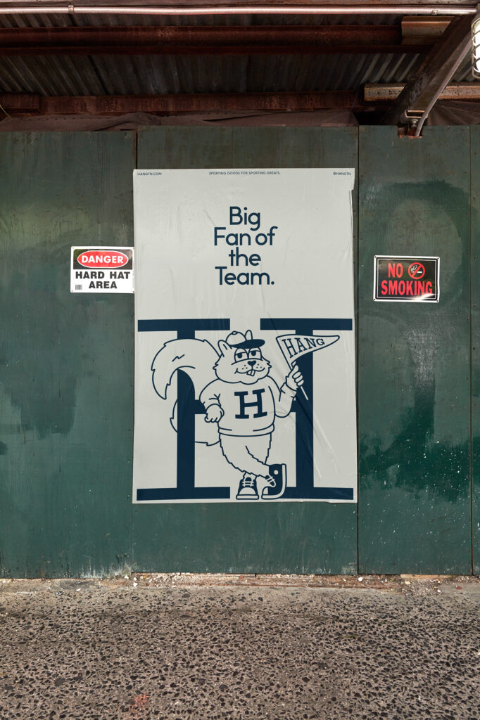
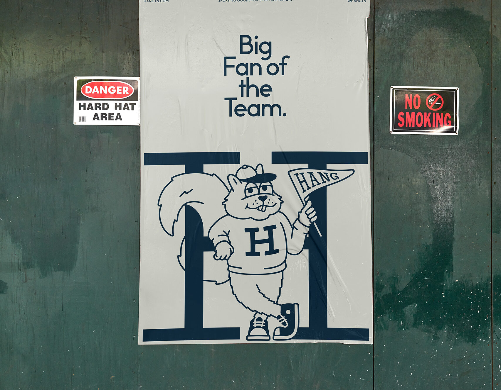
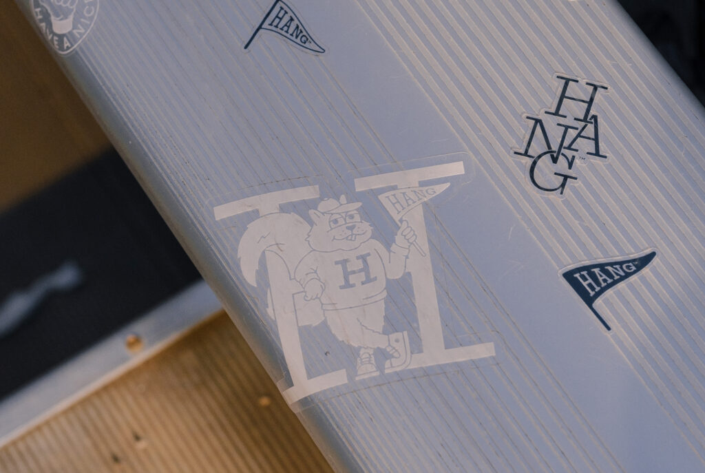
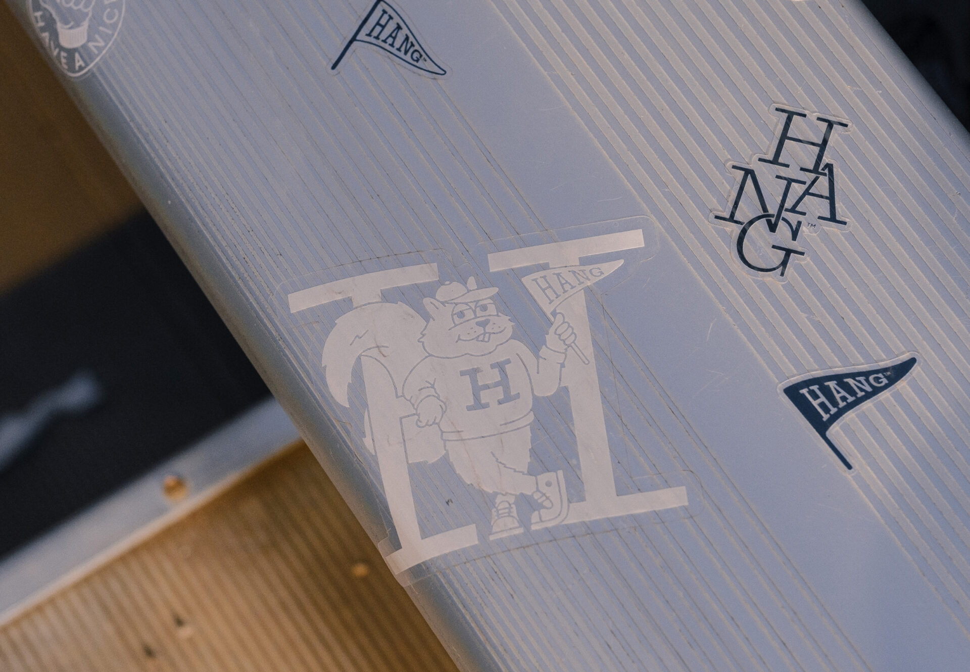
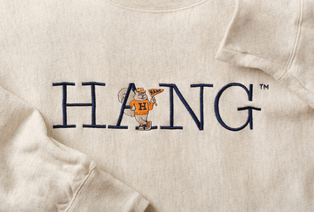
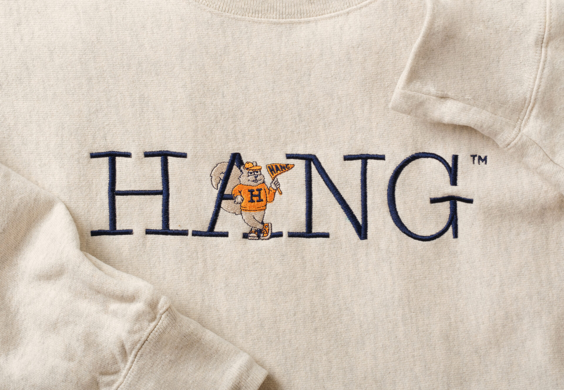
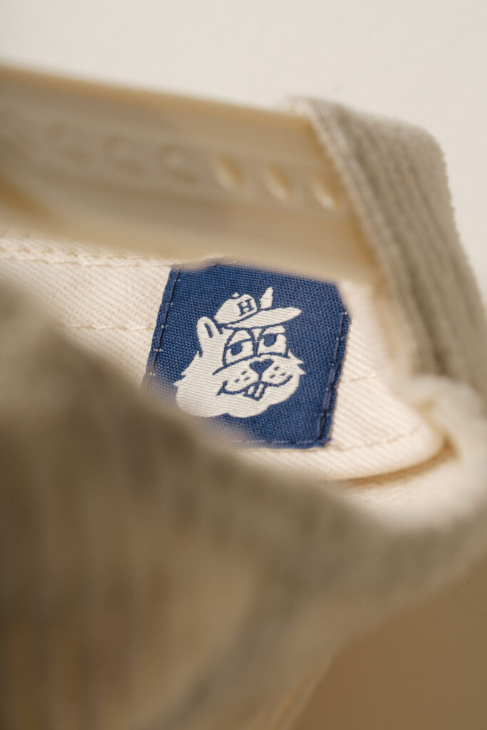
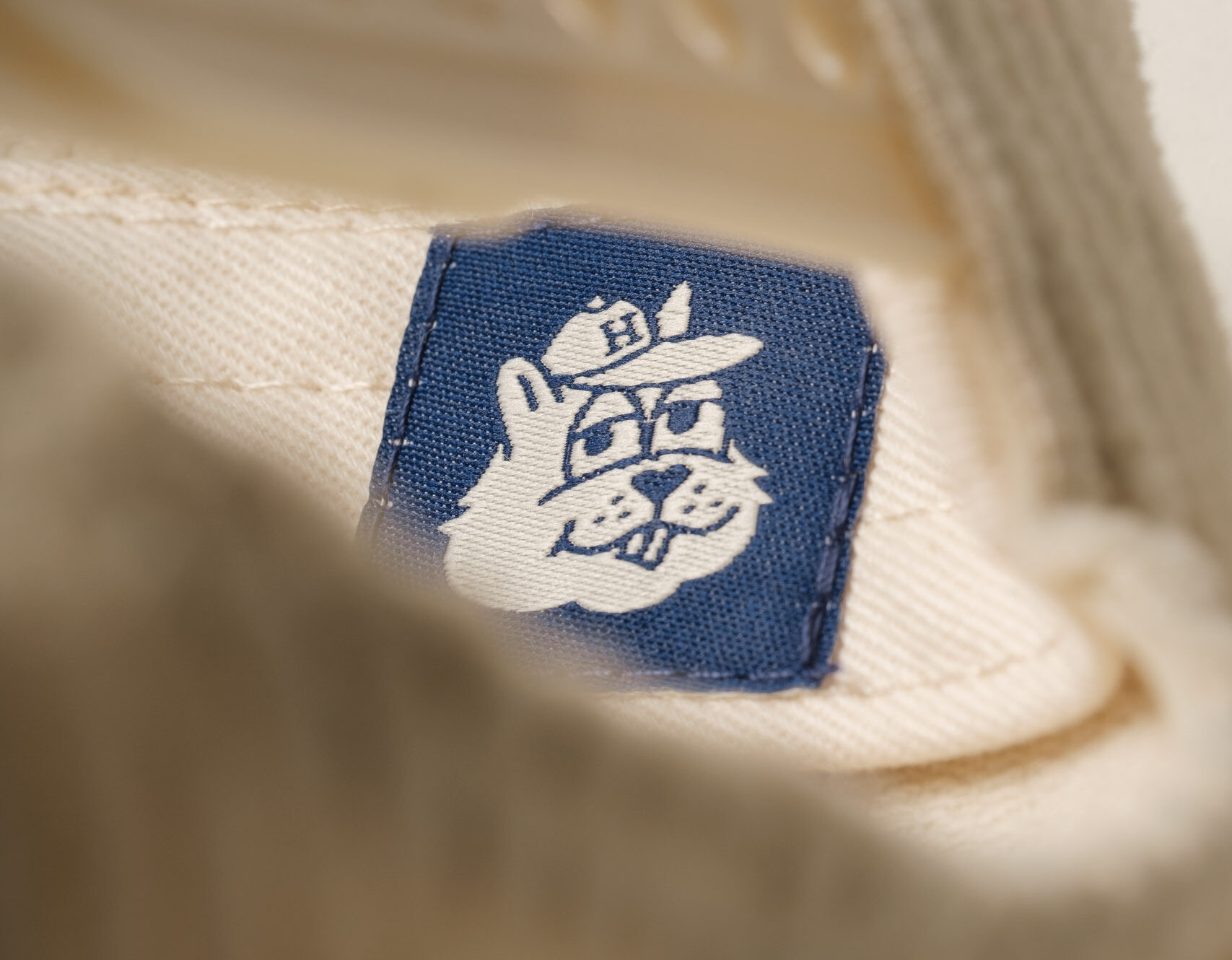
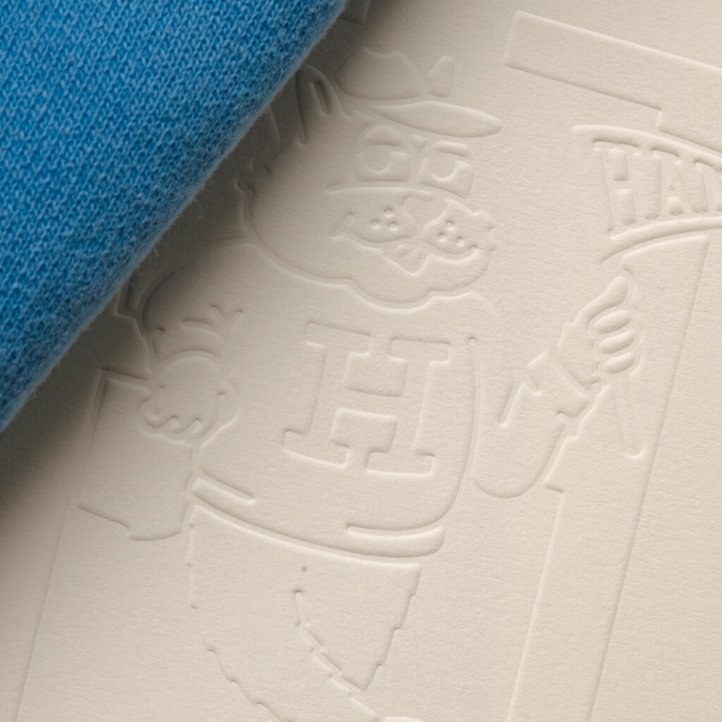
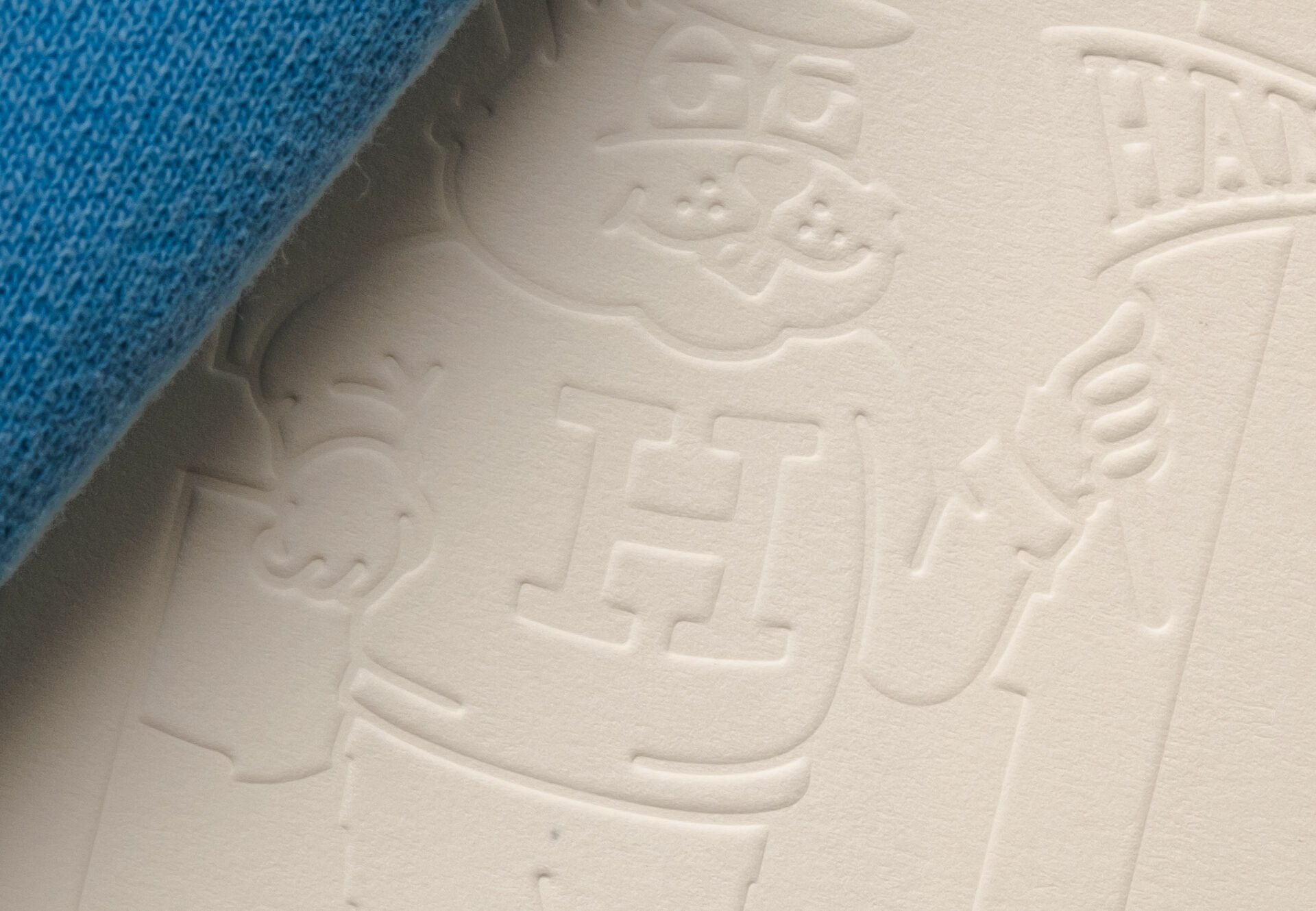
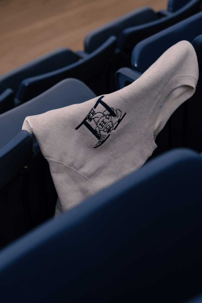
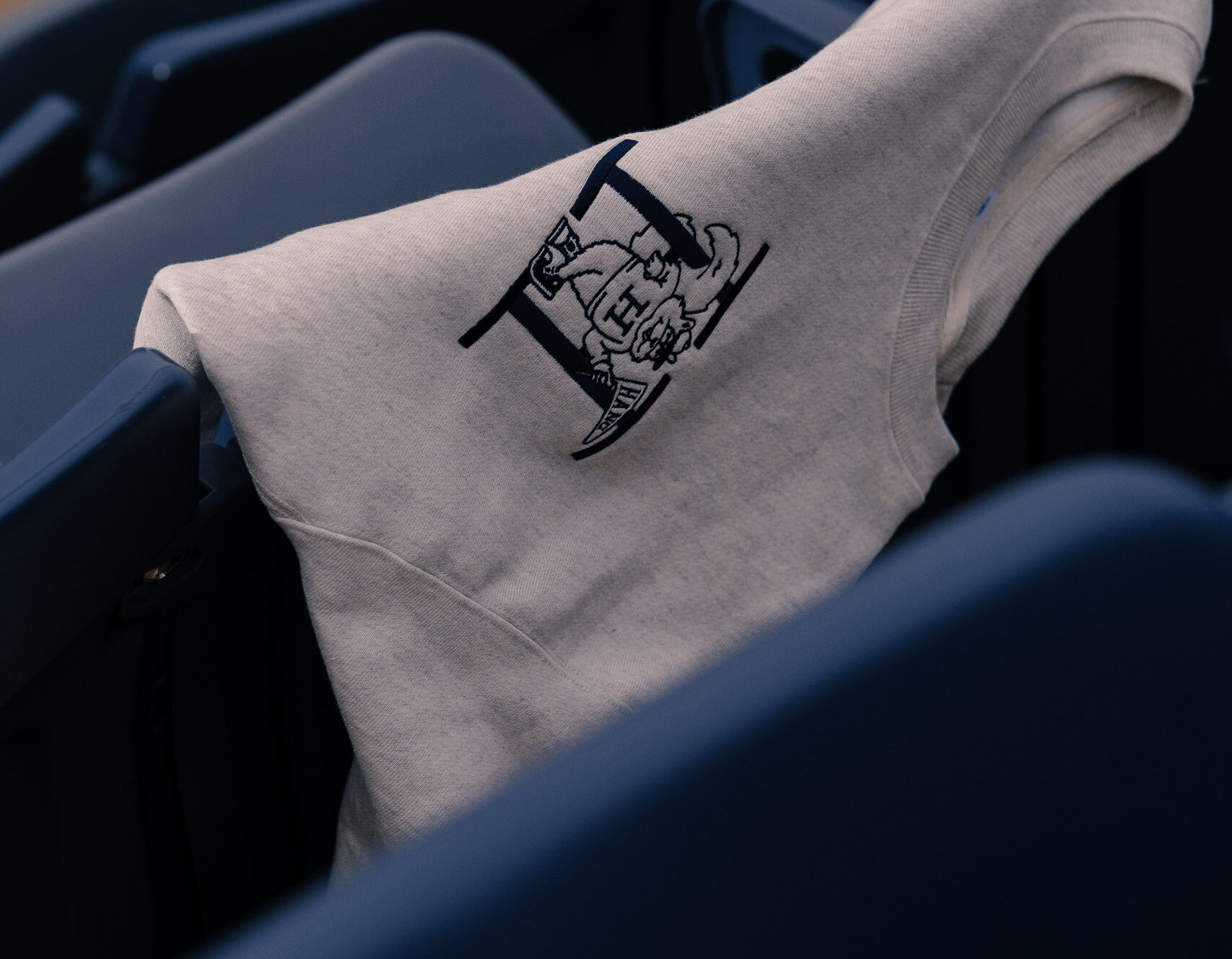
To contrast the new tidy logotype and palette, we illustrated a mascot to add a touch of charm to the personality. Tails is the type that always finds the tailgate with the free food, plays pickup in the park, and happily cheers from the cheap seats.
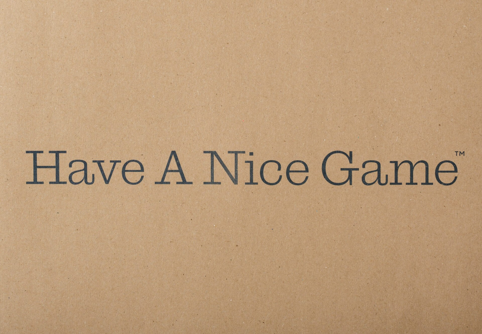
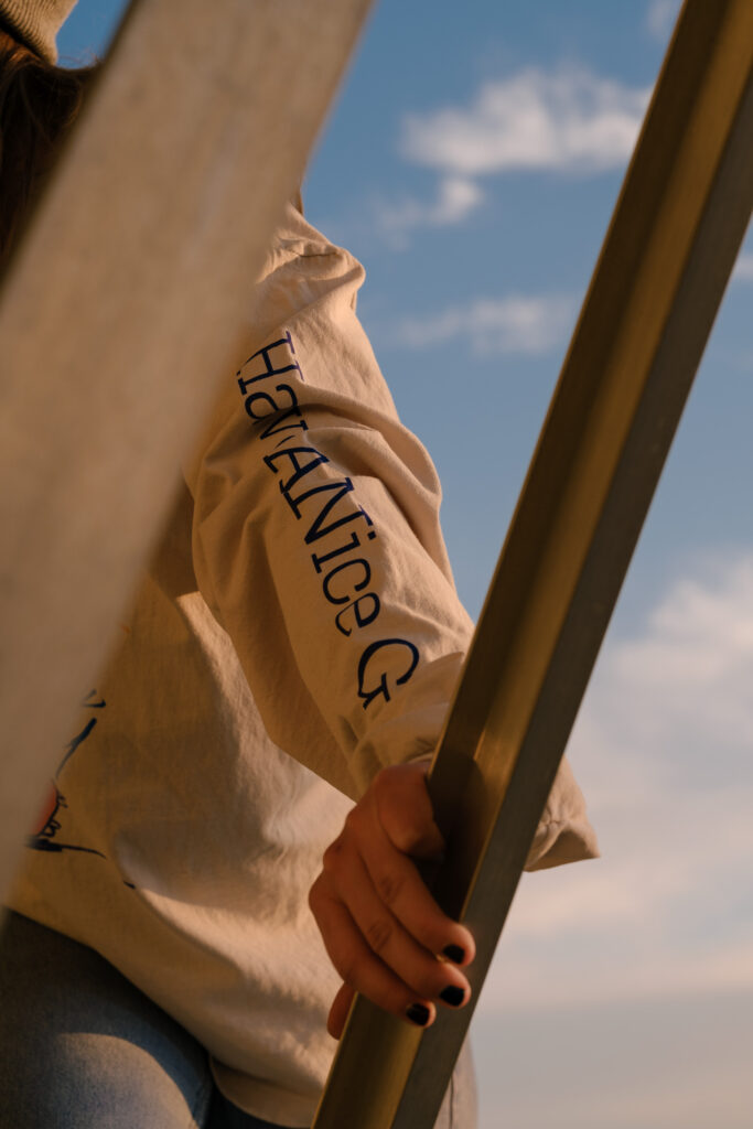
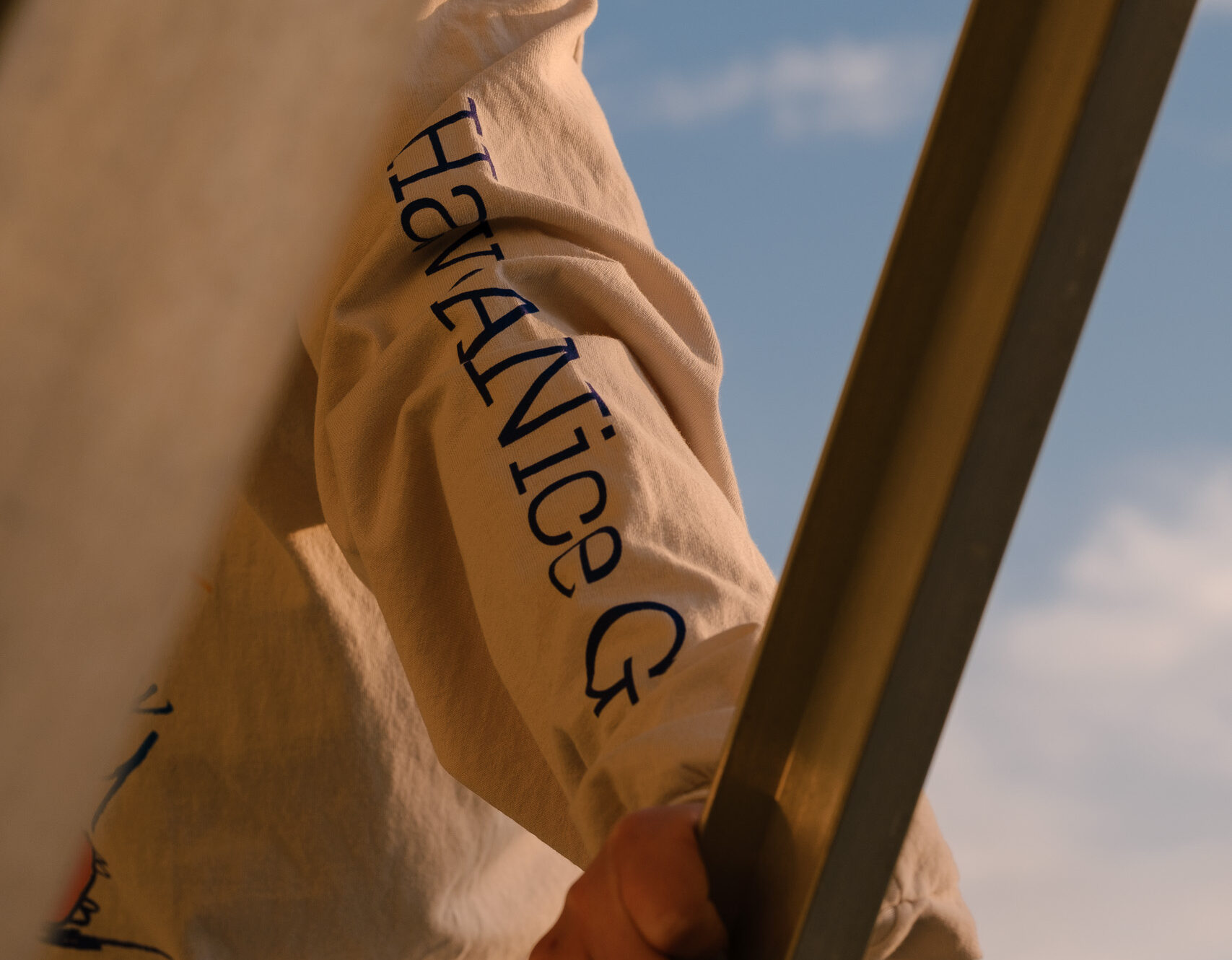
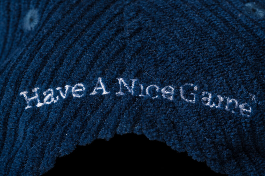
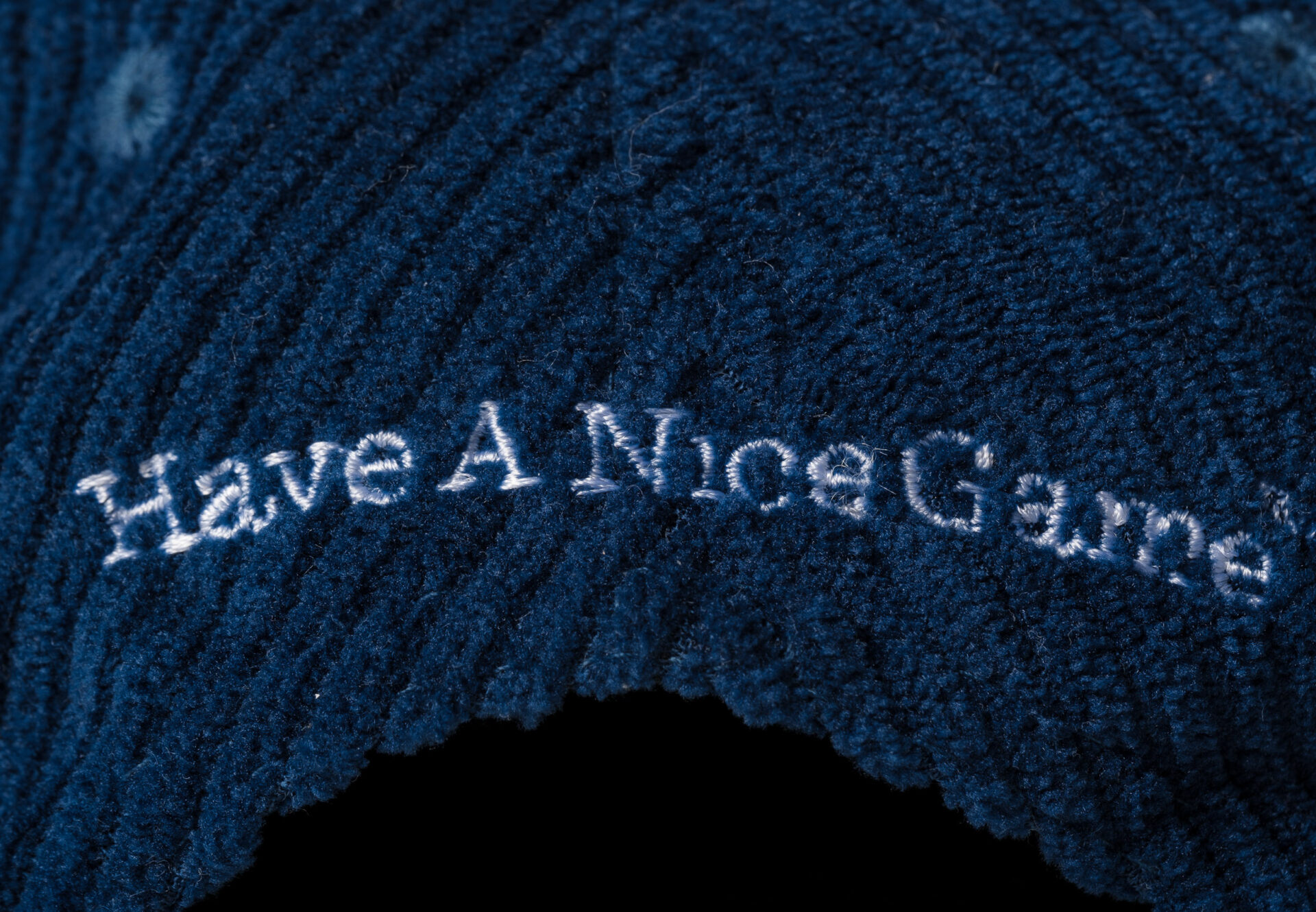
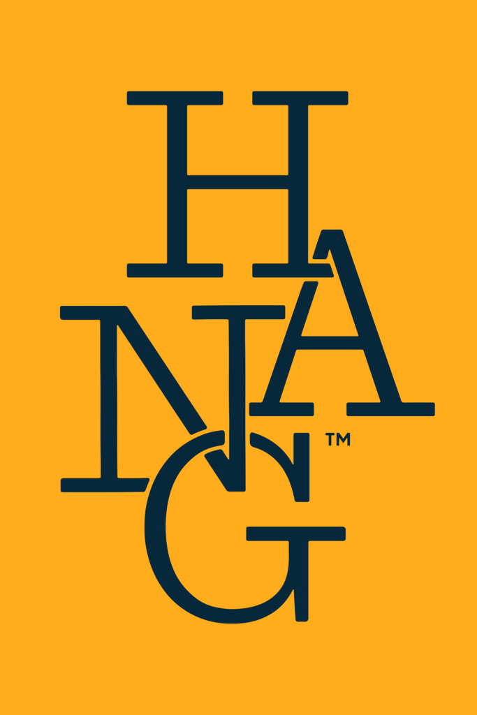
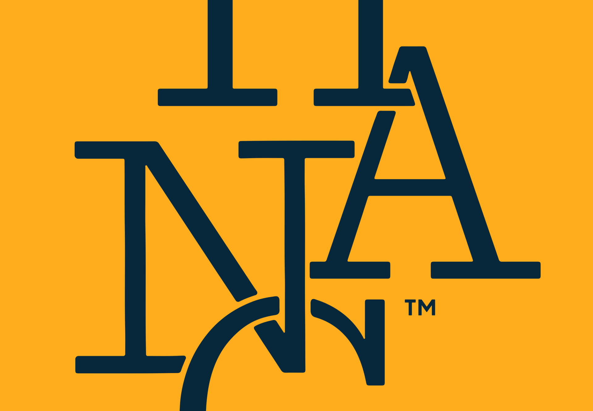
Futwora, a contemporary take on Futura, is the brand’s sole workhorse typeface. It’s a tip of the cap to the classic Futura, which has peppered sports memorabilia for almost a century.
To contrast the new tidy logotype and palette, we illustrated a mascot to add a touch of charm to the personality. Tails is the type that always finds the tailgate with the free food, plays pickup in the park, and happily cheers from the cheap seats.
Futwora, a contemporary take on Futura, is the brand’s sole workhorse typeface. It’s a tip of the cap to the classic Futura, which has peppered sports memorabilia for almost a century.
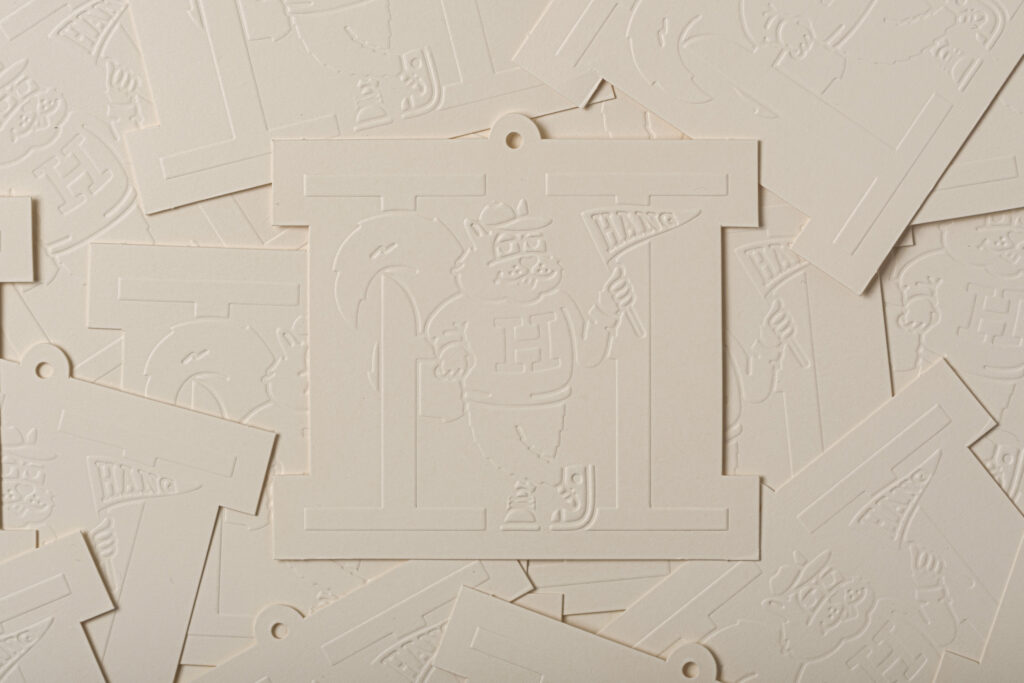
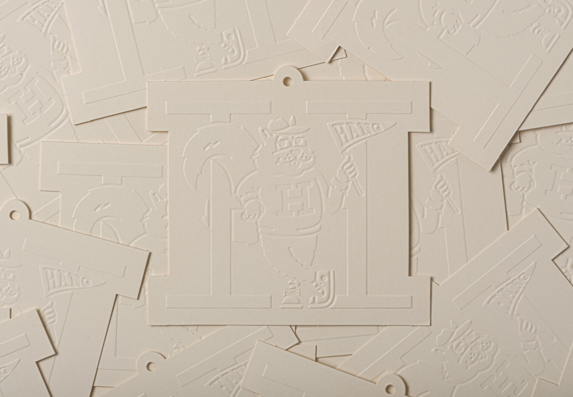
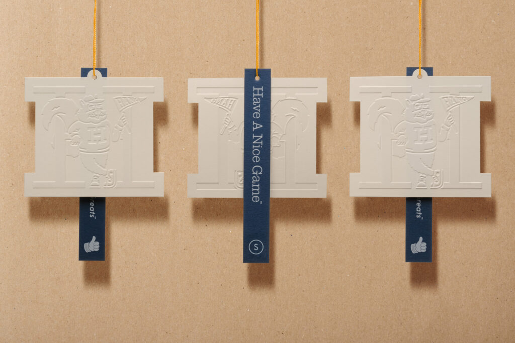

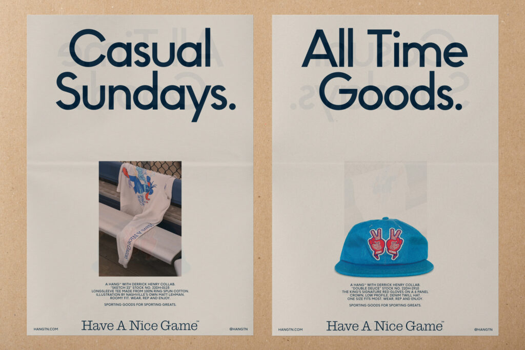
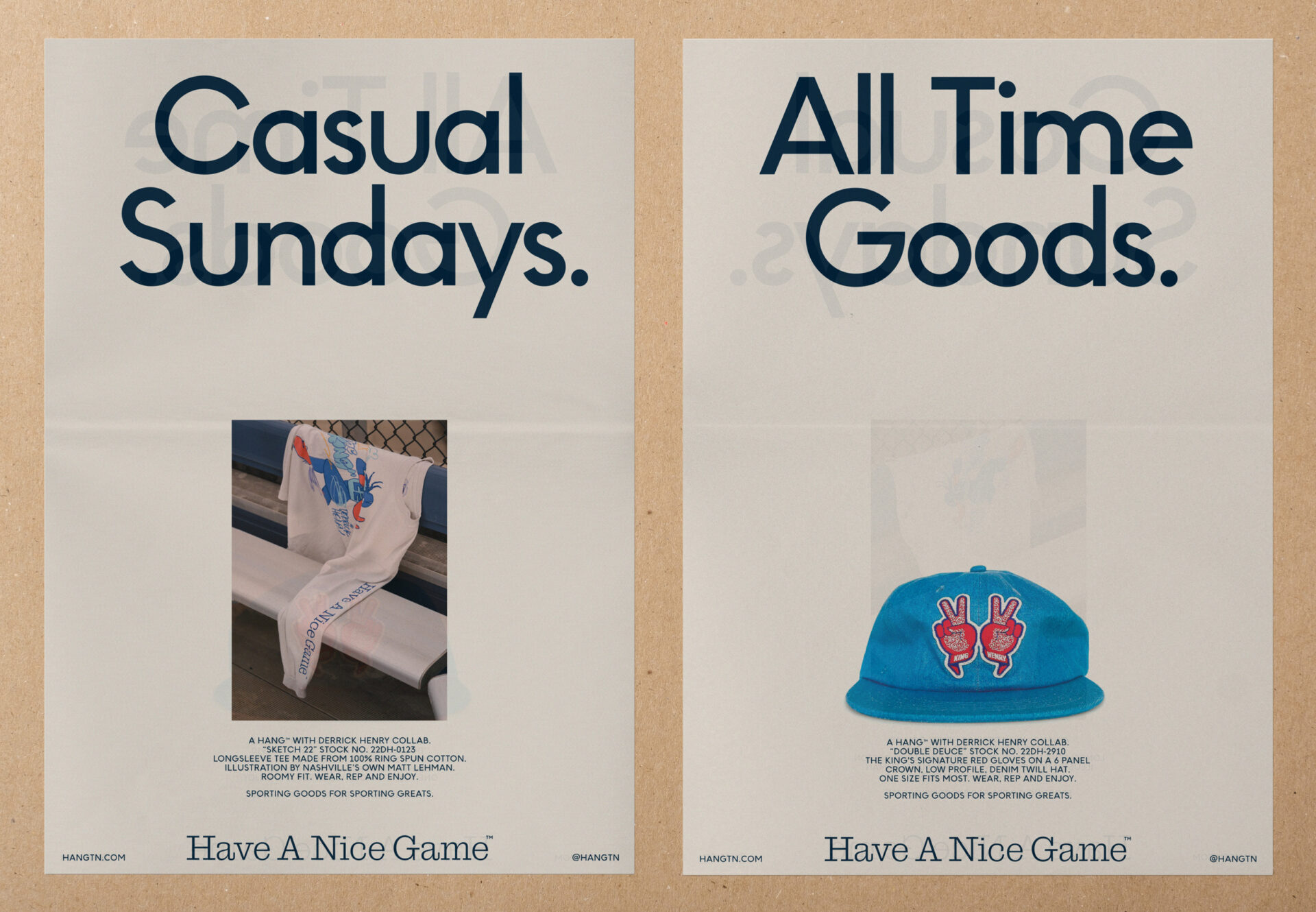
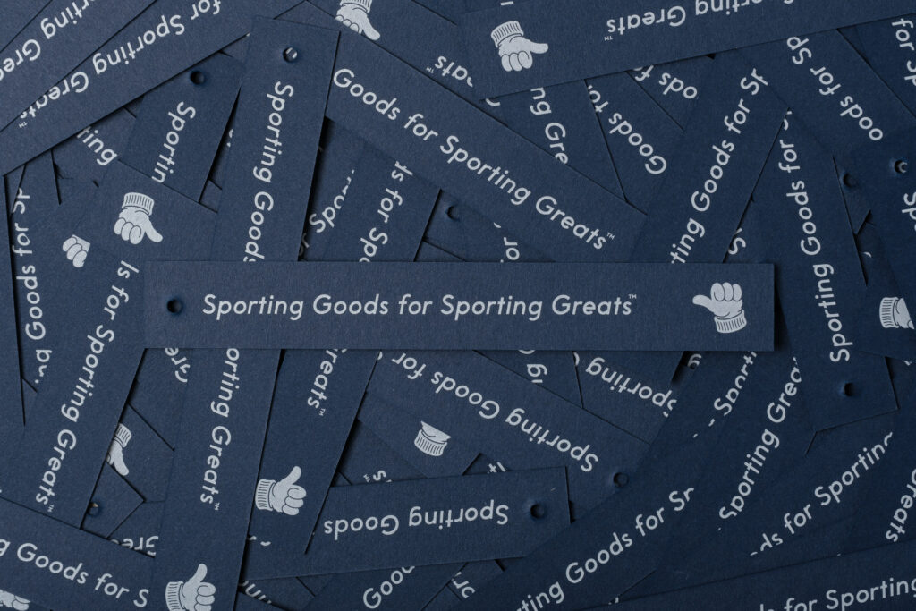
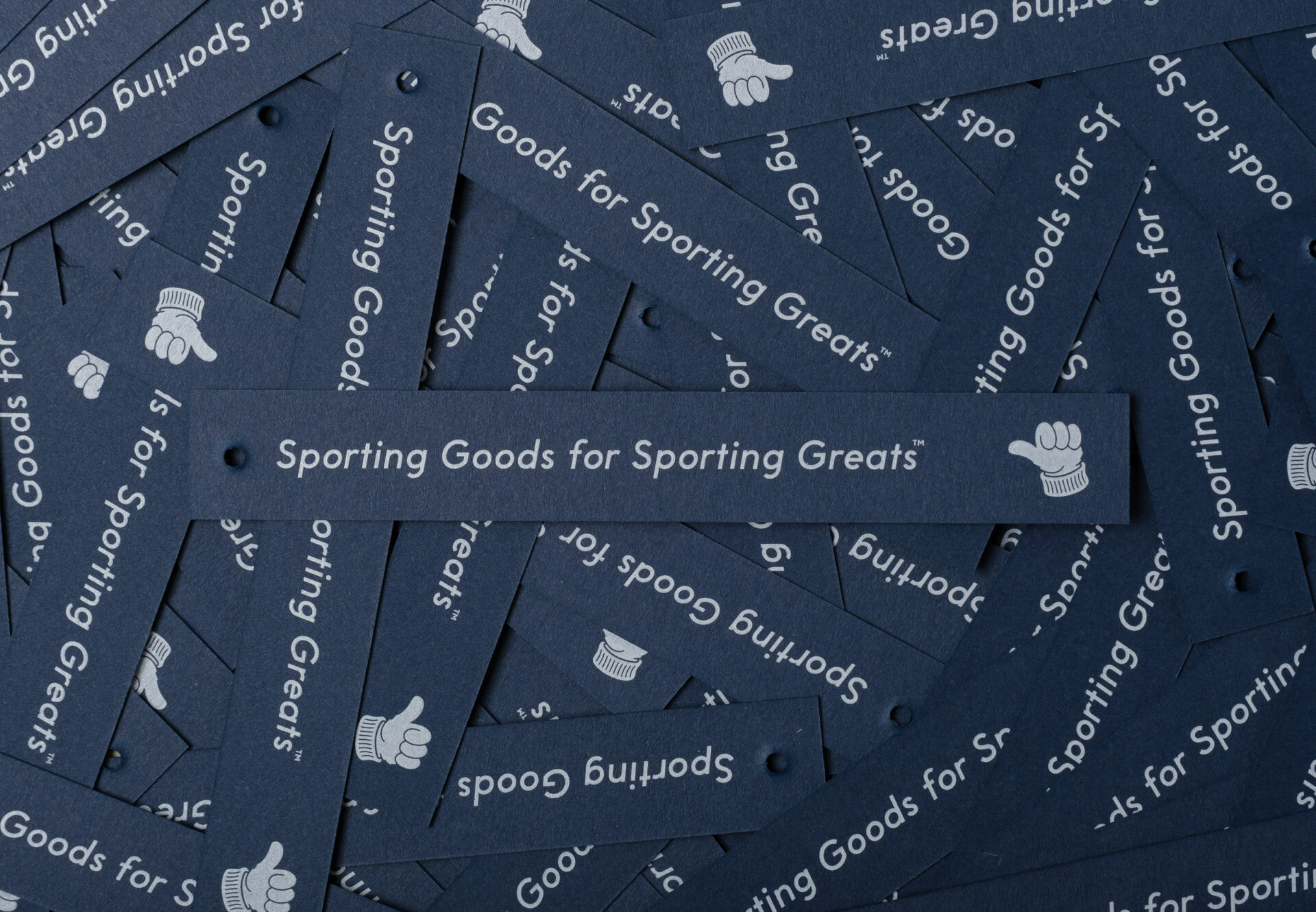
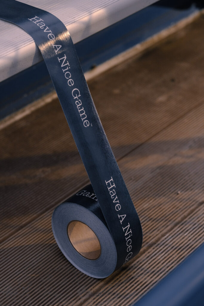
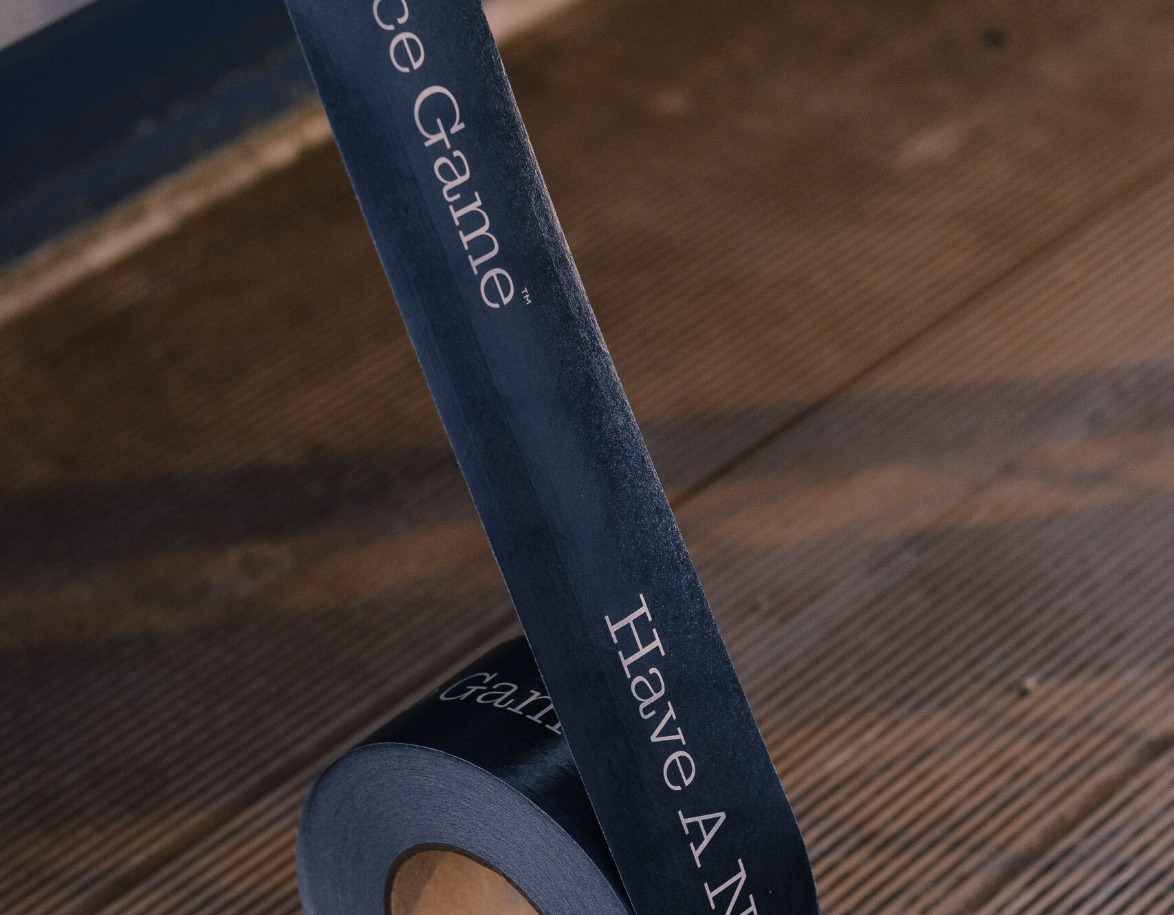
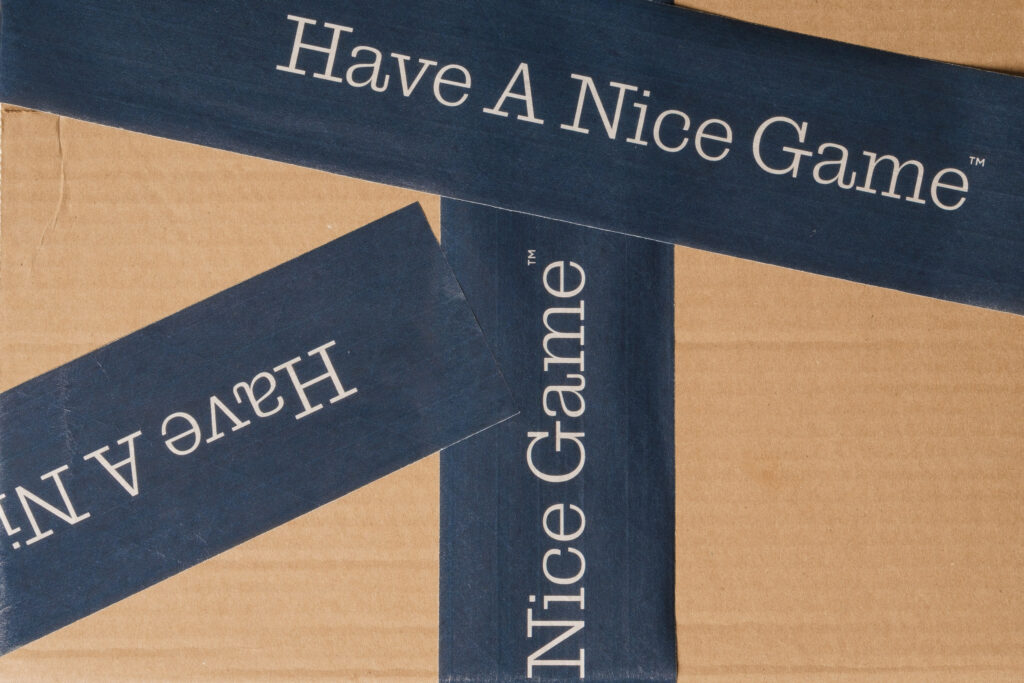
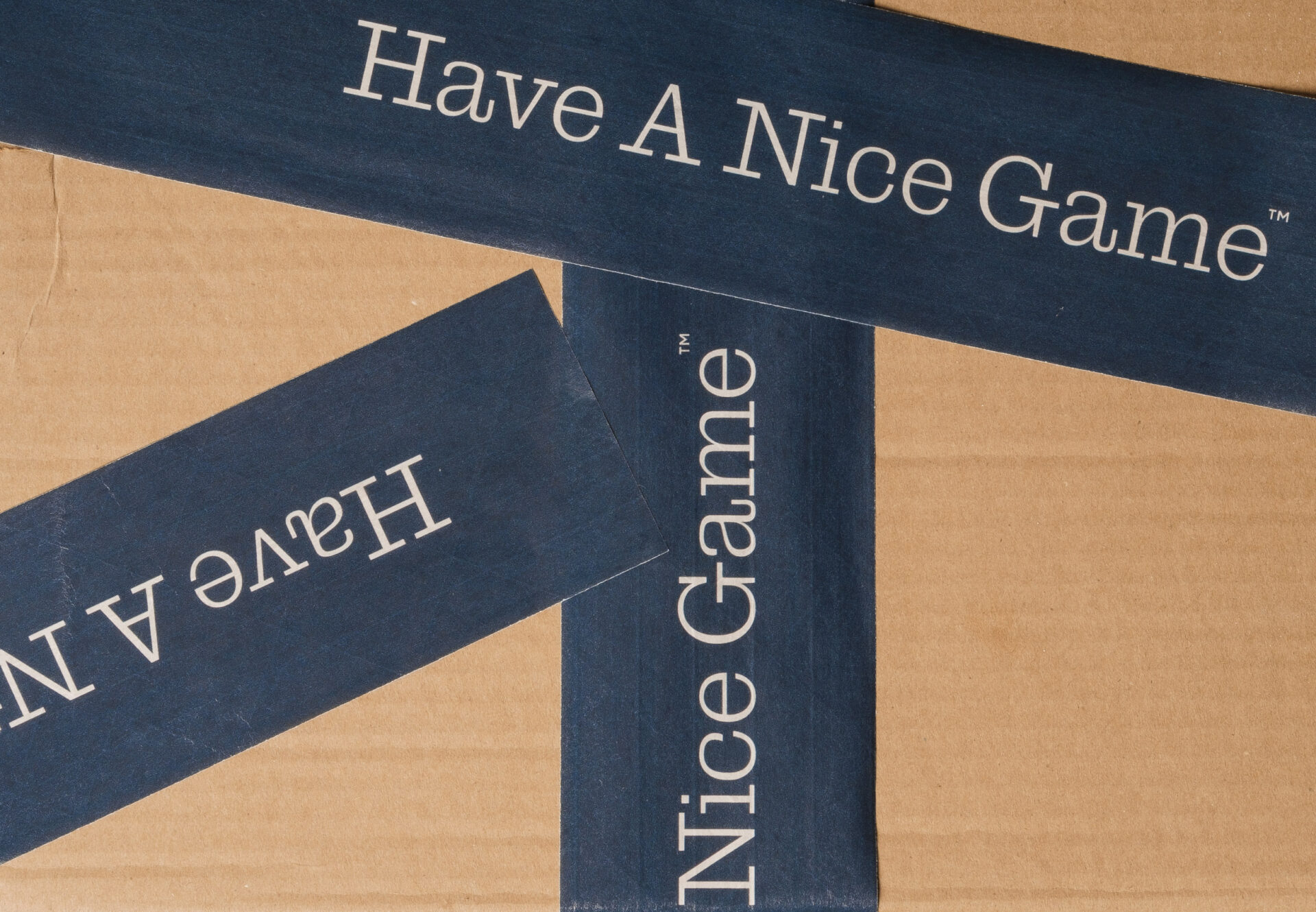
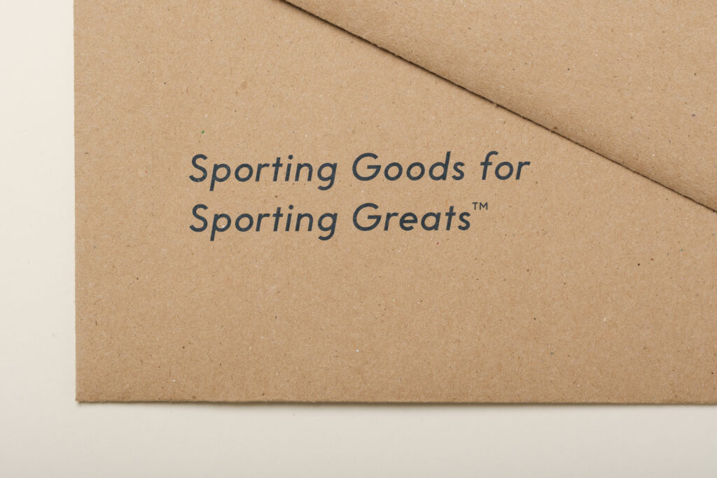
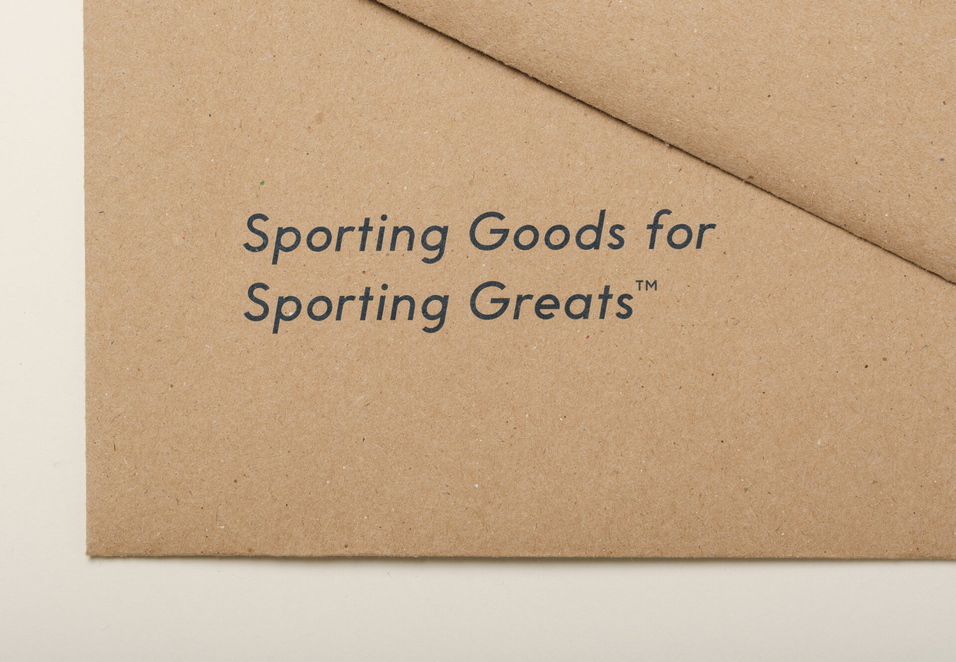
The packaging is calm with moments of spontaneity. Kind of like game day. A variety of illustrations can be found throughout the touch points — from the oversized diecut hang tags to the colorful tissue paper.
The packaging is calm with moments of spontaneity. Kind of like game day. A variety of illustrations can be found throughout the touch points — from the oversized diecut hang tags to the colorful tissue paper.
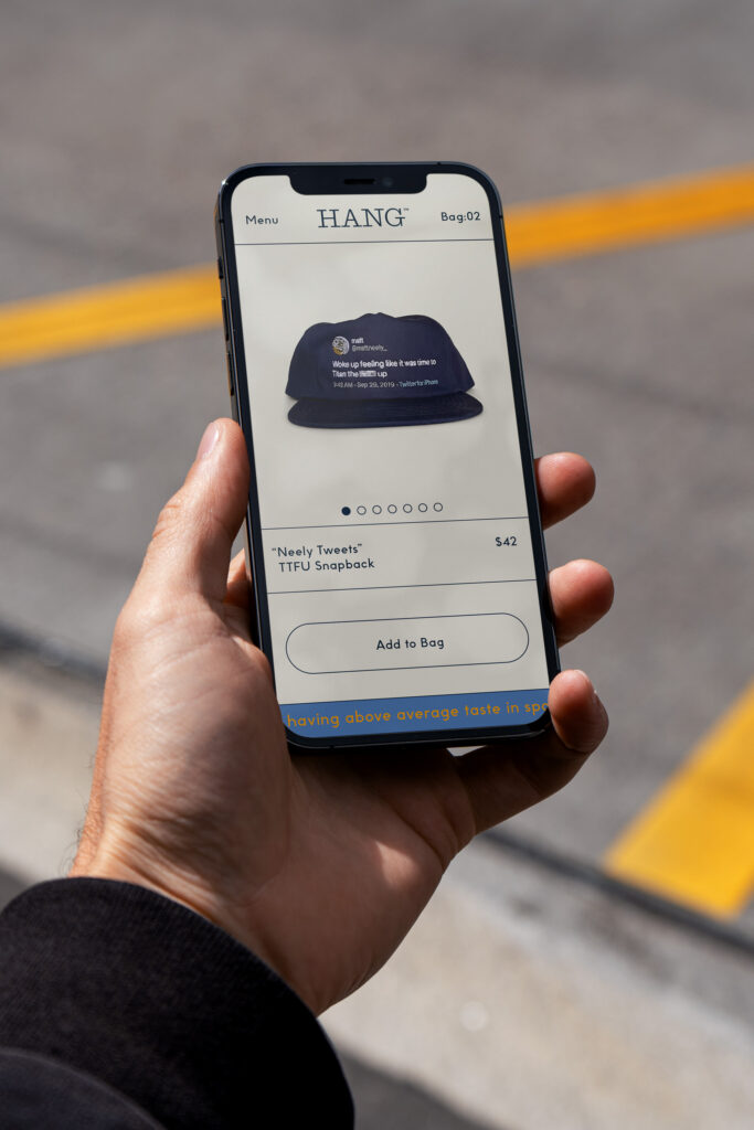
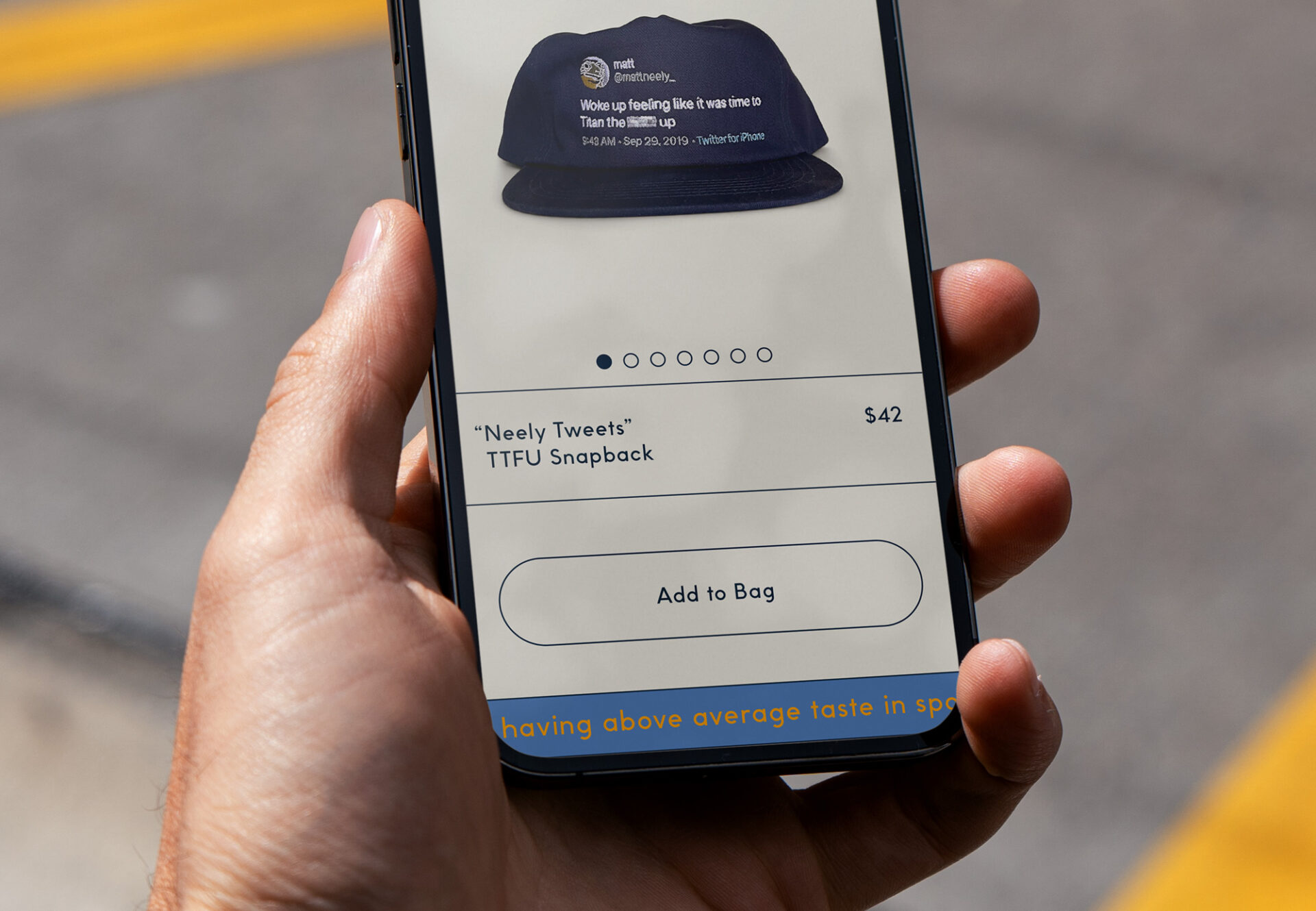
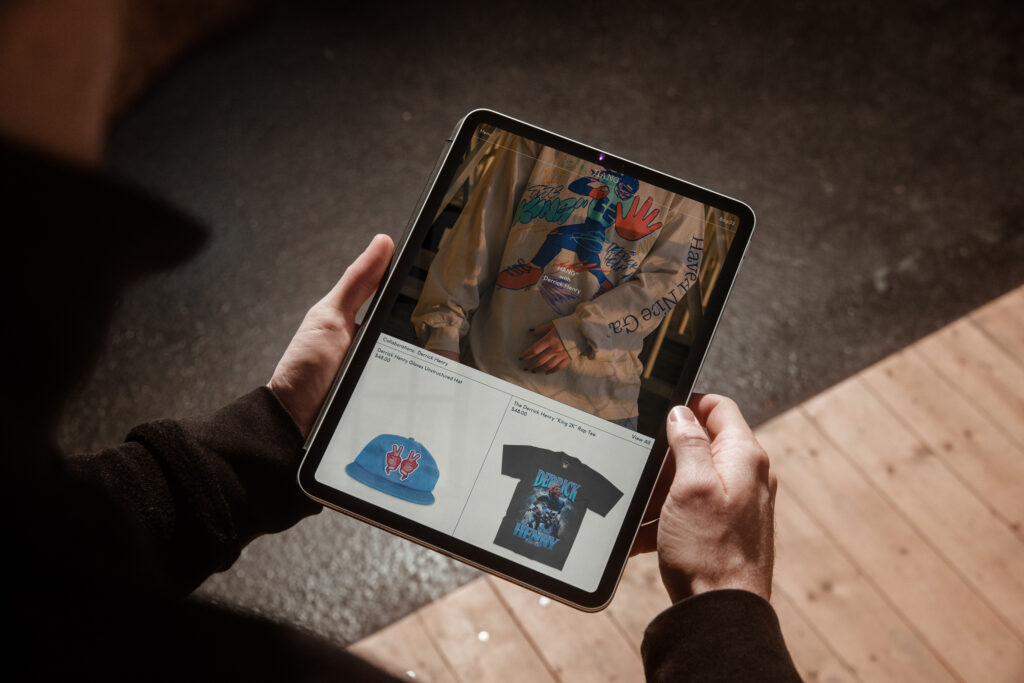
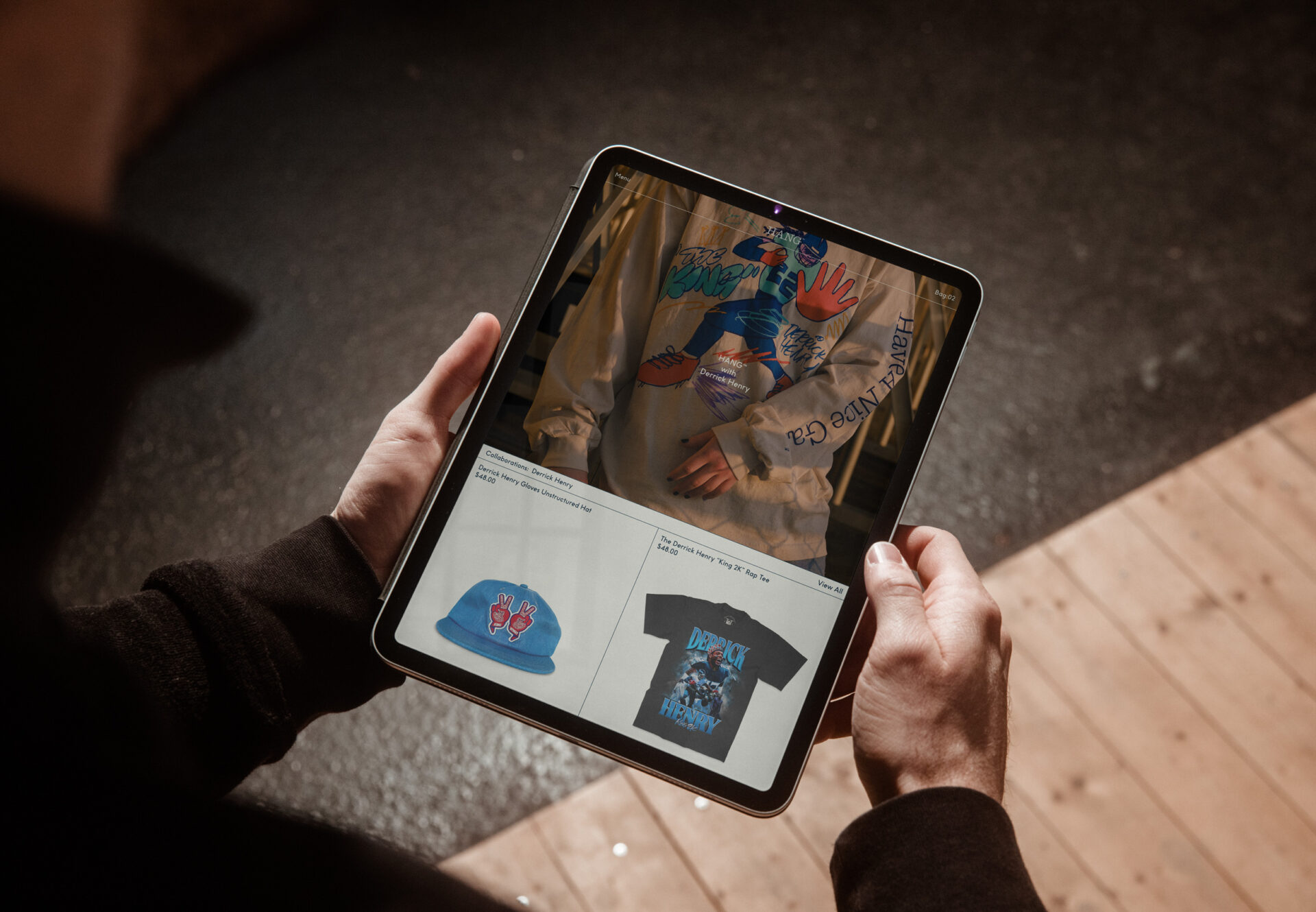
The website aesthetic and layout are executed simply — placing an emphasis on the creativity of the product. We were tasked to design directional comps for HANG’s design team to execute and develop internally. Check out the finished product here.
The website aesthetic and layout are executed simply — placing an emphasis on the creativity of the product. We were tasked to design directional comps for HANG’s design team to execute and develop internally. Check out the finished product here.
Creative Direction: Jeff Perky
Design: Jeff Perky, Rex Runyeon
Project Management: Alden Dienethal
Motion: Bryan Klenkel
Case Study Photography: Ambrose Vargason