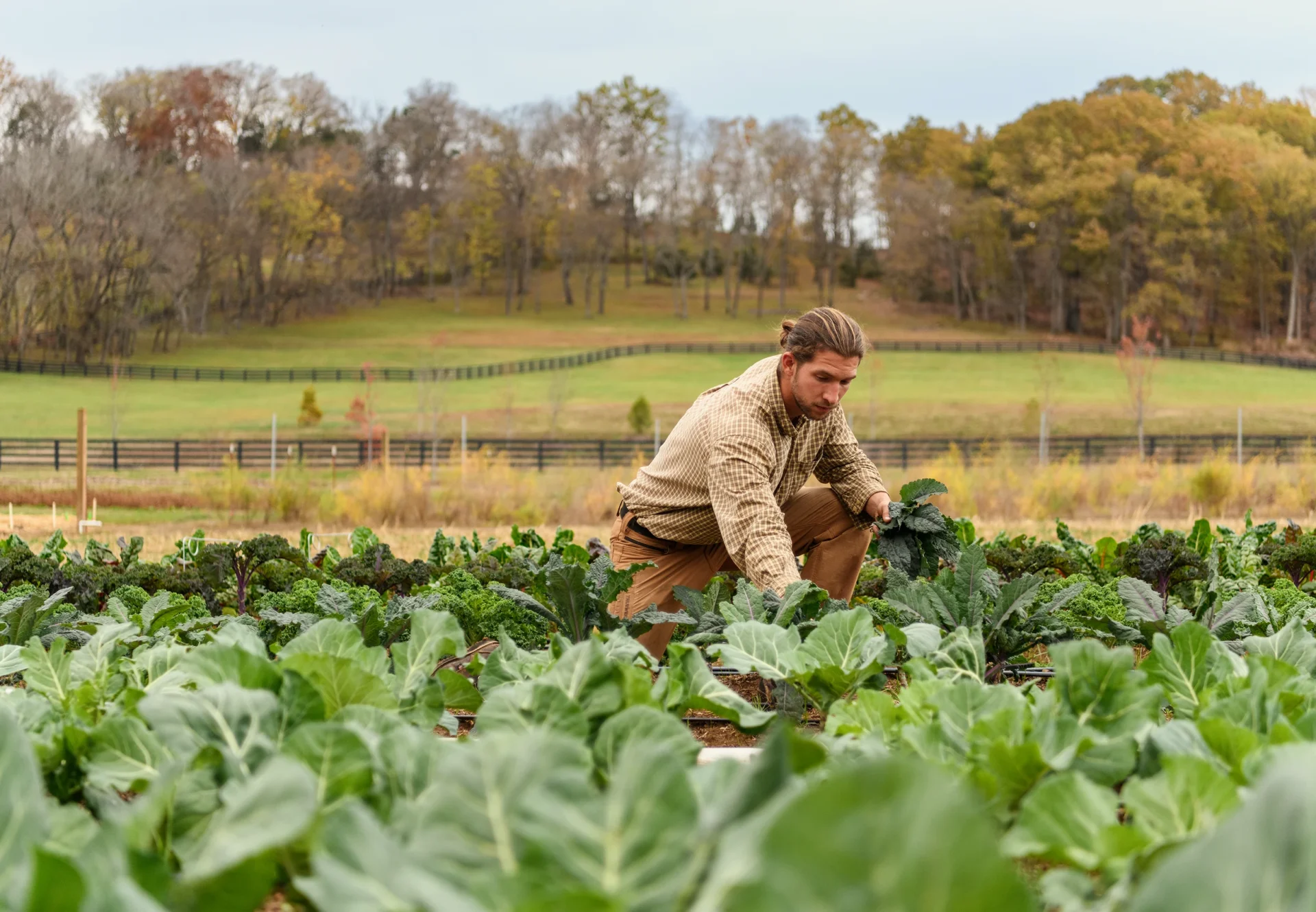
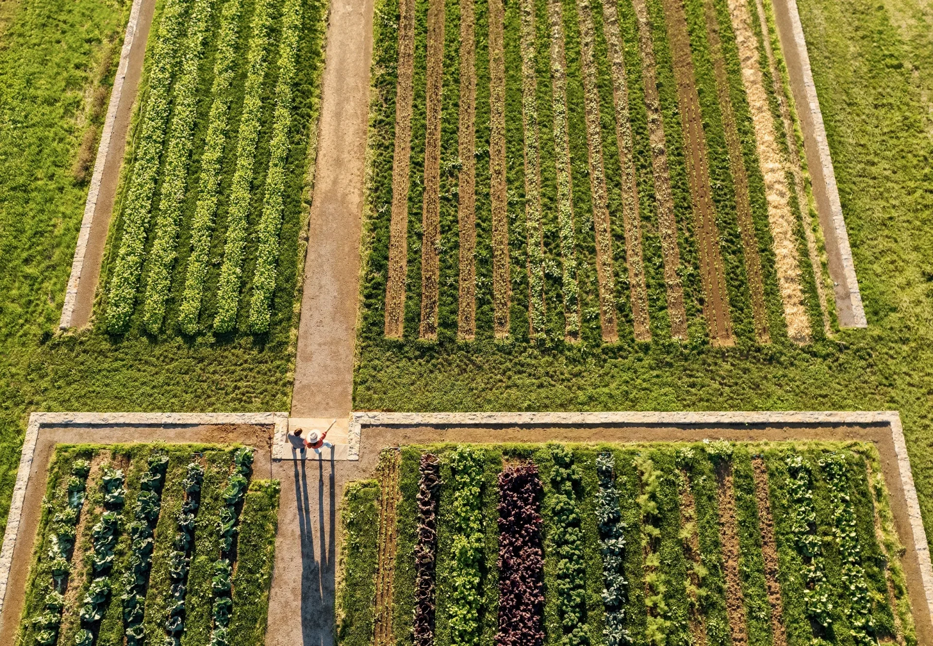
Southall offers a renewed expression of Southern hospitality, shaped by the seasons, the harvest and the belief that care can be felt in every detail. Set across 325 acres just outside Franklin, Tennessee, the Michelin Key resort brings together a working farm, refined accommodations, immersive wellness and farm-driven dining, including January, its Michelin Green Star restaurant.
From naming through design, we created a visual and verbal language around the balance at the heart of Southall: nature and refinement, tradition and progress, working farm and welcoming inn.
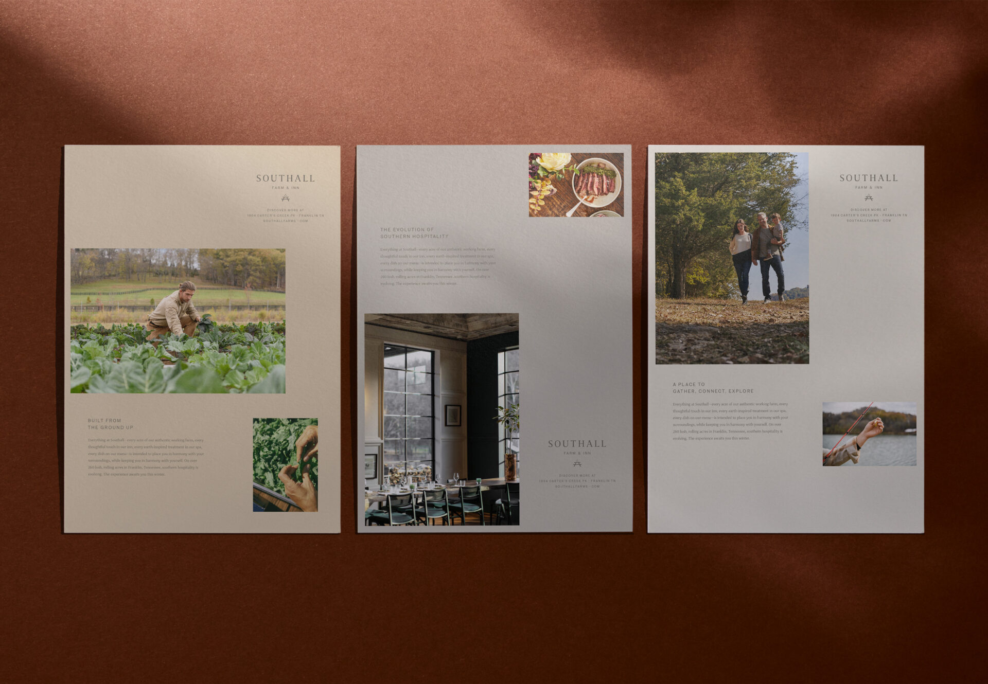
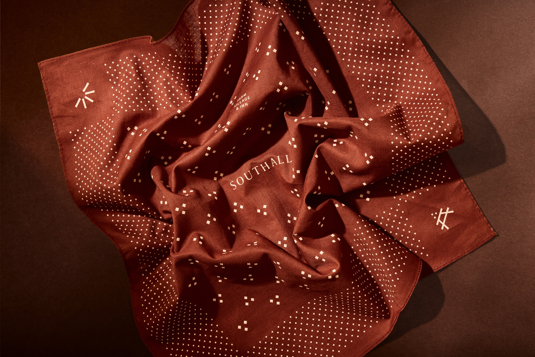
Southall’s identity moves beyond rustic Southern clichés to reflect the natural beauty of Tennessee’s rolling hills and the quiet craftsmanship of its working farm and inn. Rooted in the land, the brand balances tradition with innovation to create a refined expression of Southern hospitality.
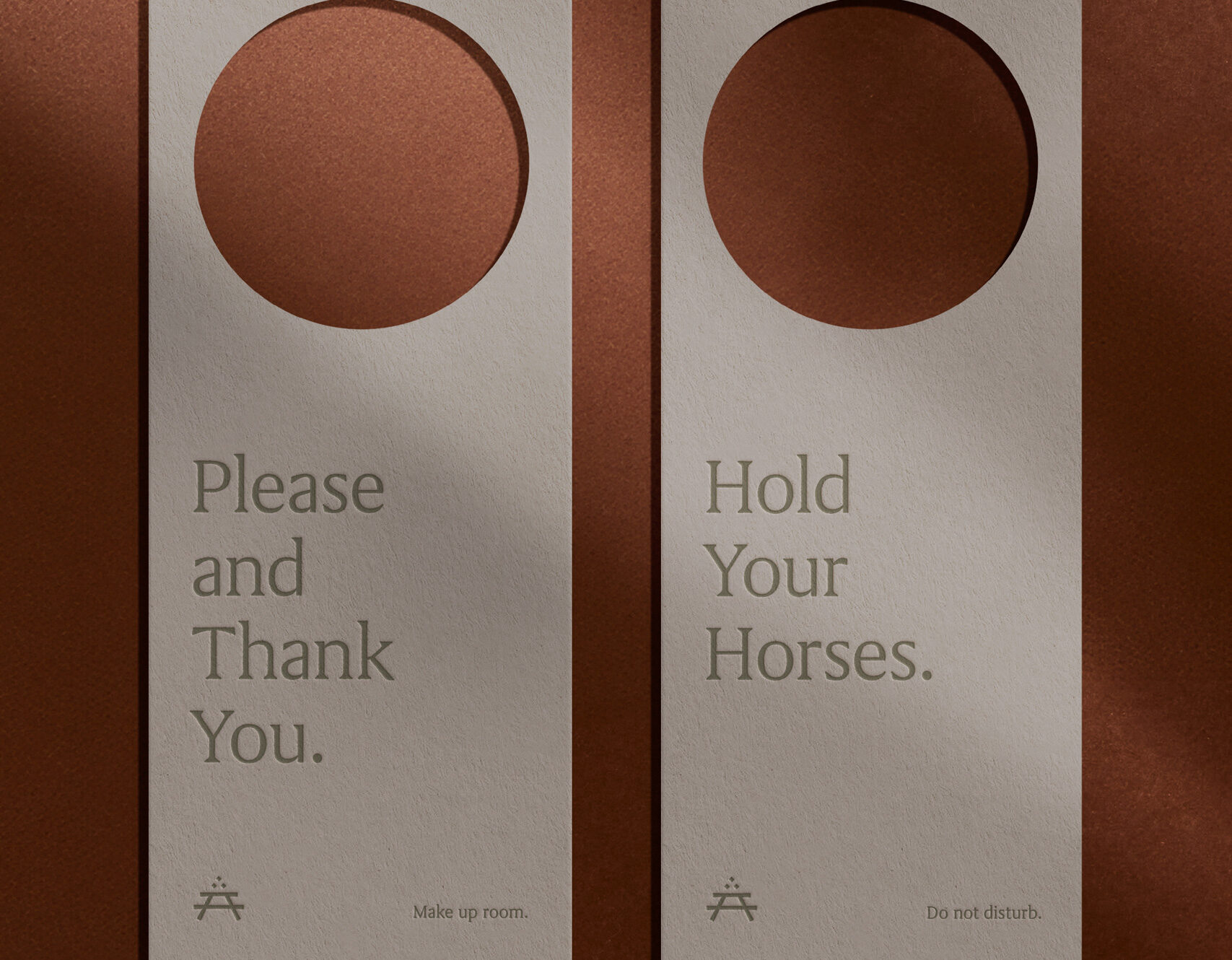
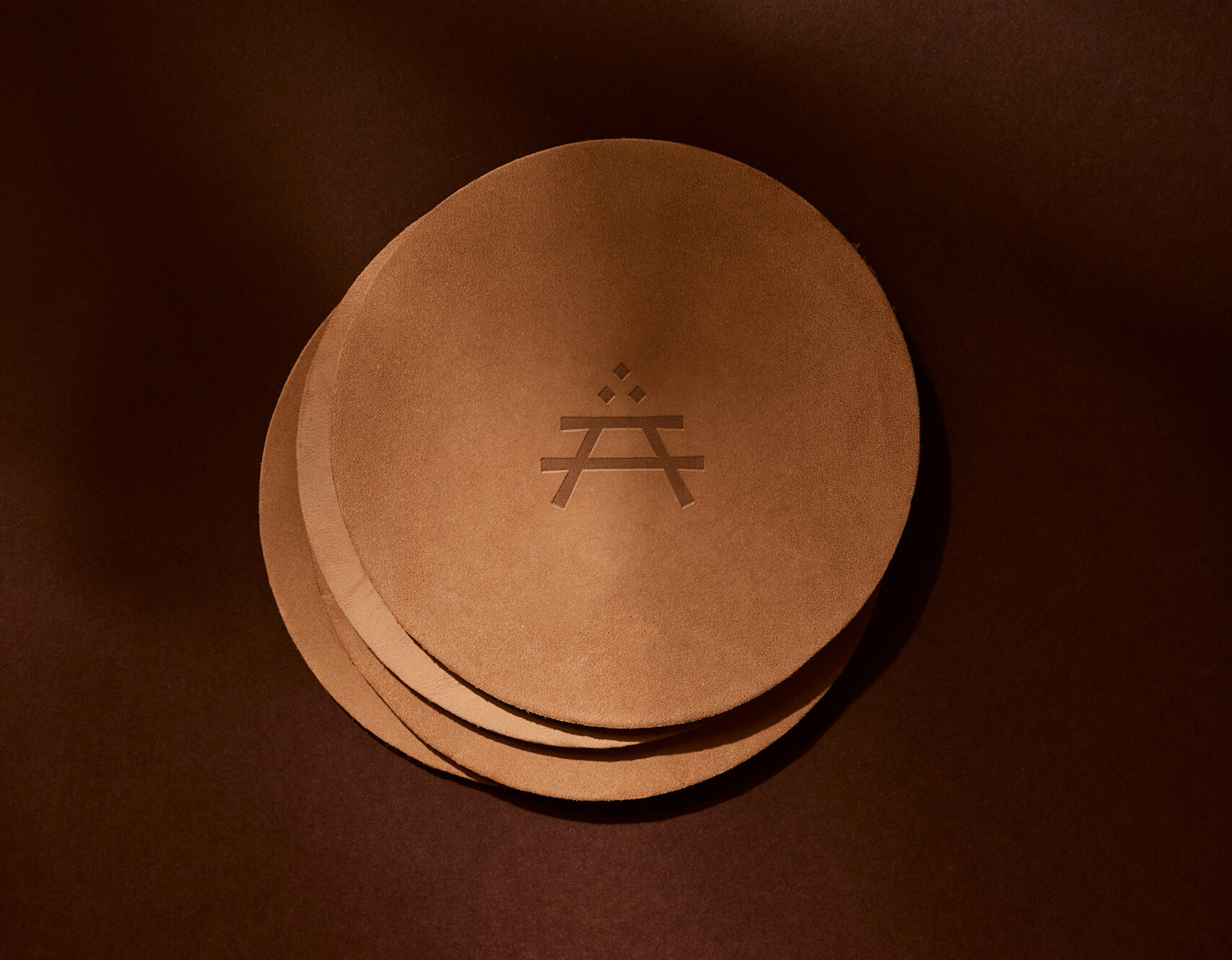
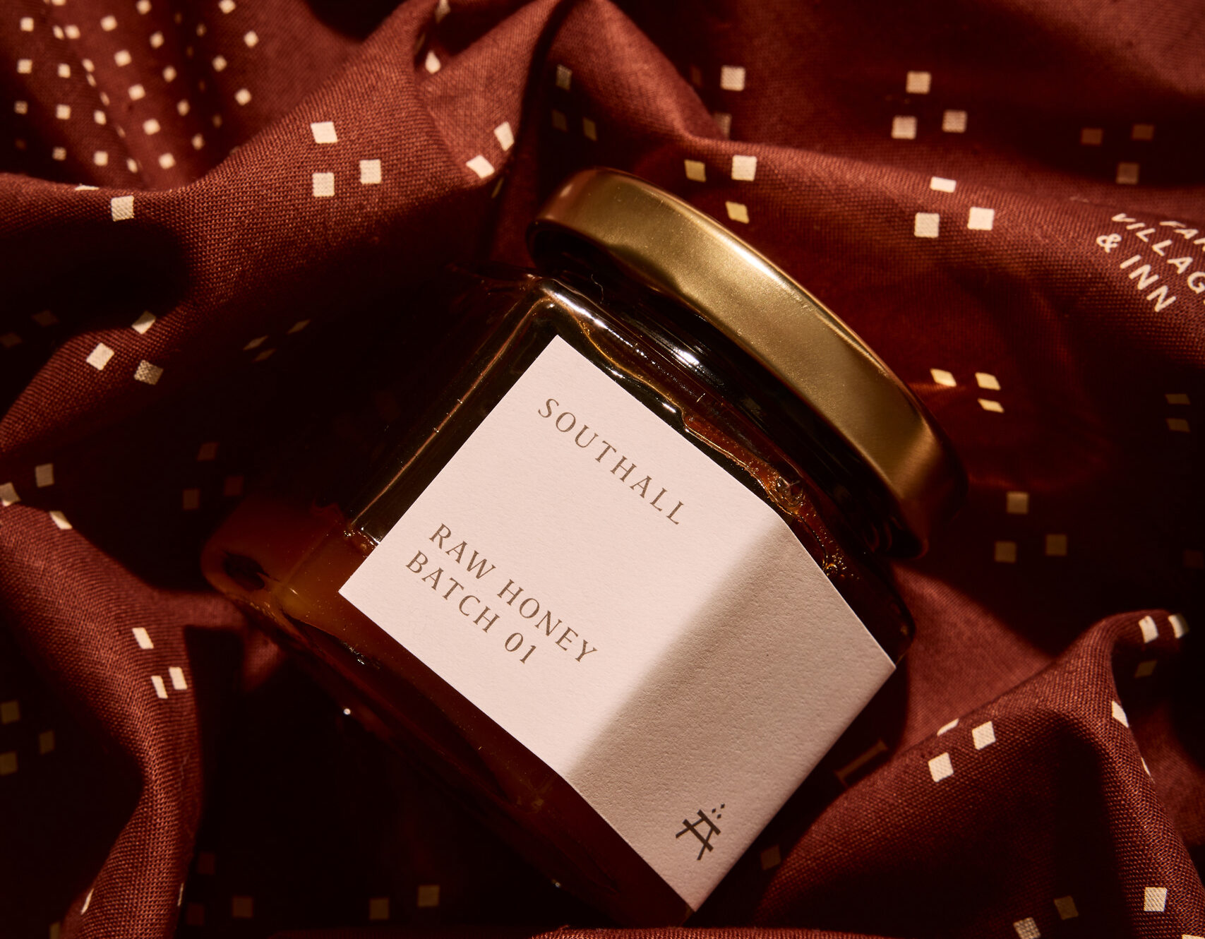
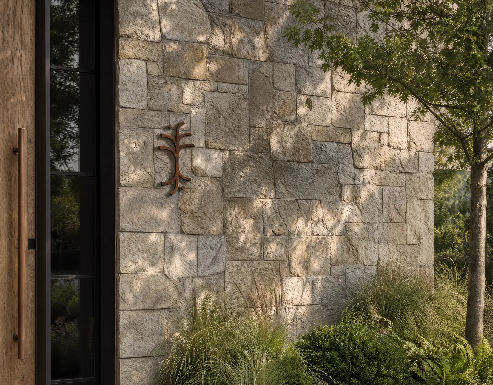
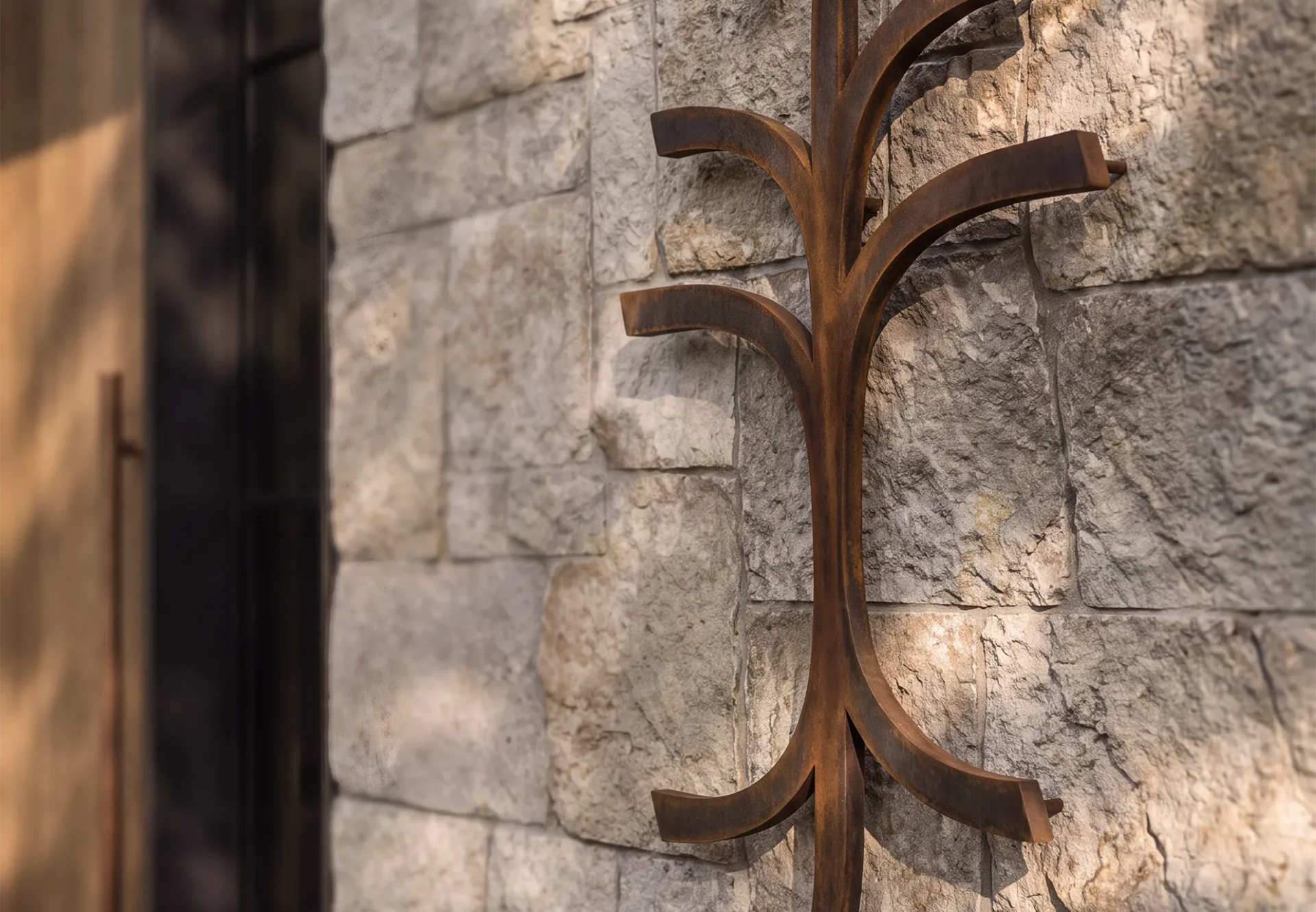
At its heart is the table symbol, an expression of gathering, nourishment and connection. The three diamonds suggest the bounty of a successful Tennessee harvest, while the use of three carries a quieter connection to Southall’s history and its place in Middle Tennessee. Inspired by the Arts and Crafts Movement, the mark’s intentionally irregular strokes give it the warmth and character of a primitive maker’s mark.
Southall’s identity moves beyond rustic Southern clichés to reflect the natural beauty of Tennessee’s rolling hills and the quiet craftsmanship of its working farm and inn. Rooted in the land, the brand balances tradition with innovation to create a refined expression of Southern hospitality.
At its heart is the table symbol, an expression of gathering, nourishment and connection. The three diamonds suggest the bounty of a successful Tennessee harvest, while the use of three carries a quieter connection to Southall’s history and its place in Middle Tennessee. Inspired by the Arts and Crafts Movement, the mark’s intentionally irregular strokes give it the warmth and character of a primitive maker’s mark.


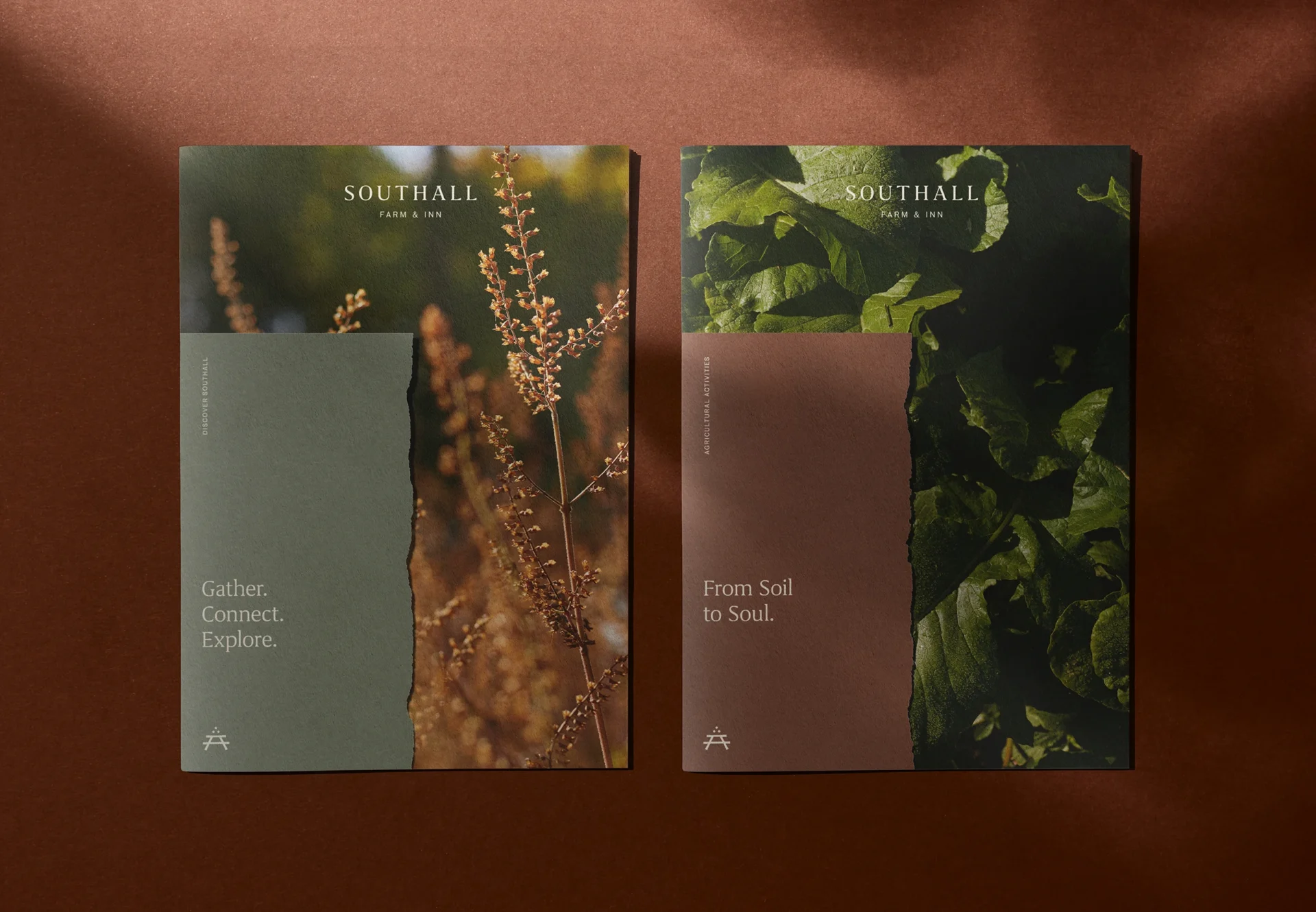

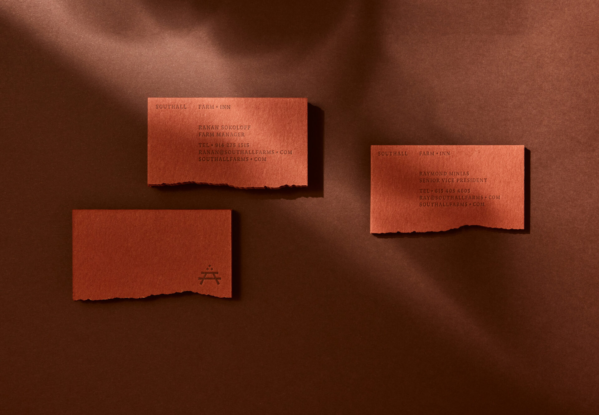

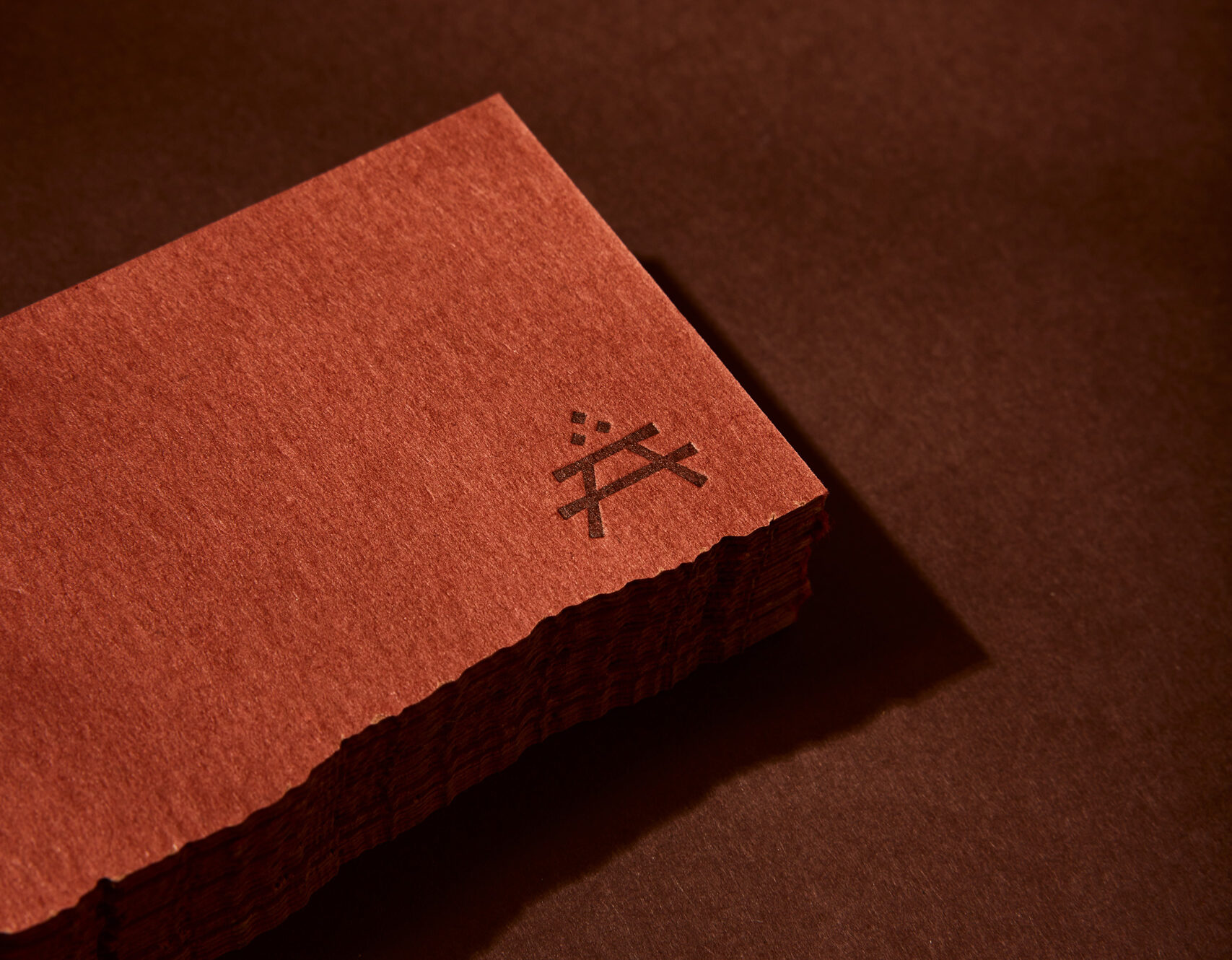
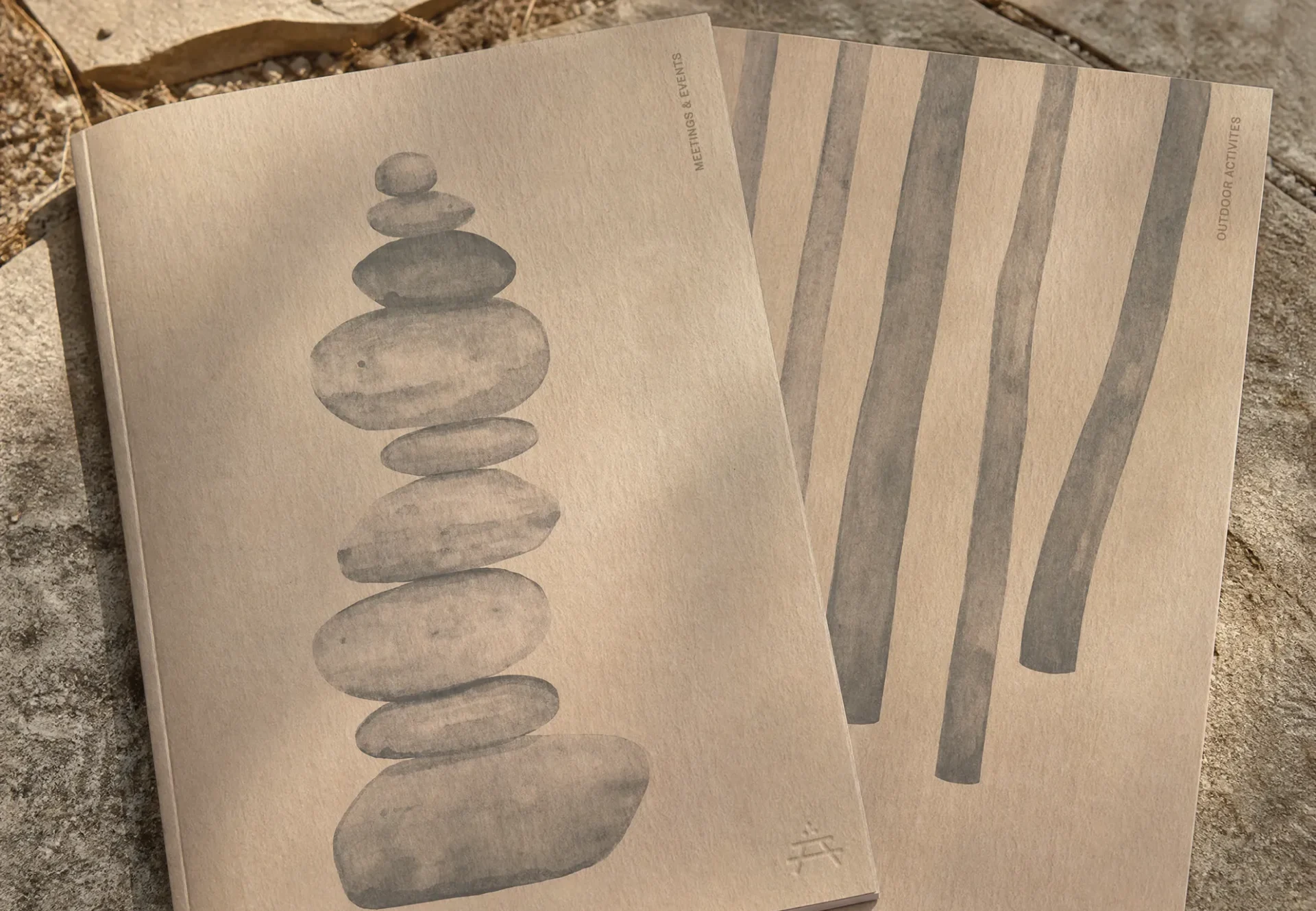
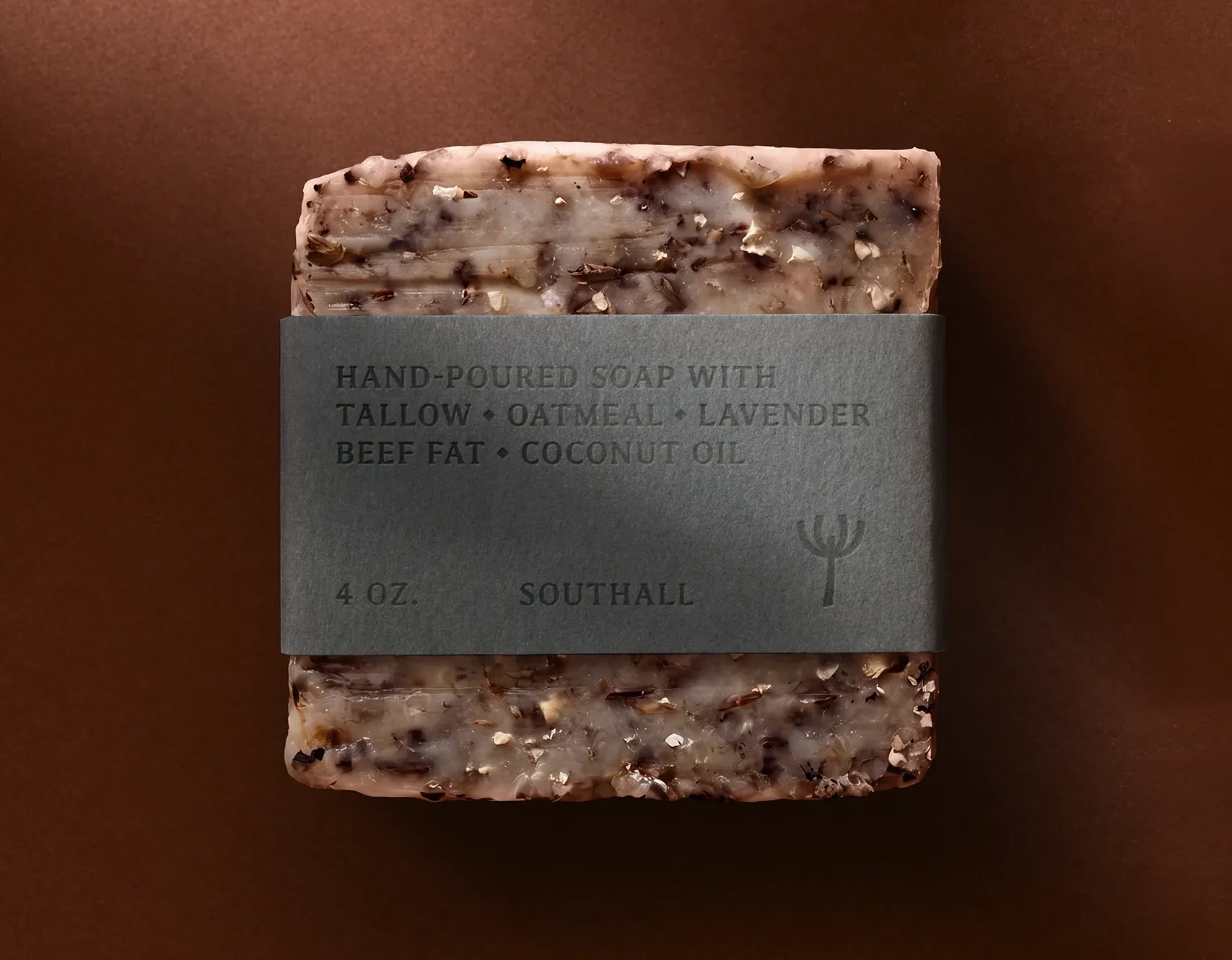
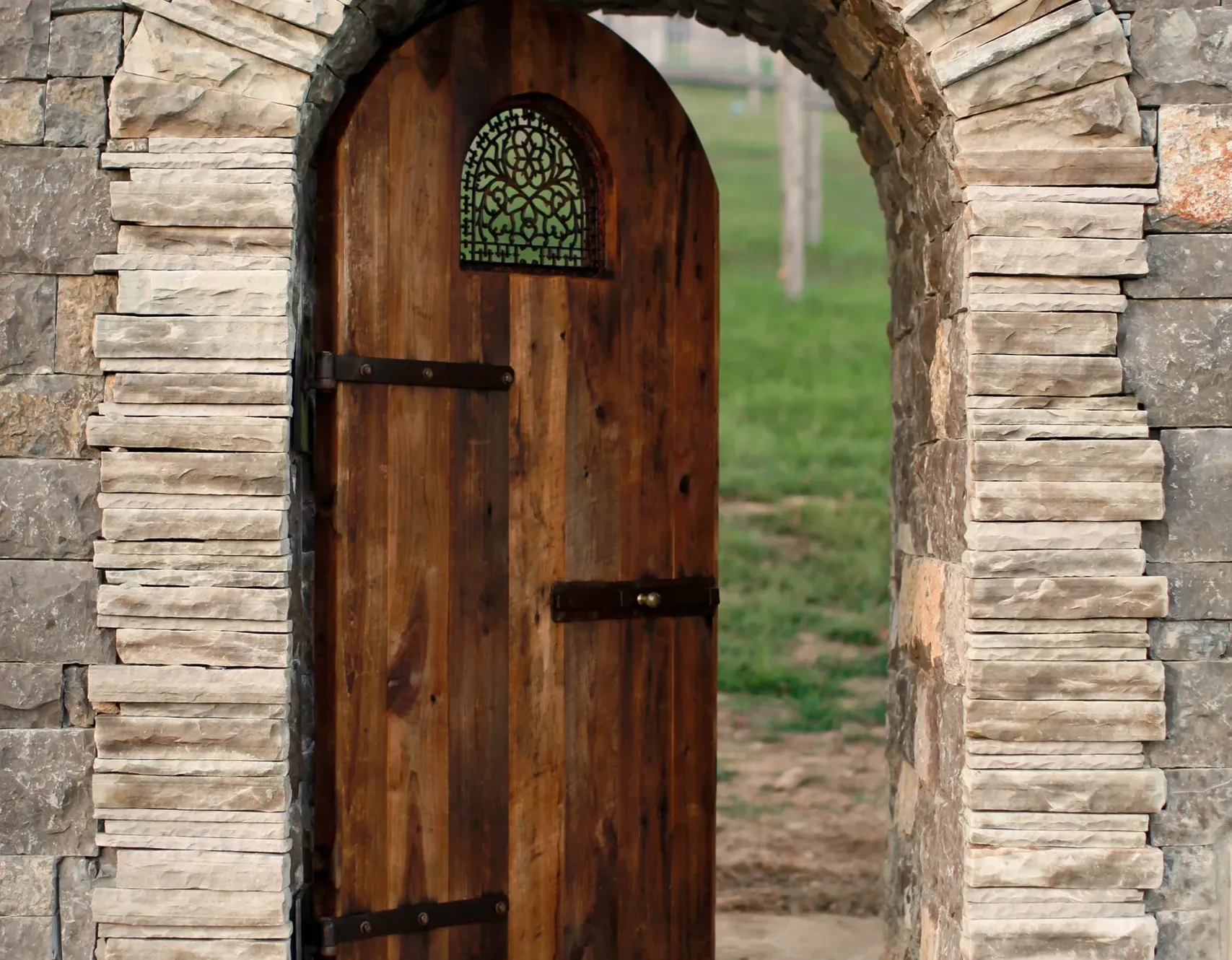
Material choices deepen Southall’s connection to the land and its history. Richly textured papers, laser-cut edges inspired by native shale and deeply impressed letterpress details create a tactile expression of the care and craftsmanship behind the brand.

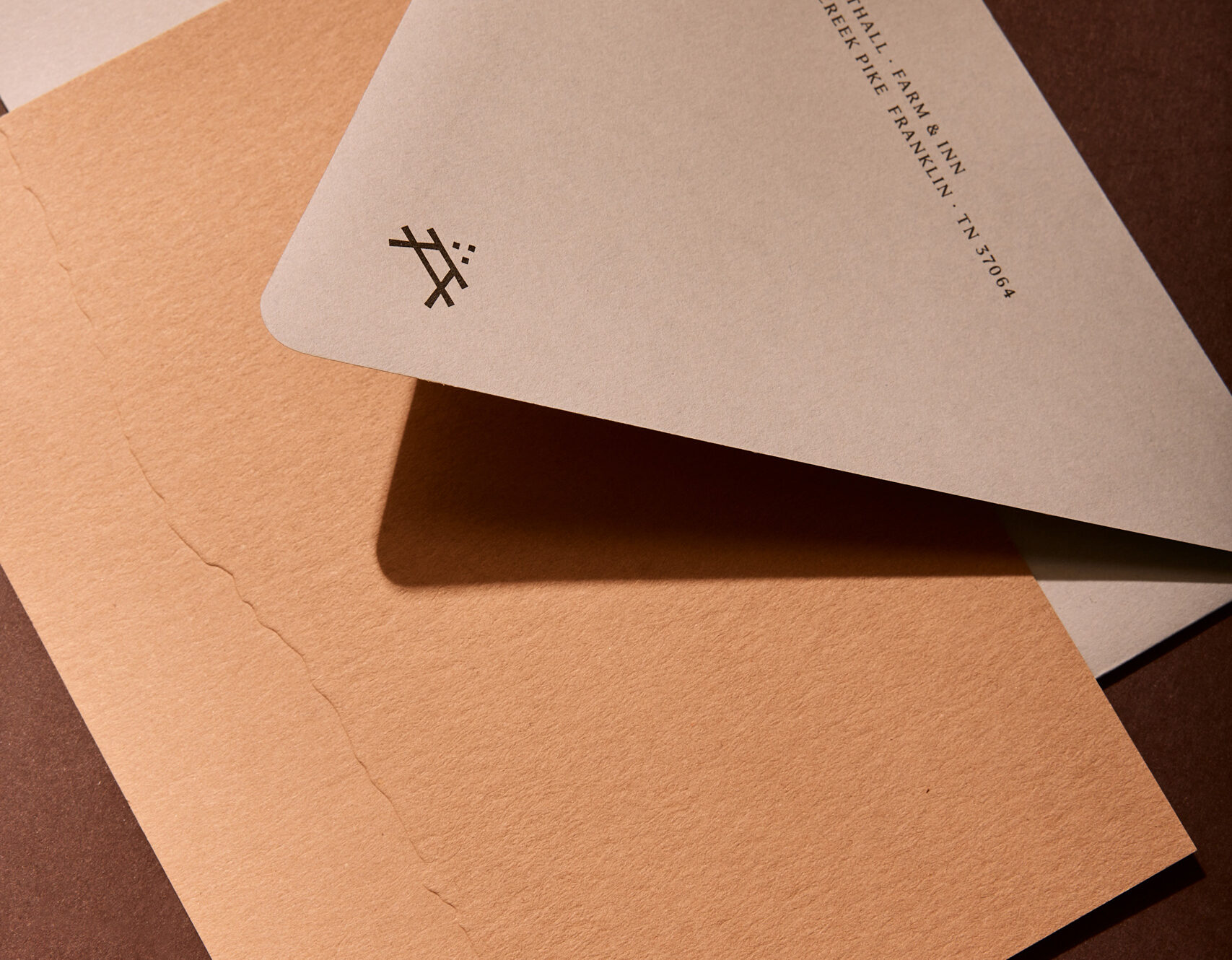

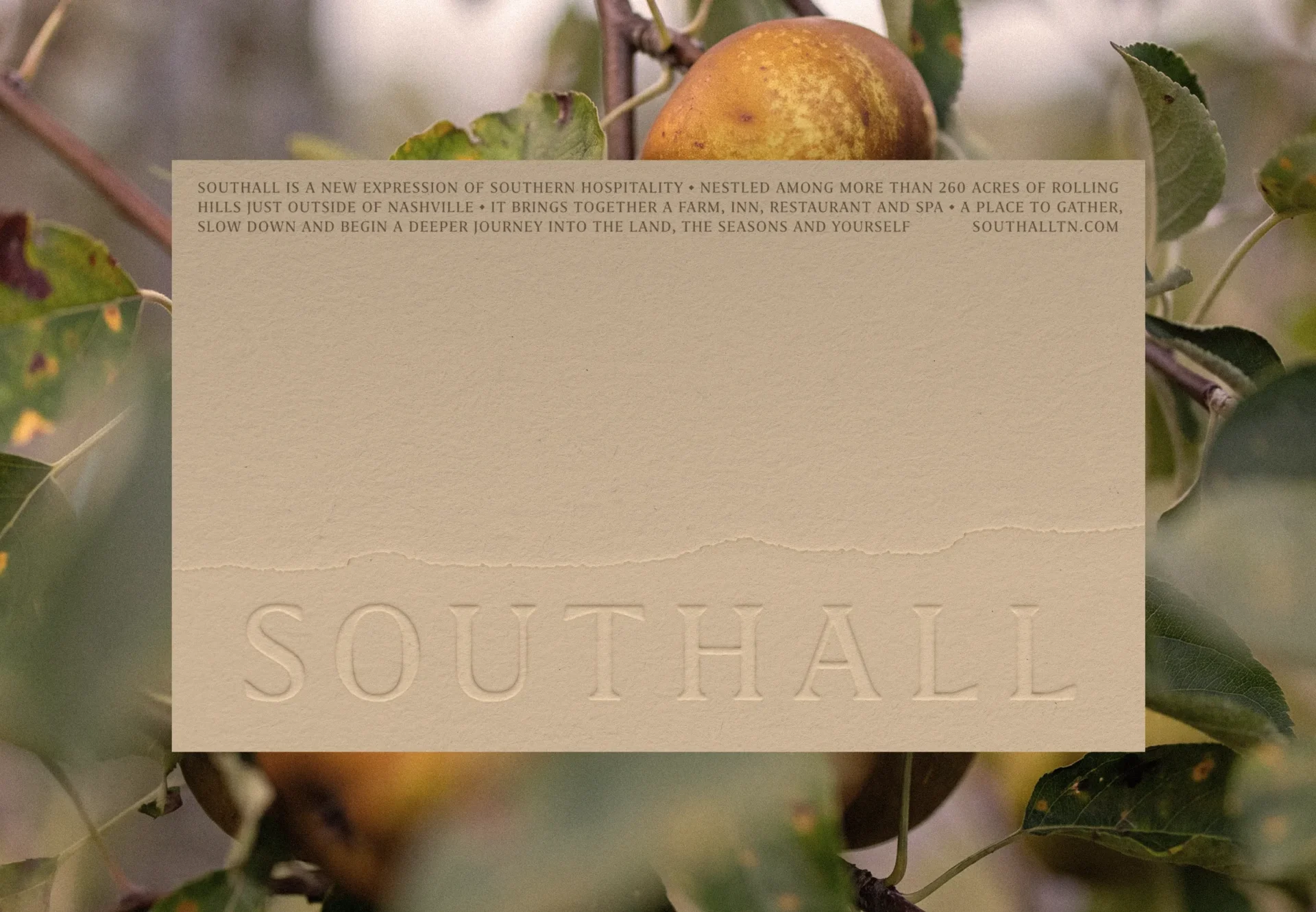


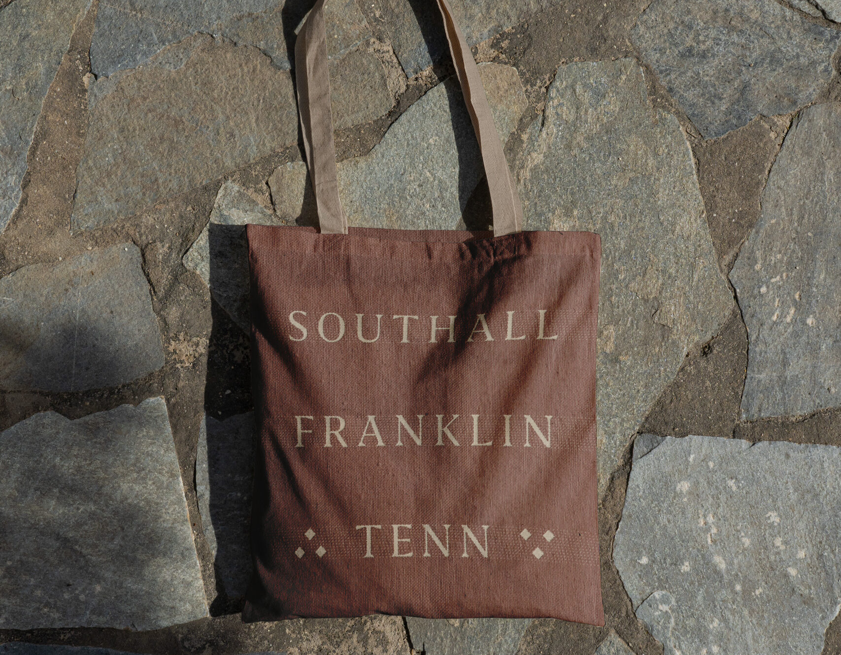
Southall’s logotype balances tradition with refinement. Customized from Grifo S, its sturdy wedge-like serifs and wide letterspacing give the mark warmth, sophistication and permanence. The table-top “A” balances the surrounding negative space and gives the mark a distinctive character.
The broader typographic system pairs Grifo S with Marr Sans. Grifo S carries the warmth and character of the brand, while Marr Sans adds clarity and restraint for supporting information. Together, they create a cohesive system across editorial, environmental and guest-facing applications.
Southall’s logotype balances tradition with refinement. Customized from Grifo S, its sturdy wedge-like serifs and wide letterspacing give the mark warmth, sophistication and permanence. The table-top “A” balances the surrounding negative space and gives the mark a distinctive character.
The broader typographic system pairs Grifo S with Marr Sans. Grifo S carries the warmth and character of the brand, while Marr Sans adds clarity and restraint for supporting information. Together, they create a cohesive system across editorial, environmental and guest-facing applications.














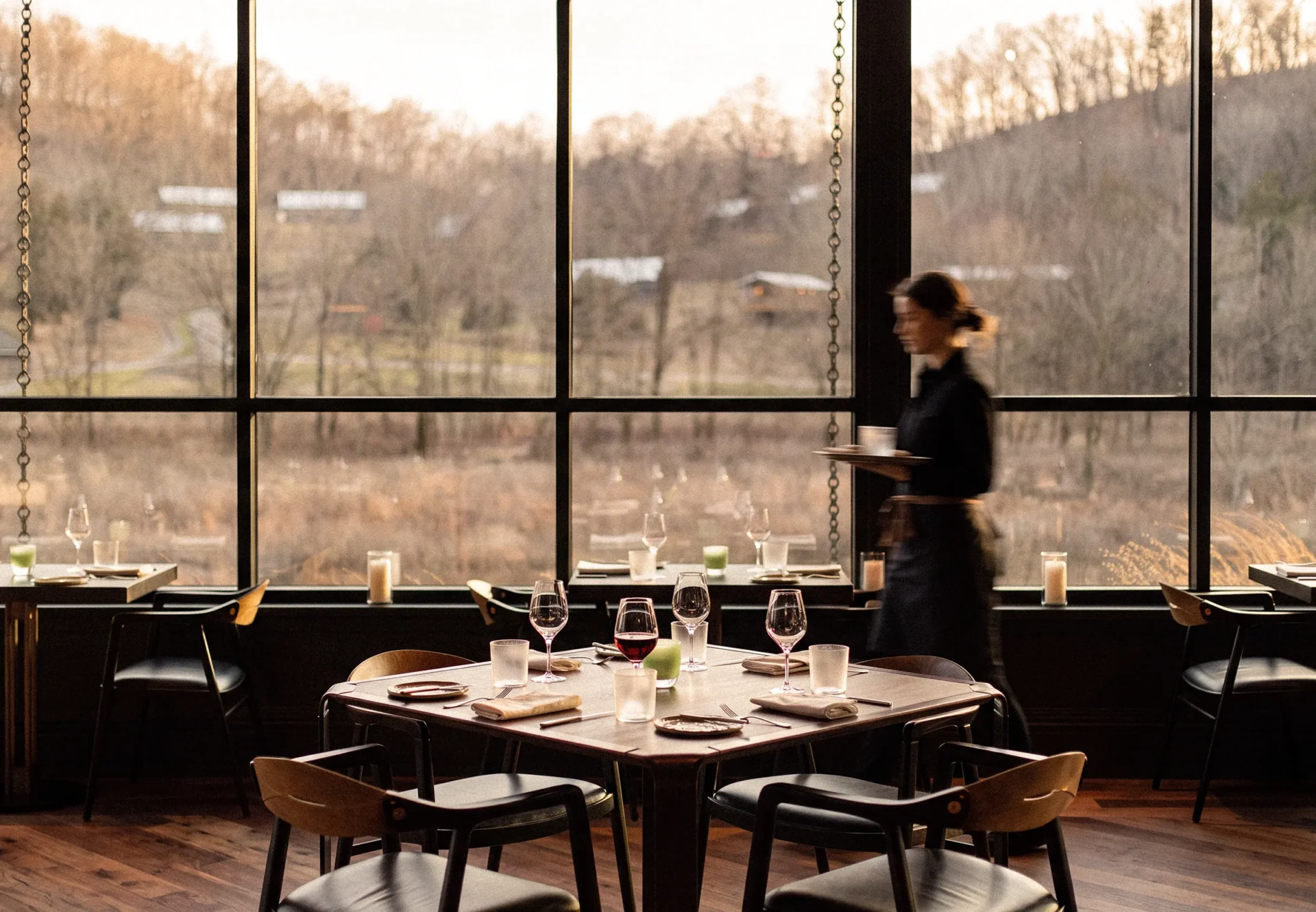
Southall’s flagship restaurant, January, called for a menu that could change with the harvest and the seasons. Organic, shifting type keeps each edition flexible, while making it feel distinctly of the day.

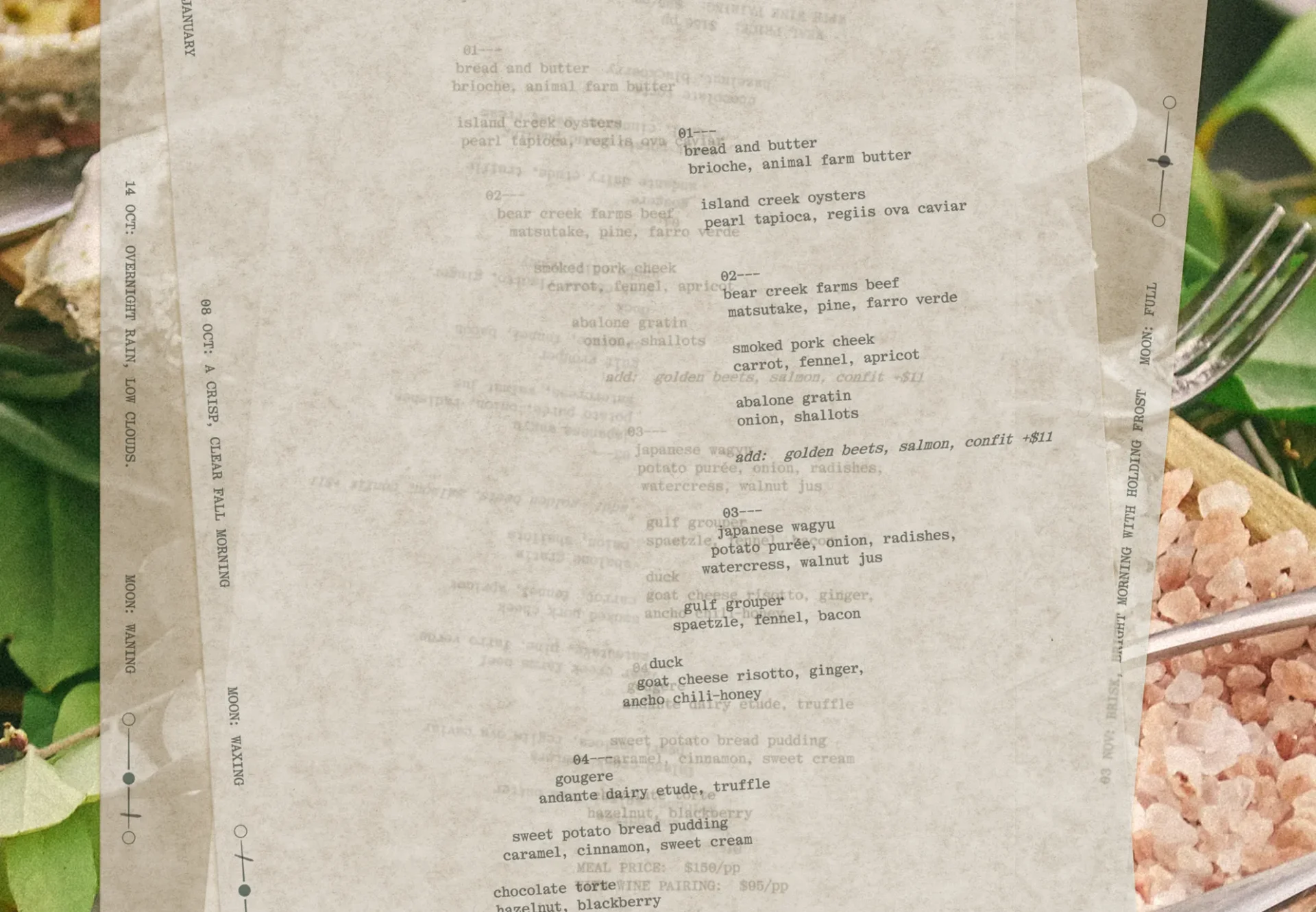
Southall’s flagship restaurant, January, called for a menu that could change with the harvest and the seasons. Organic, shifting type keeps each edition flexible, while making it feel distinctly of the day.

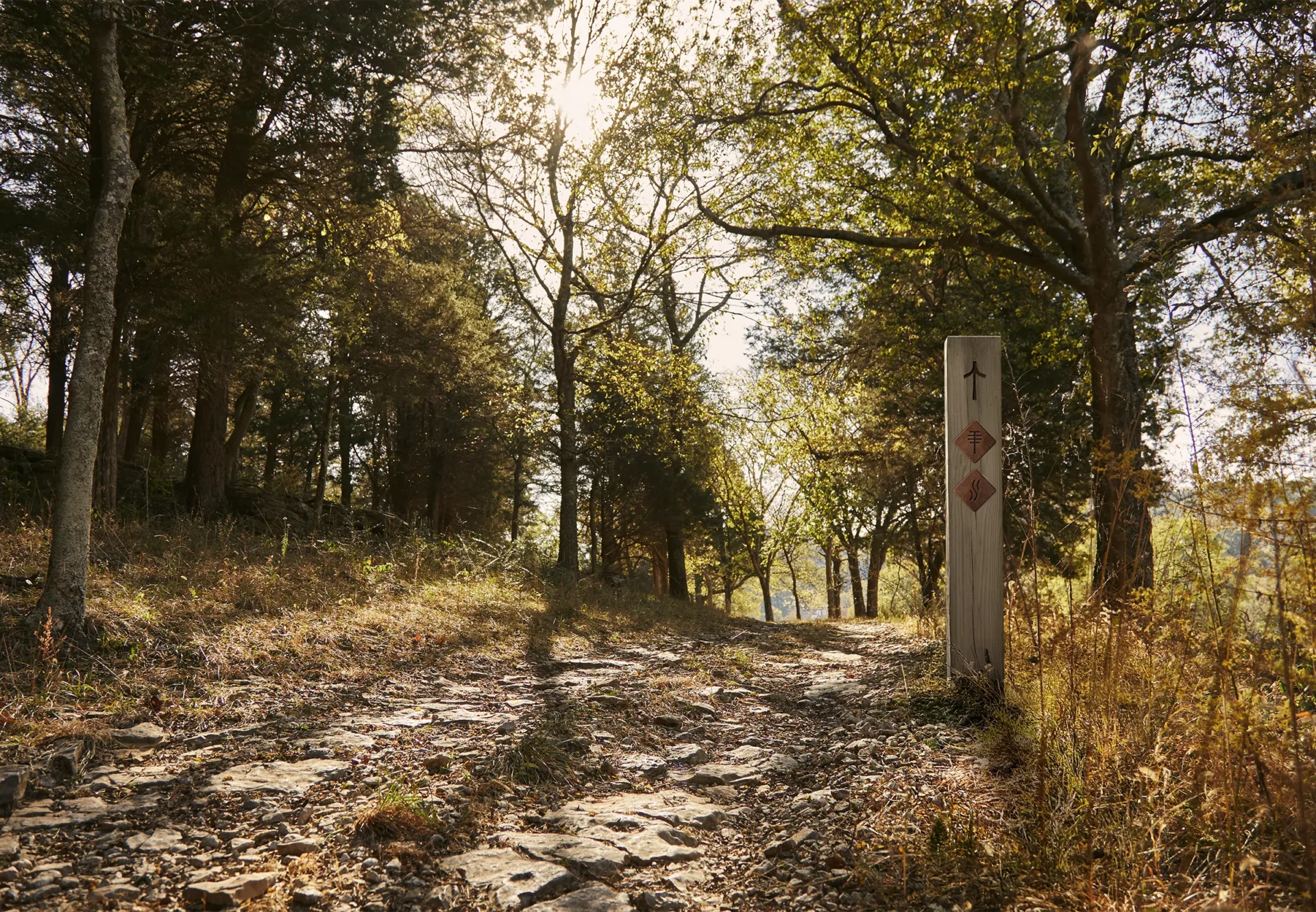

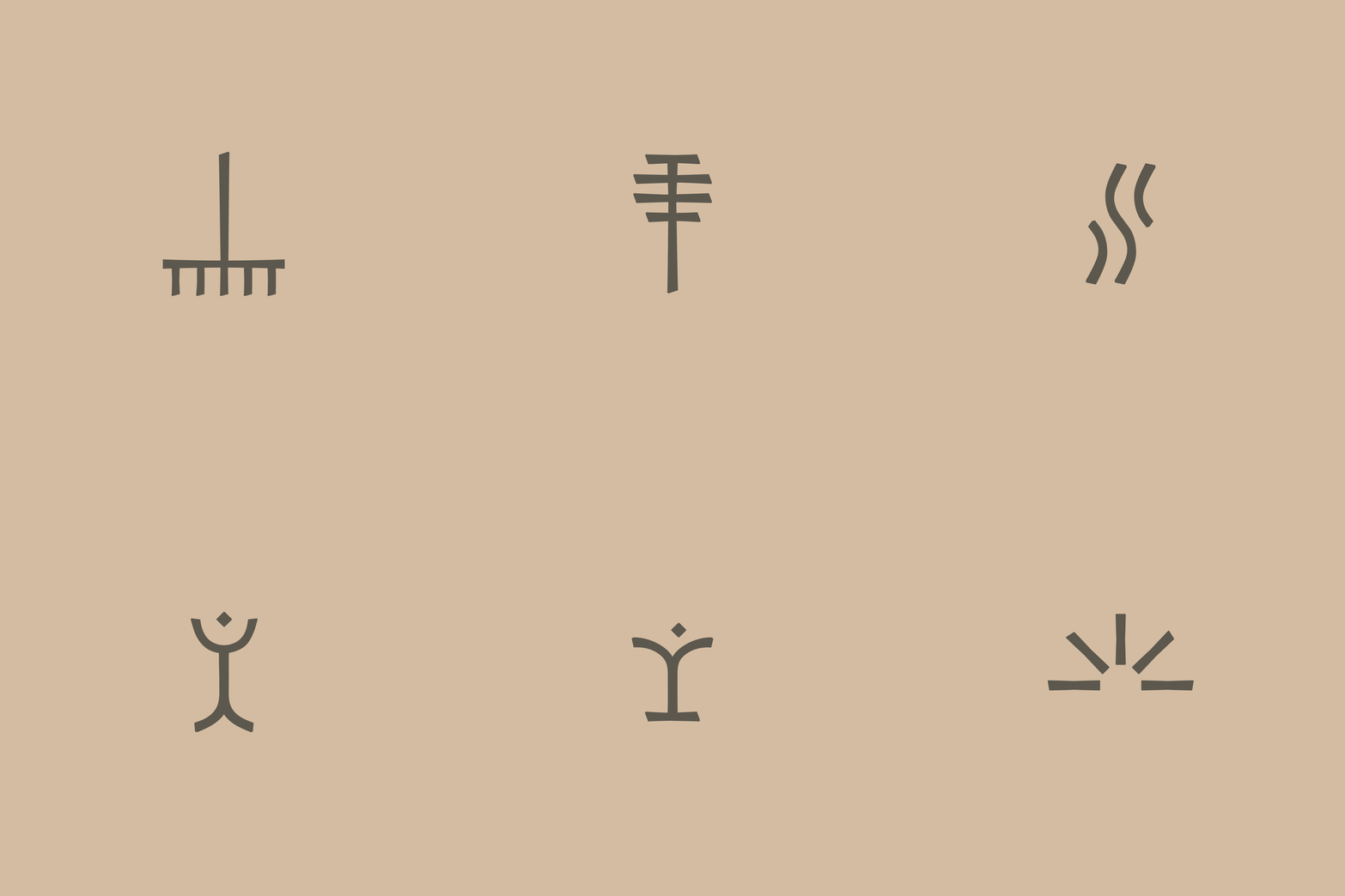
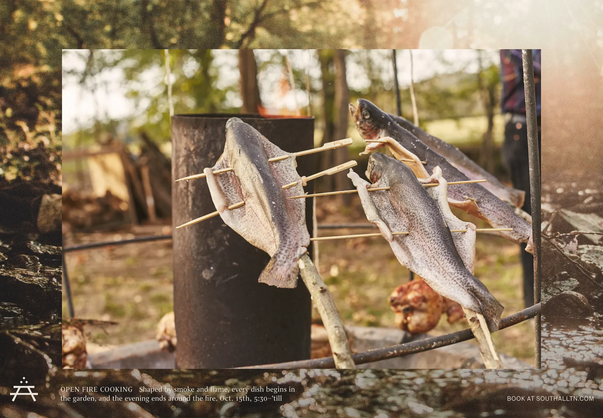
The brand’s iconography creates a simple visual shorthand for Southall’s amenities and property features, helping guests navigate the grounds while extending the character of the identity across the experience.

Design: Rex Runyeon, Jeff Perky
Creative Direction: Jeff Perky
Project Management: Alden Dienethal
Brand Photography: Brett Warren, Heather Durham, Victoria Quirk
Case Study Photography: Ambrose Vargason
Web Development: Wallop