Brand Identity, Packaging, Illustration, Web Design
Lillian St. Bread is a community bakery made to warm the tables of their neighbors. Their goal is simple—to connect to their ever-growing East Nashville community through food.
Lillian St. Bread is a bakery born from the heart and hard work of Tara Tidwell. When she approached us, she expressed her ambitious yet perfectly simple desire to bake bread for her neighborhood, East Nashville.
The practice of baking, much like a community, is unique—each bread is different, full of surprises, and can even be dependent on the weather. The “S” and “B” in the logo have been vertically flipped in the otherwise modest typesetting to reflect this unique quality. The primary typeface, Brunswick Grotesque, is utilitarian, yet idiosyncratic, and features five distinct widths combined randomly to mimic old hand-painted signage. The warm creams, yellows and blues of the palette keep the overall look and feel familiar, informal and approachable.
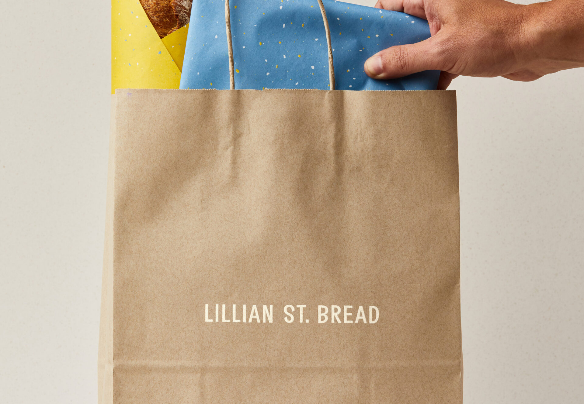
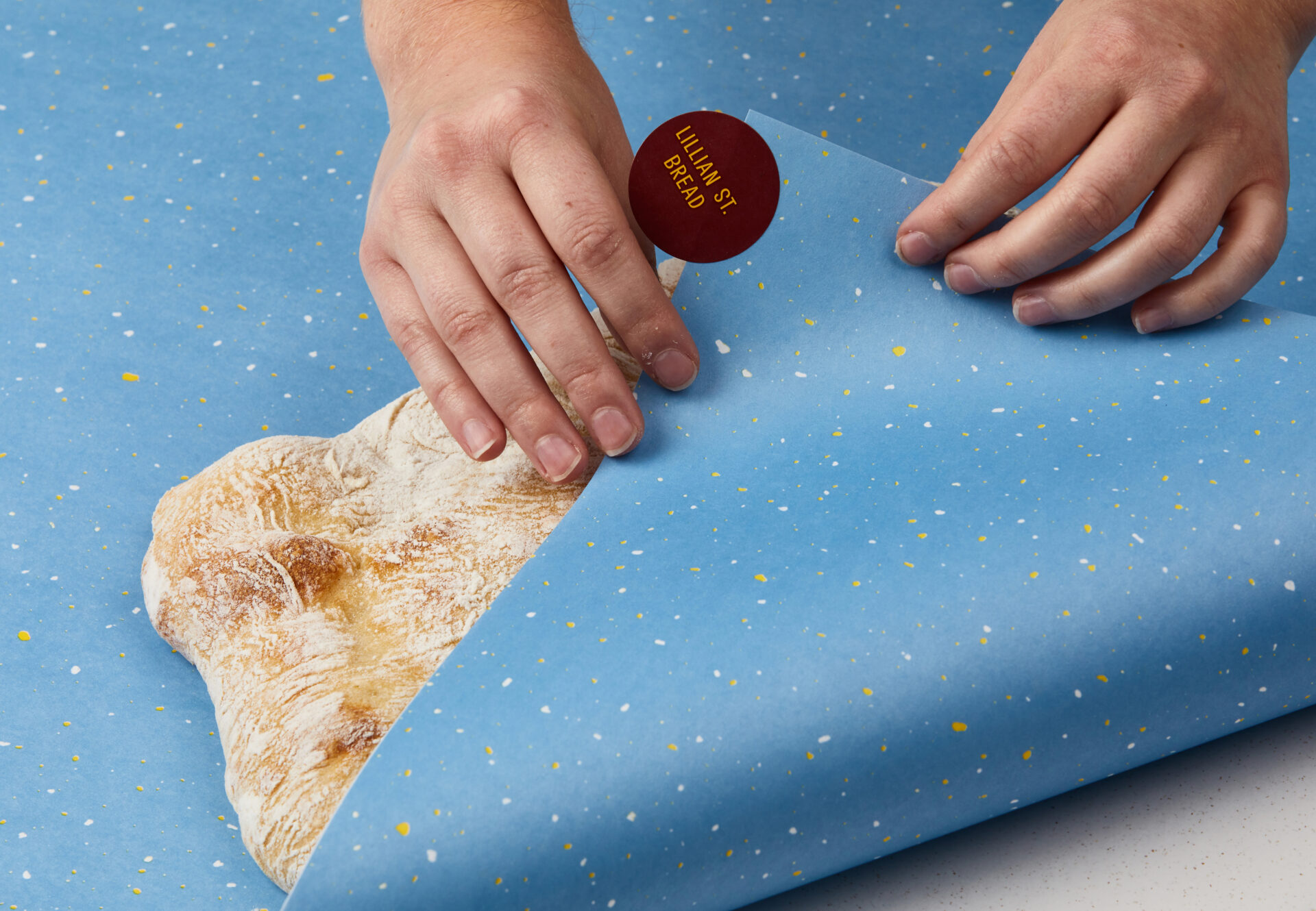
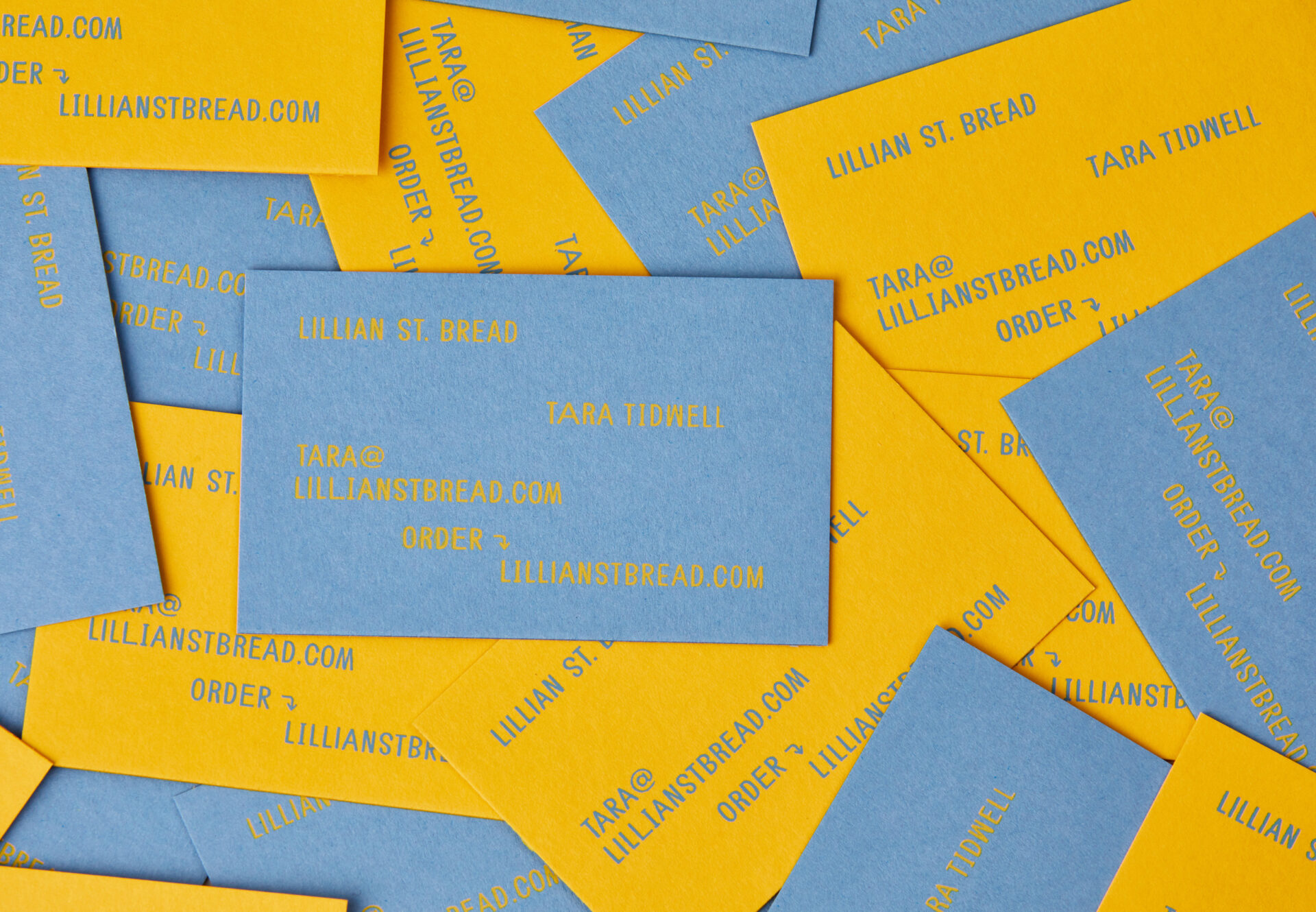

One of the main considerations with the packaging was to create a system that was easily recognizable from a distance—whether seen in someone’s hands at the farmers market or spotted on someone’s doorstop from across the street.
Bright pops of speckled yellow and blue paper mimic the feel of scattered crumbs from fresh bread and are a happy, confetti-like reminder that the simplest things in life can bring you the most joy.
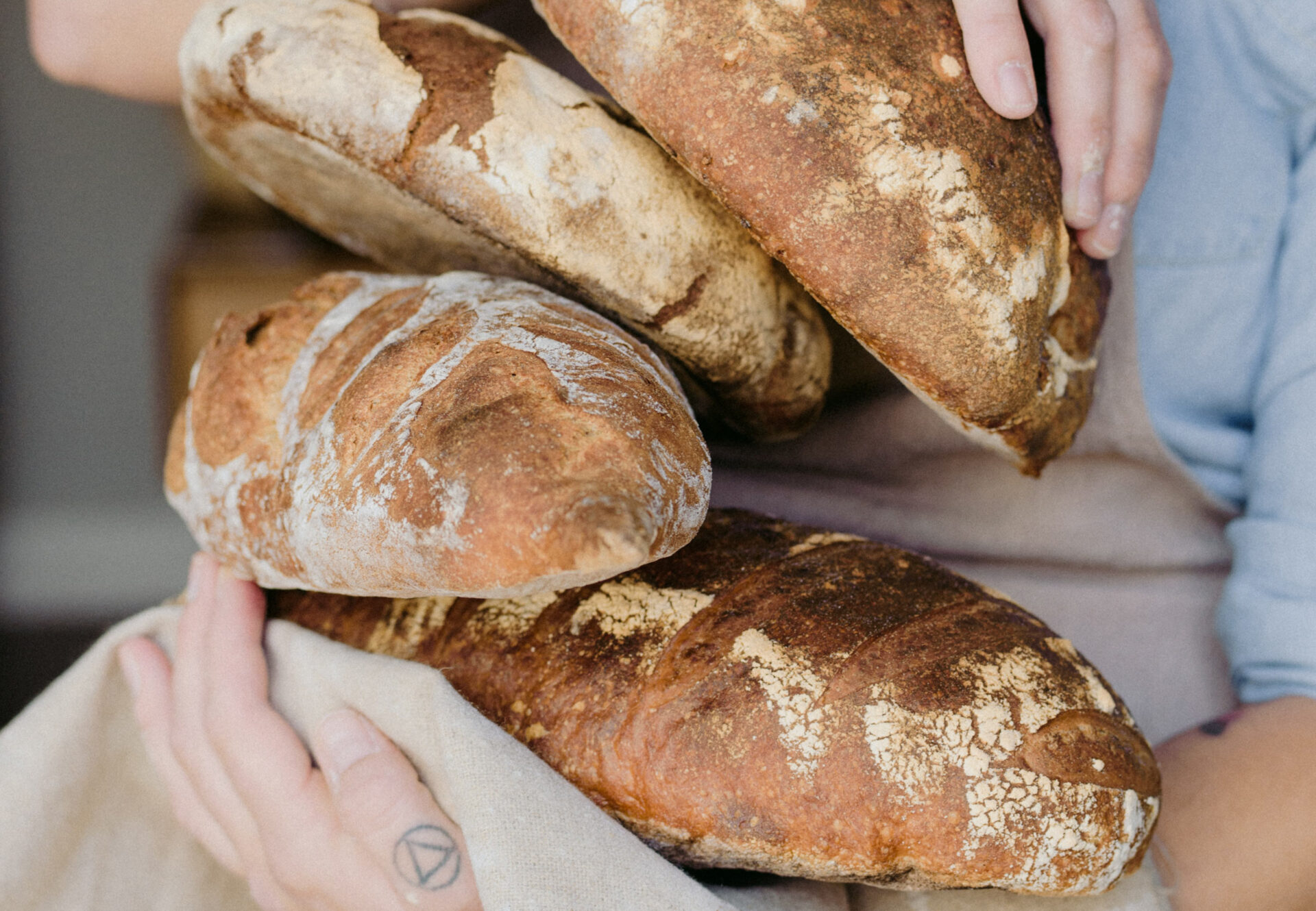

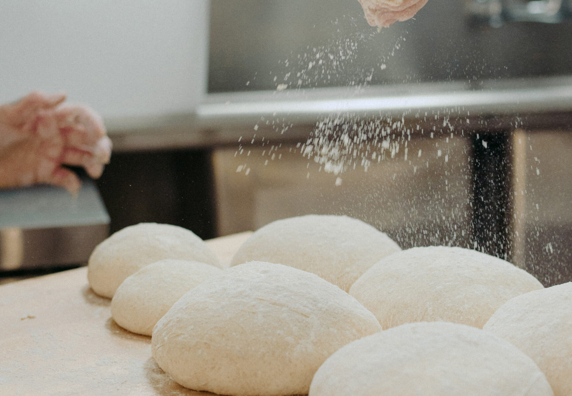
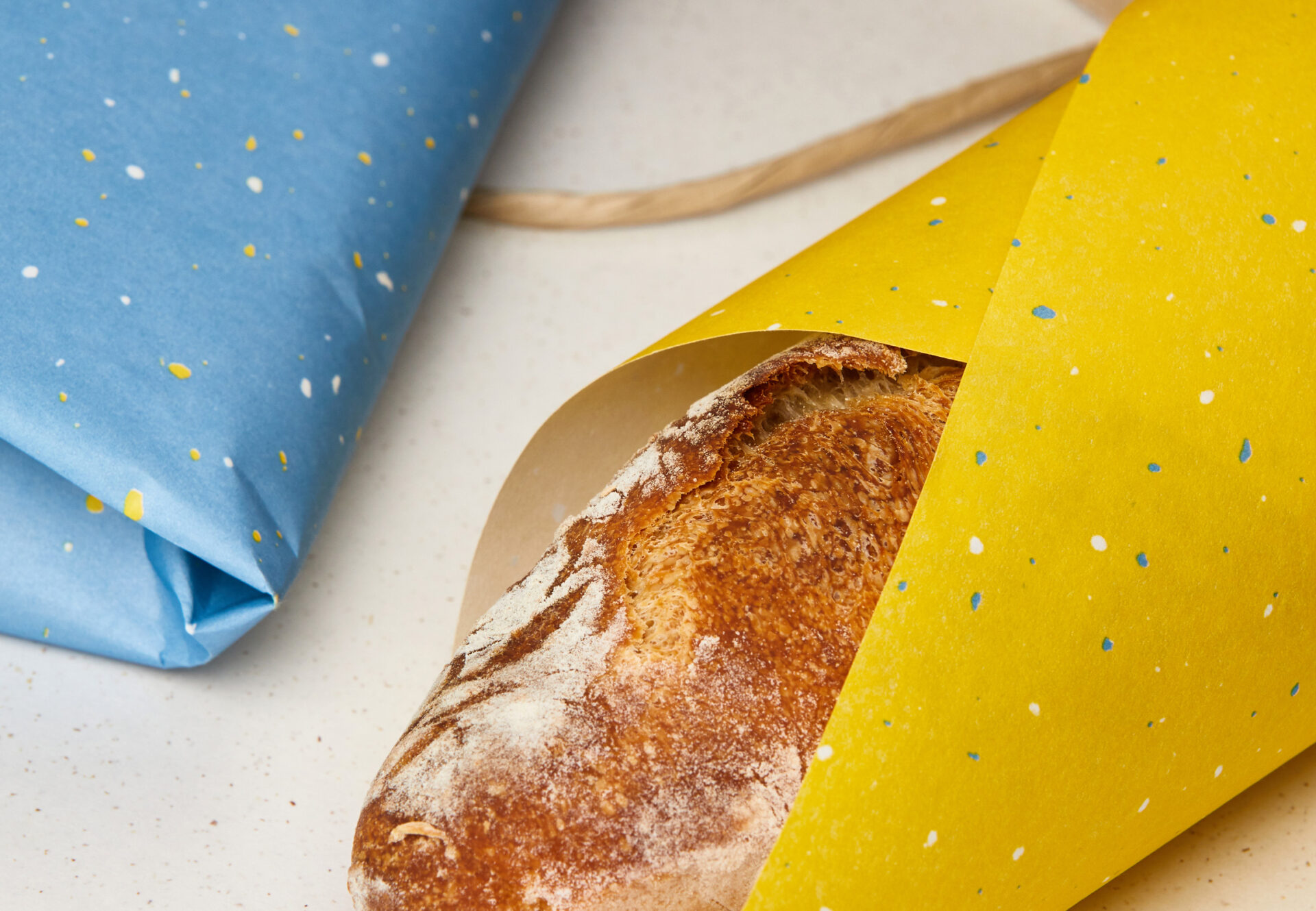


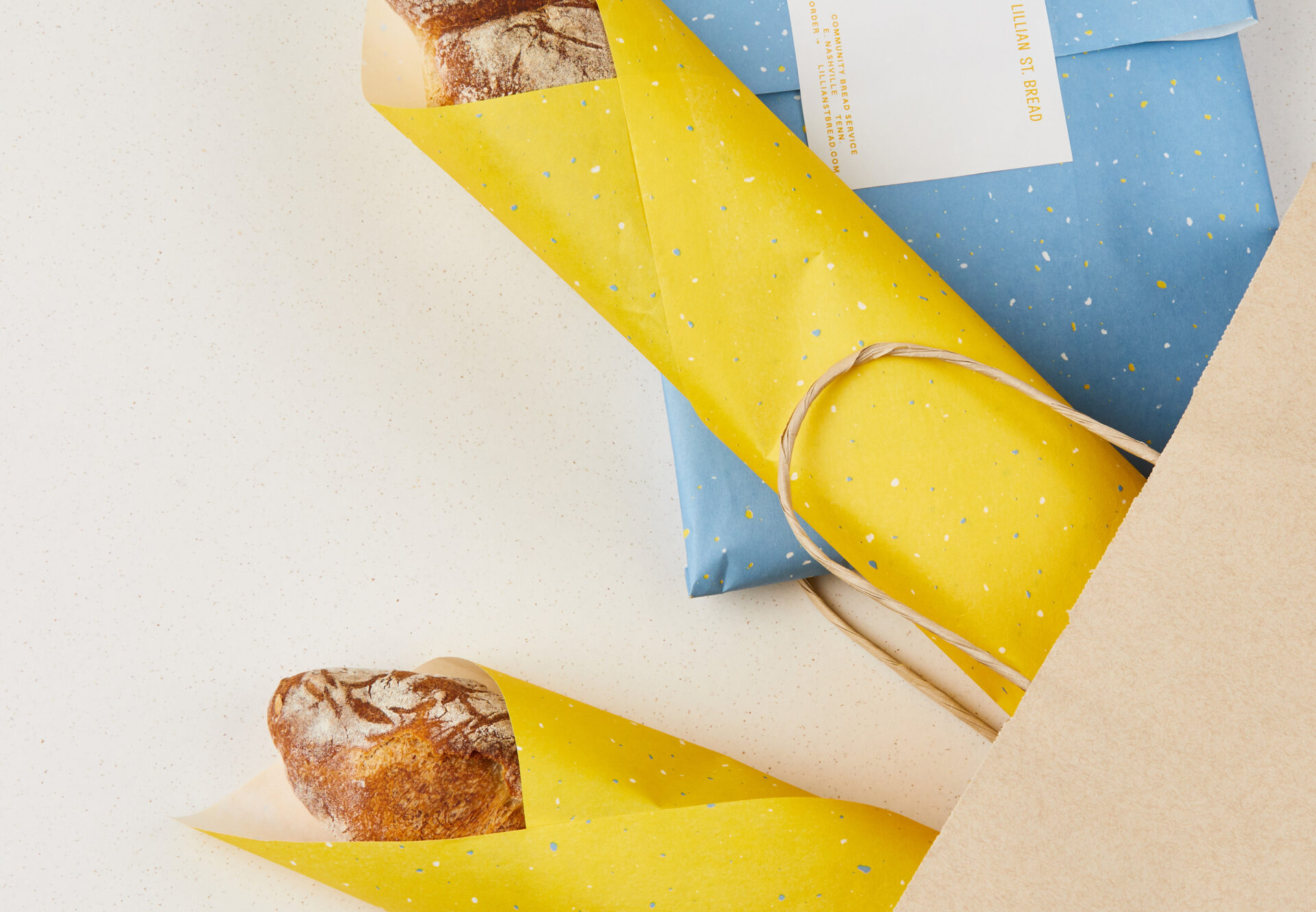


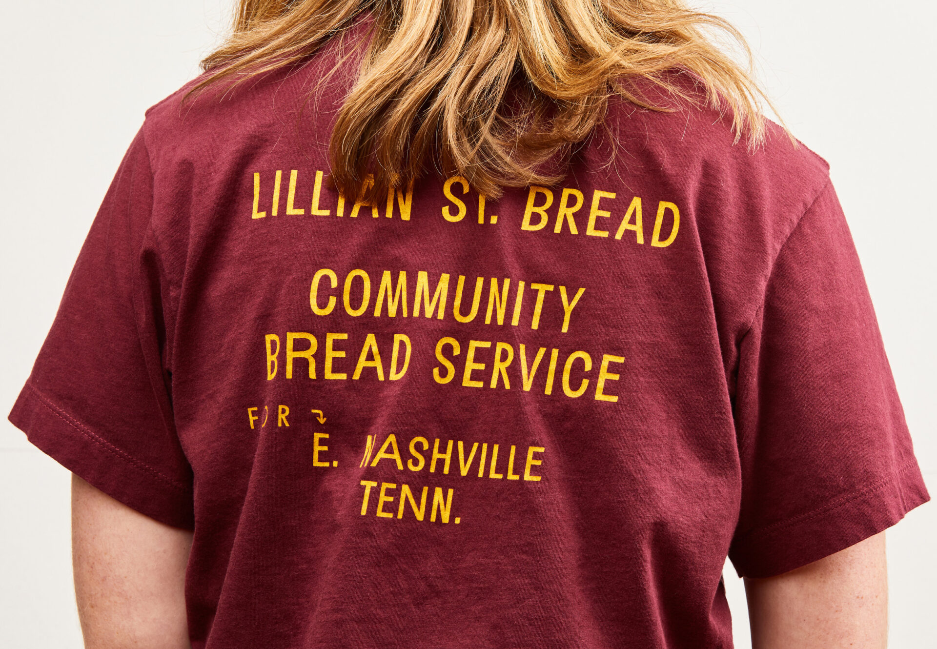
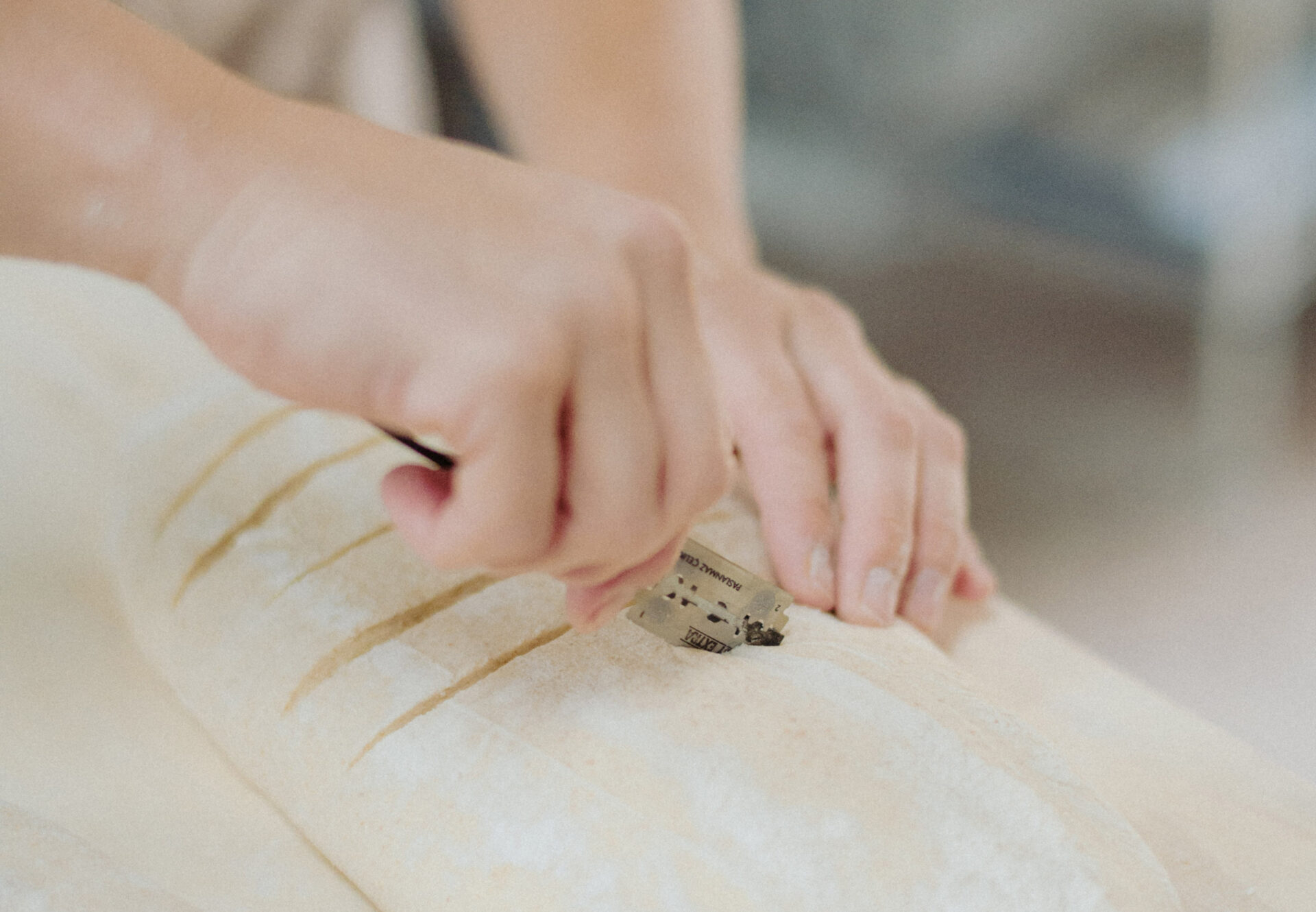
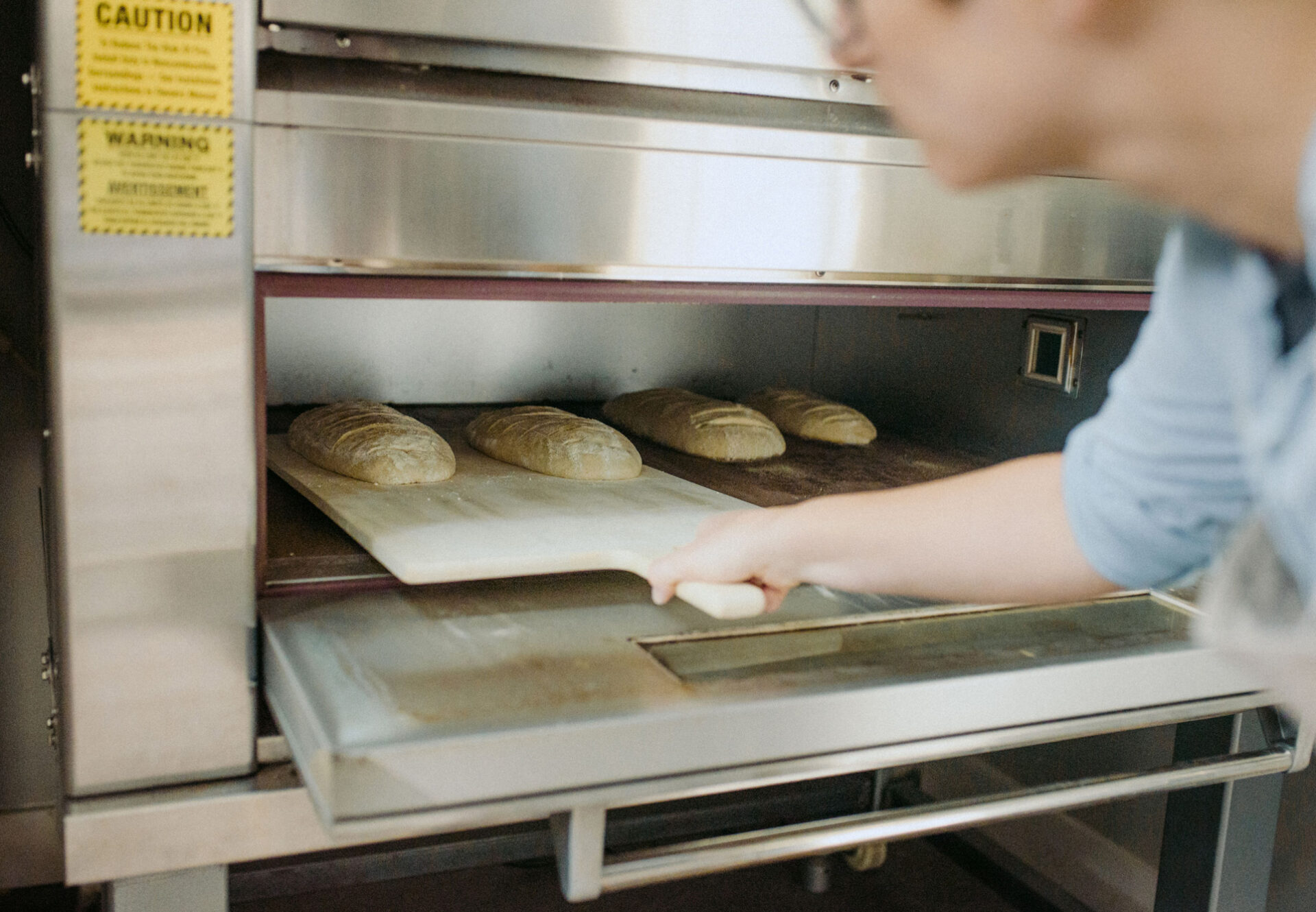
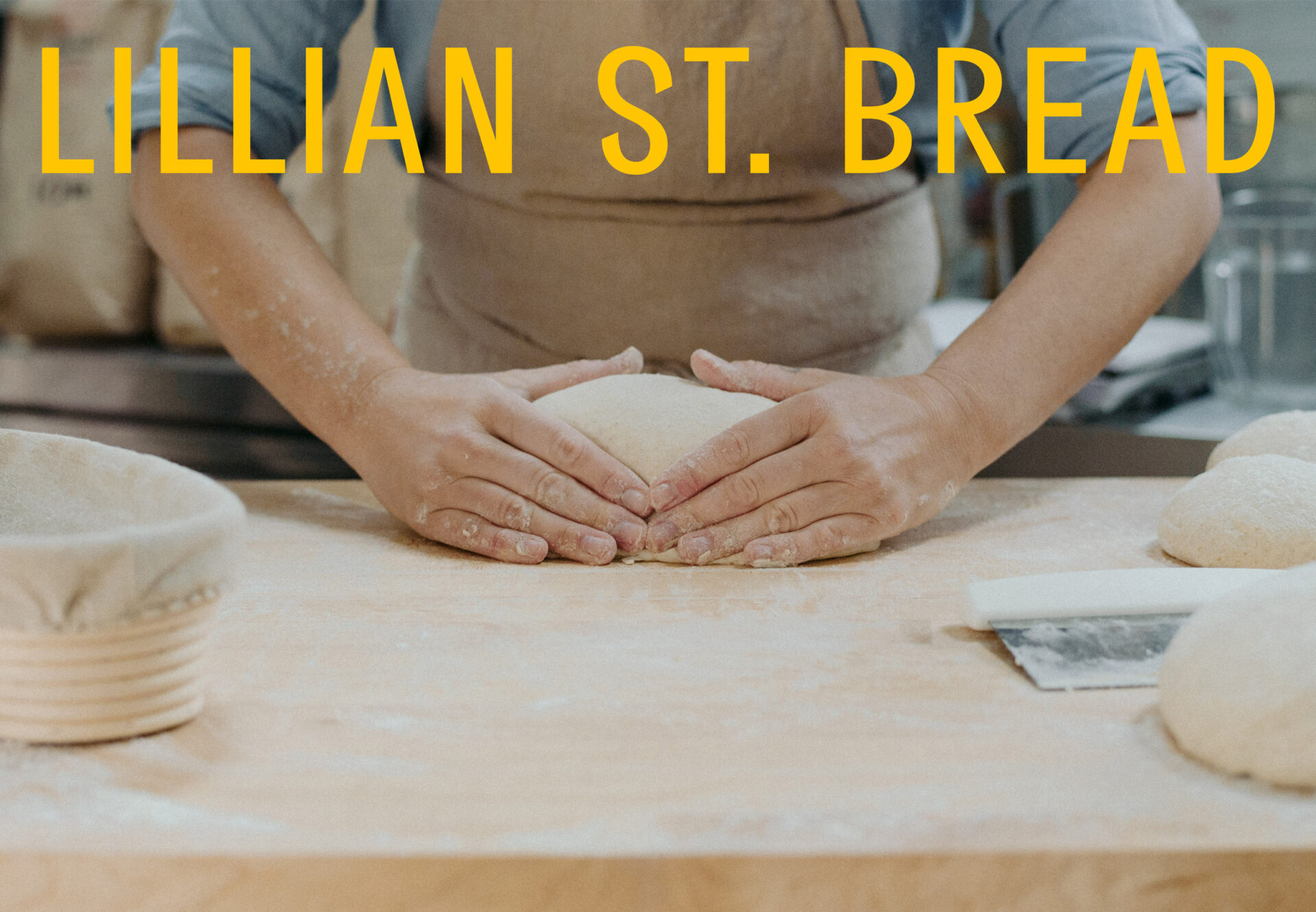
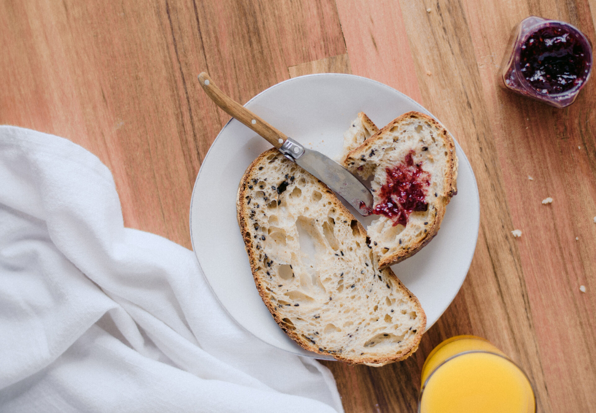
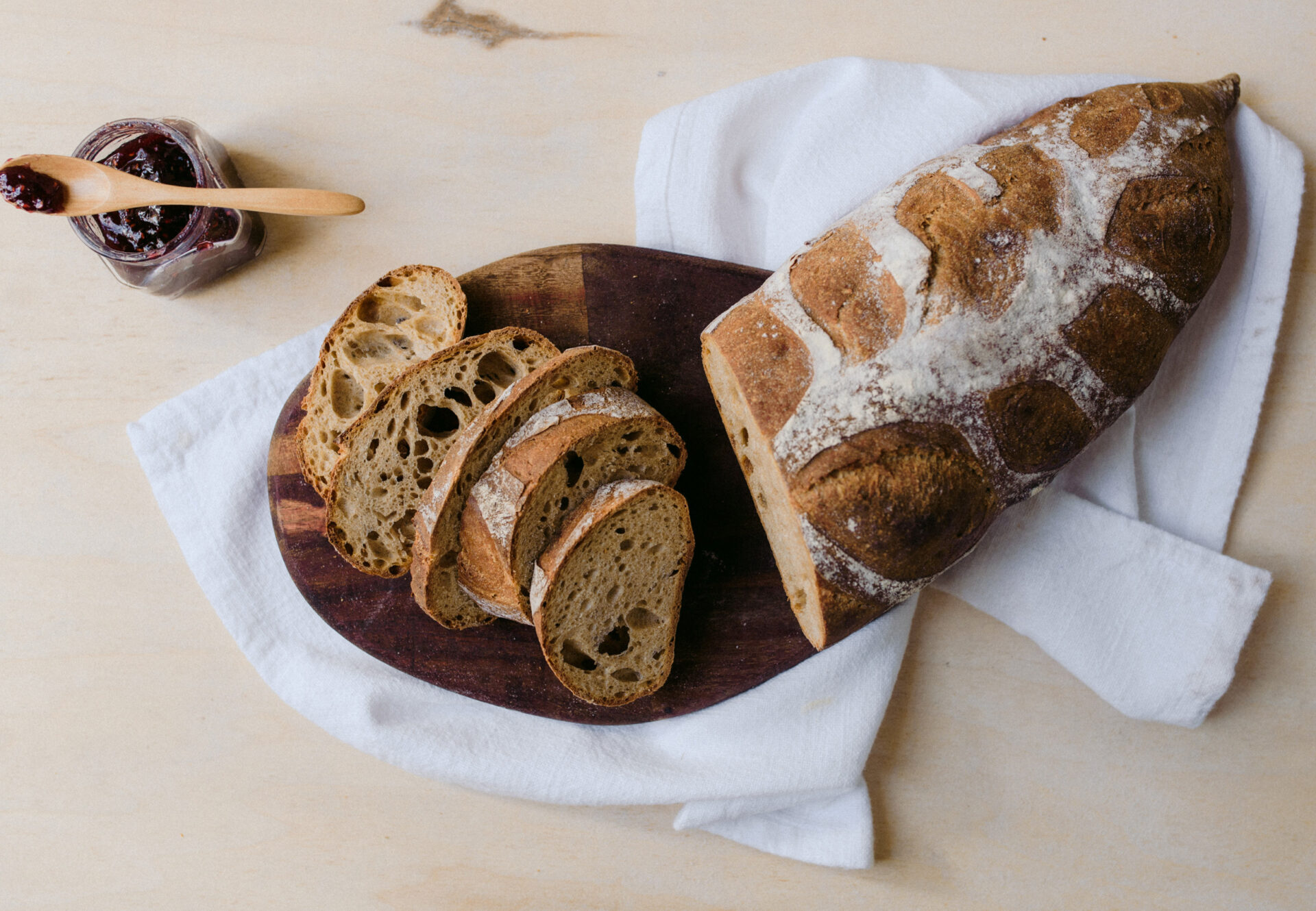
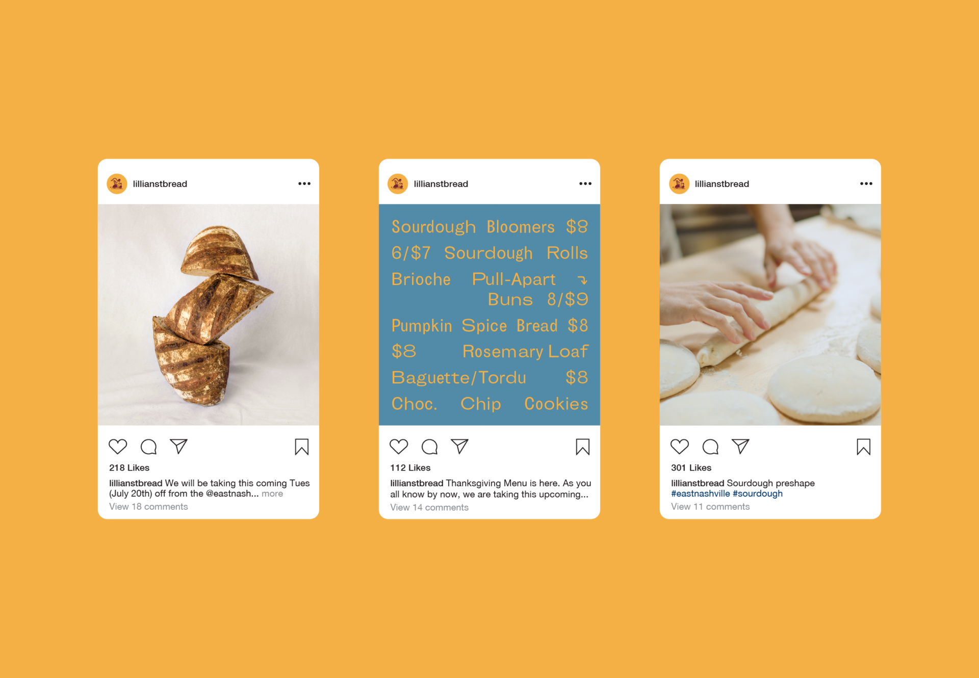
We worked with Nashville photographer Nicola Harger to create a photography style that communicates the feeling of a warm, sleeping morning with Tara in the bakery. Process shots feature a day in motion with hardworking bread peels and flourishes of flour.
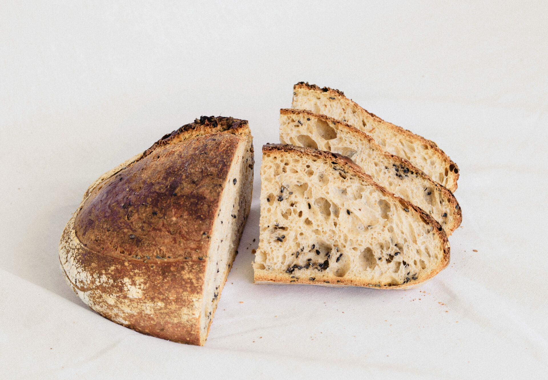
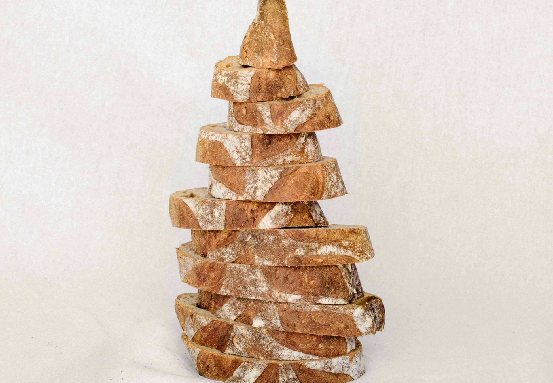
The product photography offers moments of fun and spontaneity. Never dull or flat, the stacks of bread feel creative and in motion, just like Tara and her bakery.

Design: Jeff Perky, Dana Kingery
Project Management: Alden Dienethal
Project Photography: Nicola Harger & Brett Warren
Website Development: Brad Good


