Brand Identity, Packaging, Print, Web Design
Public Pool adds style and joy to adult swim with thoughtfully designed, responsibly made pool leisure goods. Inspired by the nostalgic charm of hot summer days at the community pool, Public Pool speaks to the fine folks in the middle, not just the beach crowd.
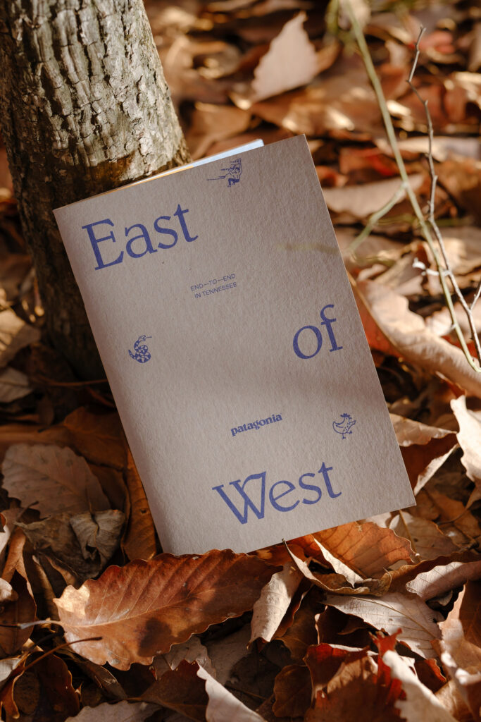
When Cole Brown approached us to create the brand identity, packaging, and e-commerce experience for the new company, we were happy to dive in. The design blends the approachable attitude of the 1980s with the elevated tone of a premium product for today’s discerning lounger.

In a market saturated with coastal aesthetics, we sought out to create a distinctive identity that speaks directly to cities and towns between the coasts, celebrating their unique sense of community and identity.
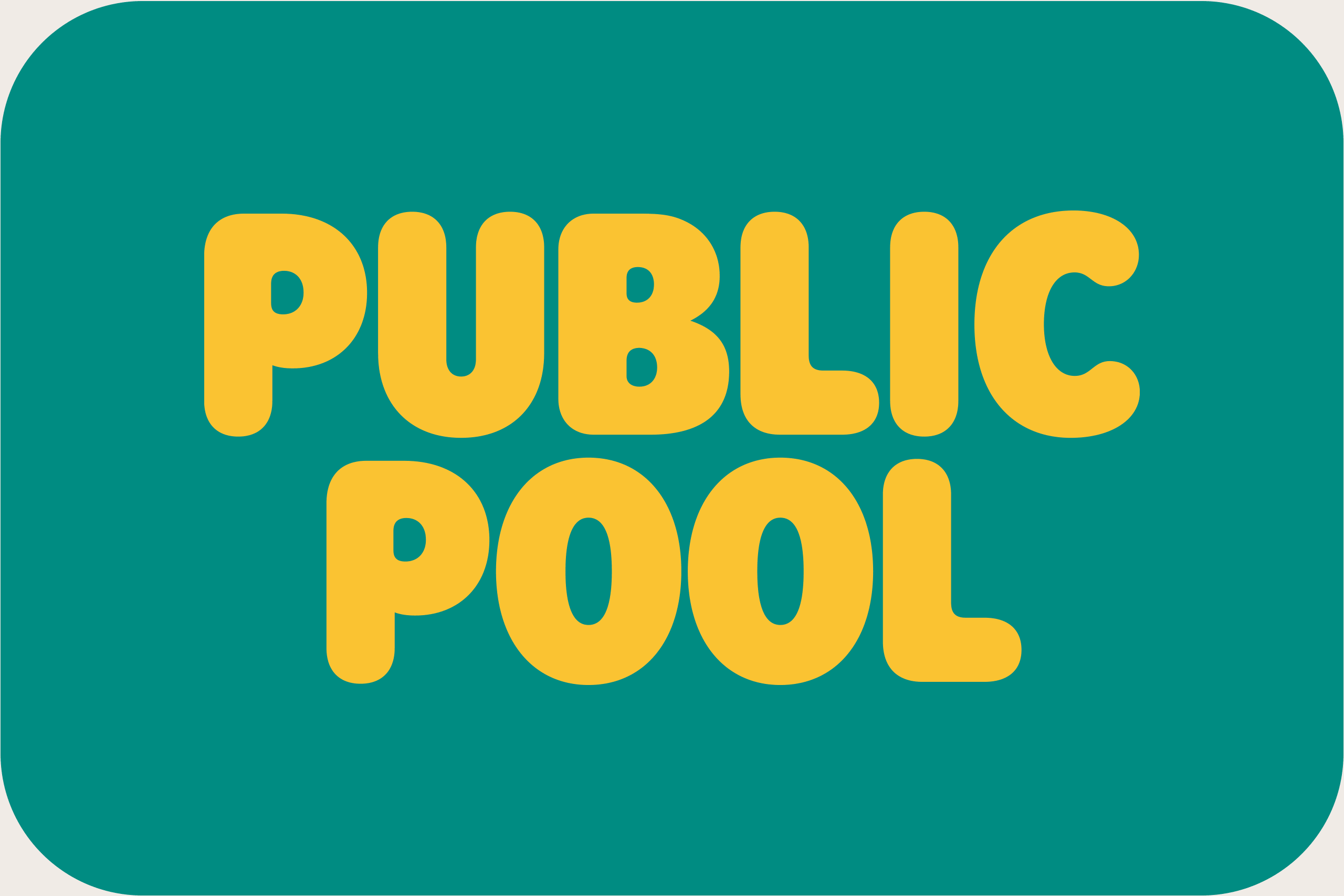
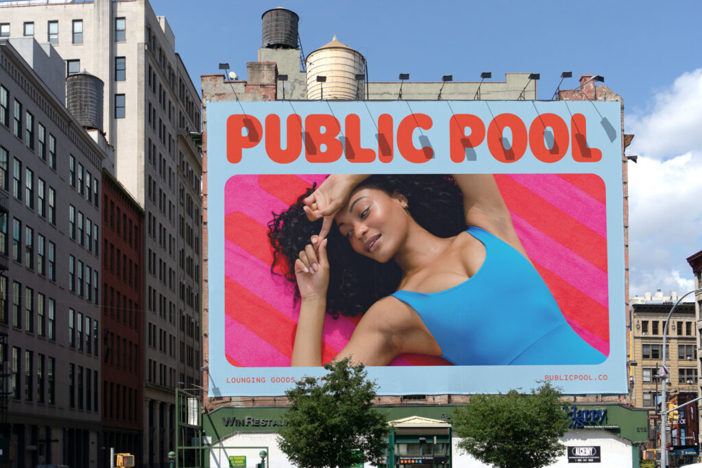
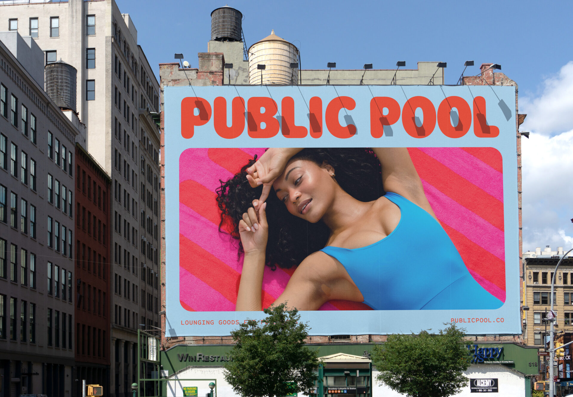
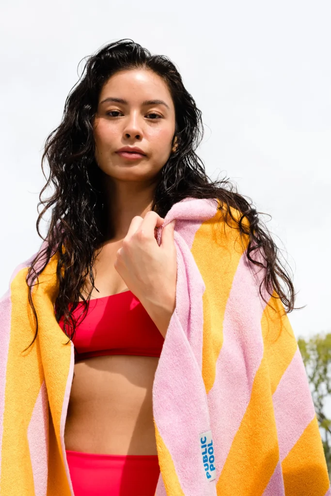
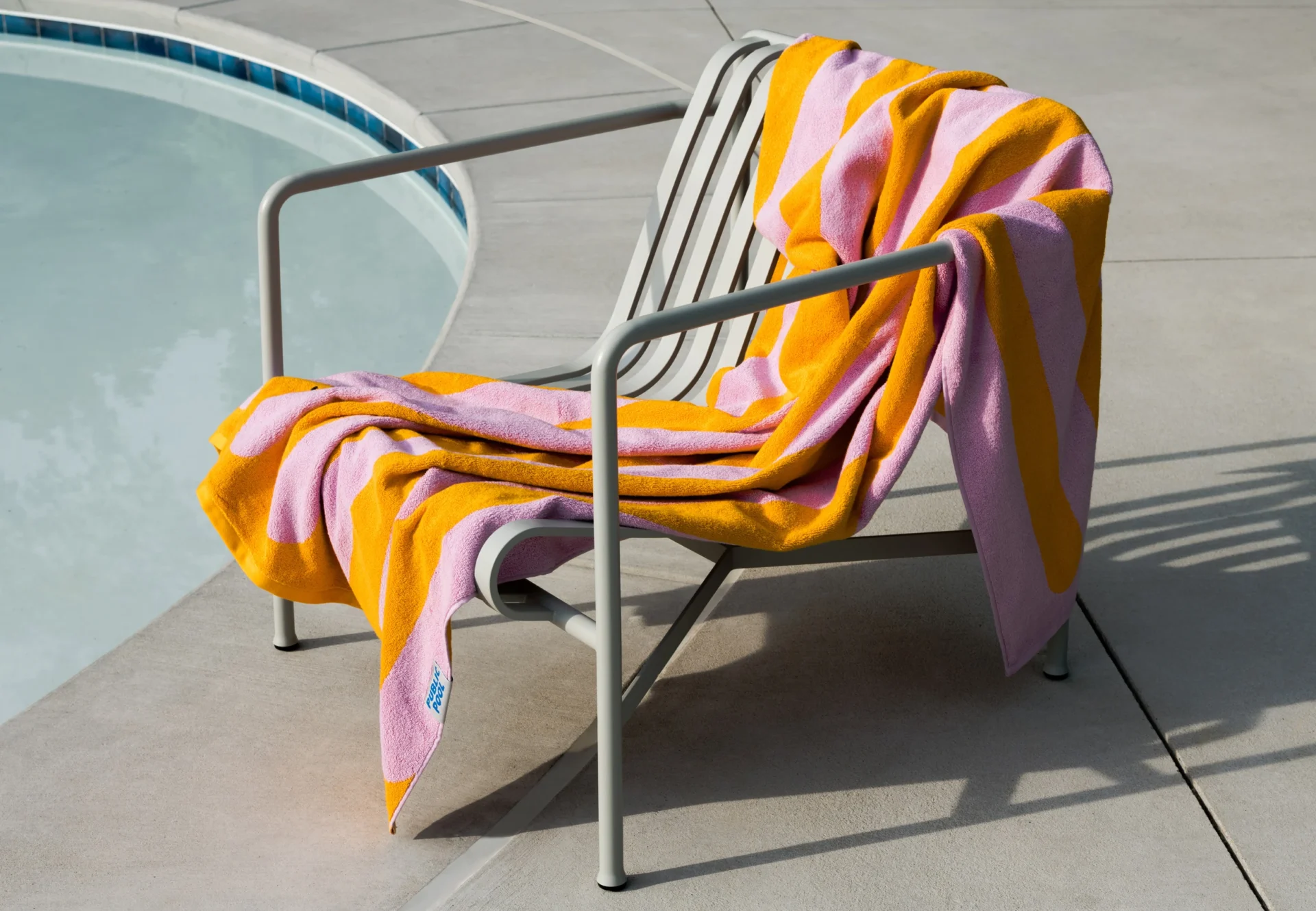
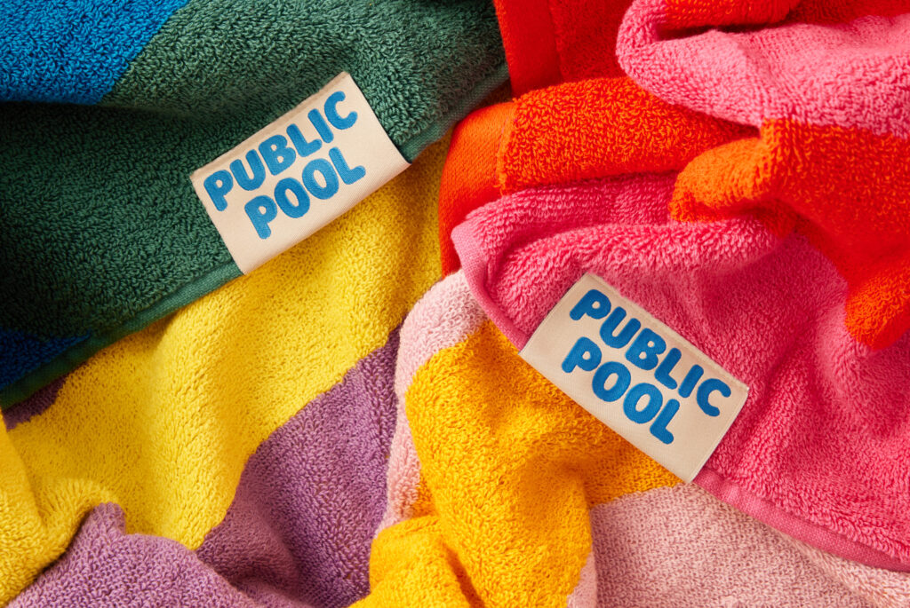
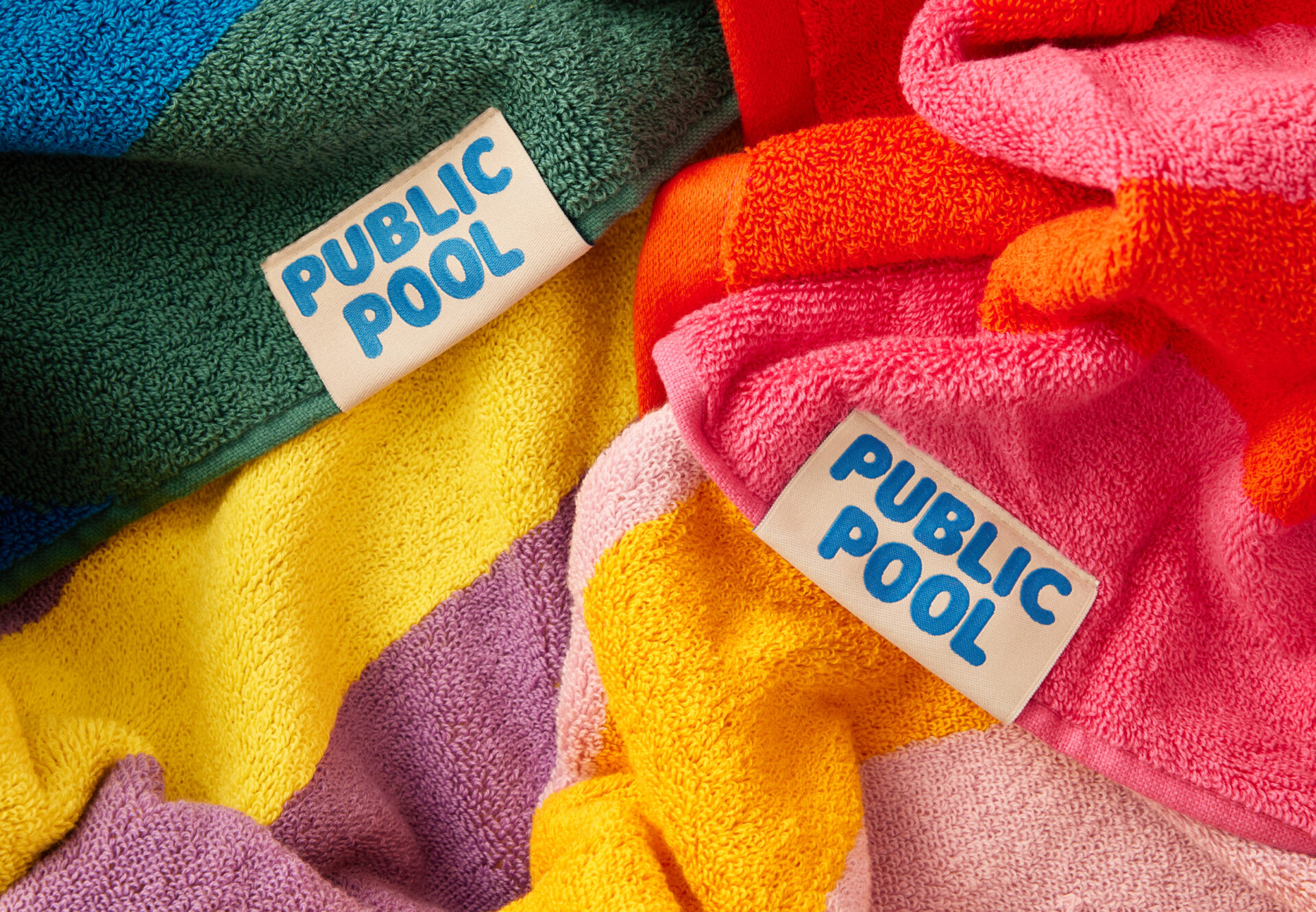
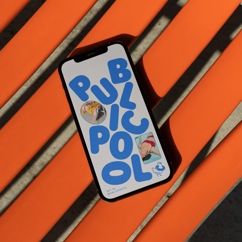
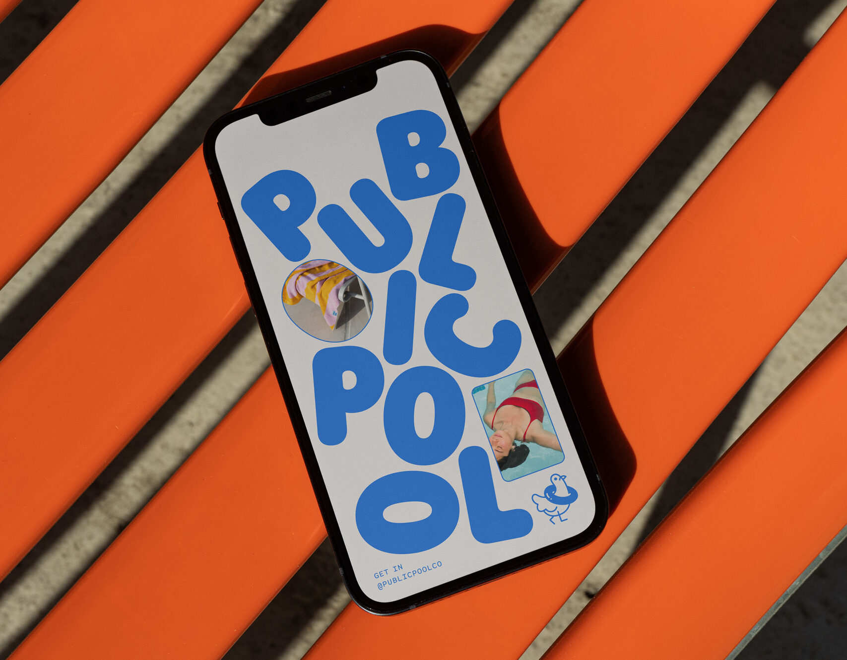
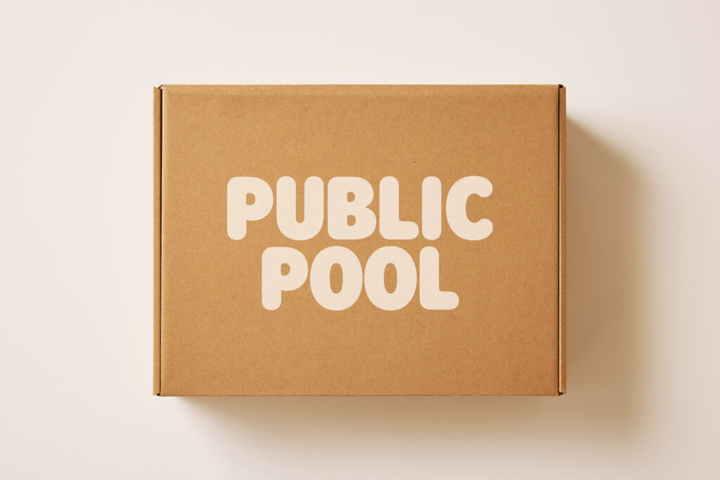
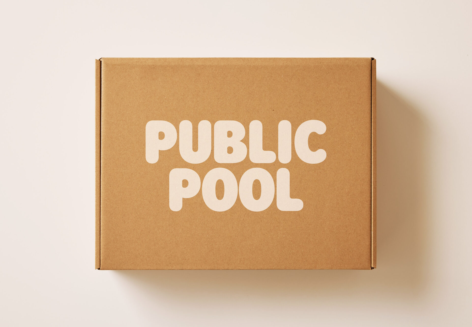
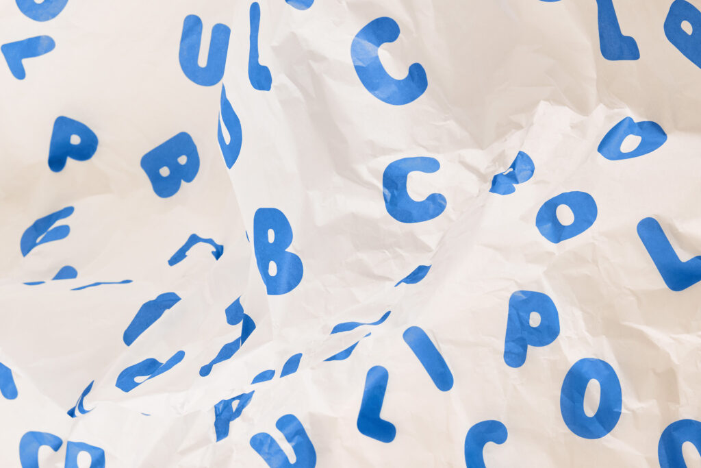
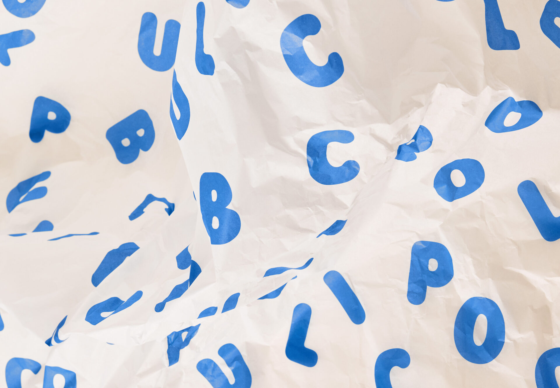
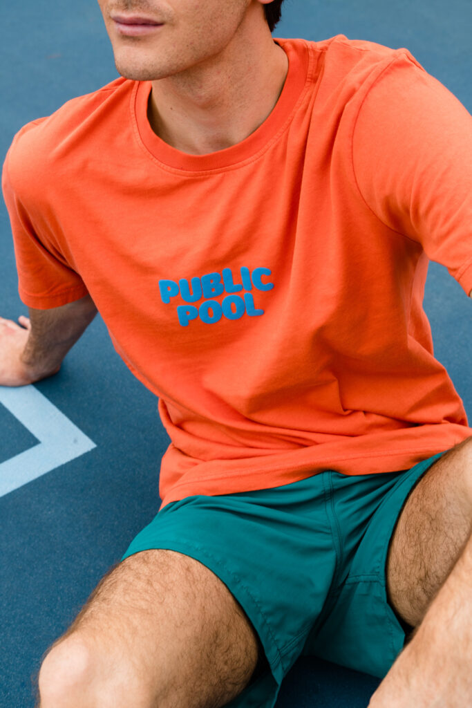
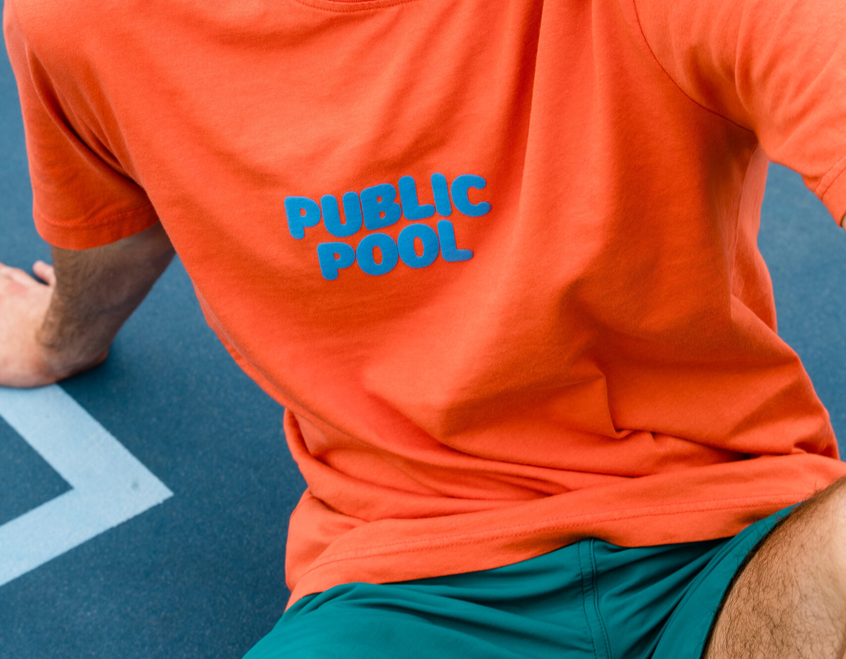
Channeling the sensations of sun-soaked concrete and the scents of sunscreen and chlorine, Public Pool’s brand identity blends the casual elegance of lounging poolside with the playful spontaneity of a belly flop. Our design system incorporates a bold, playful language, featuring a wordmark and a typography system inspired by pool floats, alongside a vibrant, off-center color palette.
In a market saturated with coastal aesthetics, we sought out to create a distinctive identity that speaks directly to cities and towns between the coasts, celebrating their unique sense of community and identity.
Channeling the sensations of sun-soaked concrete and the scents of sunscreen and chlorine, Public Pool’s brand identity blends the casual elegance of lounging poolside with the playful spontaneity of a belly flop. Our design system incorporates a bold, playful language, featuring a wordmark and a typography system inspired by pool floats, alongside a vibrant, off-center color palette.

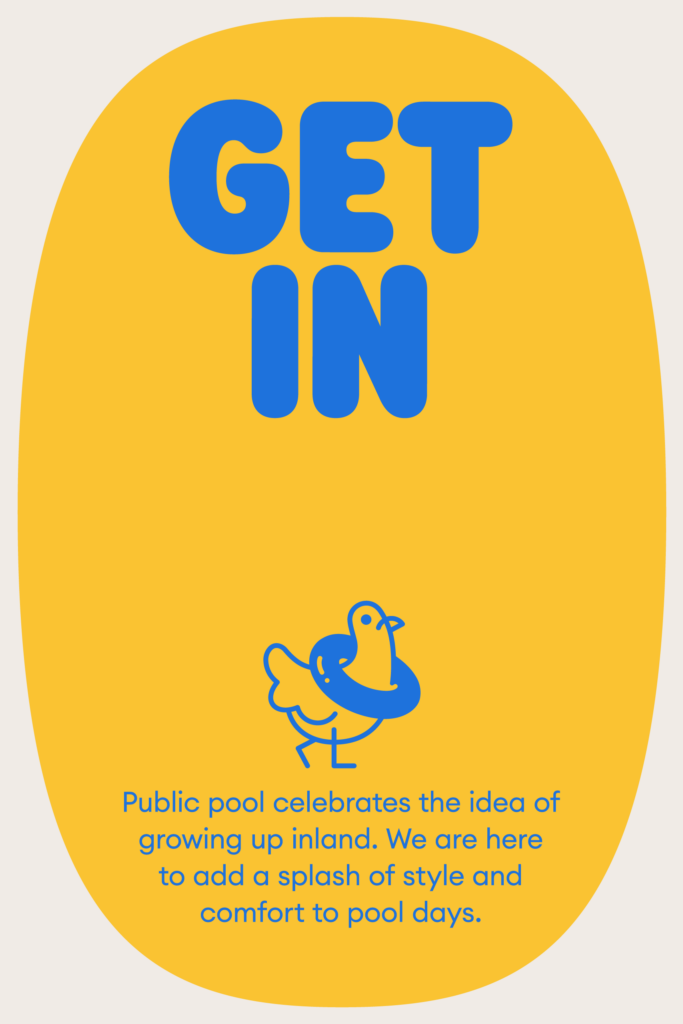

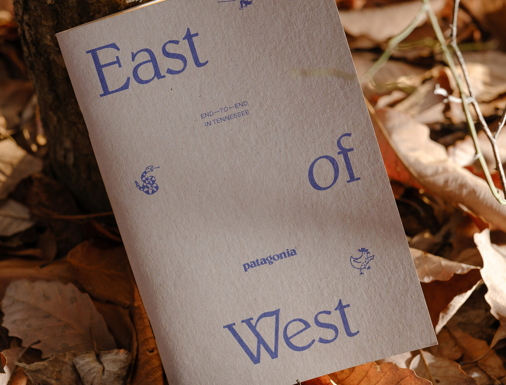
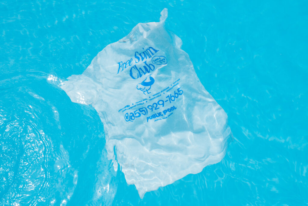
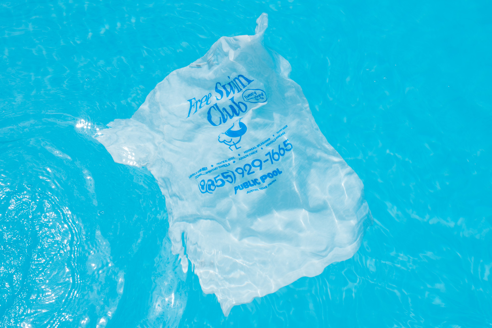
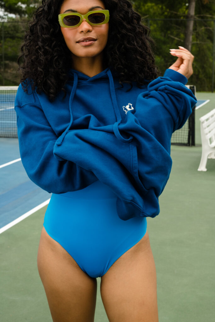
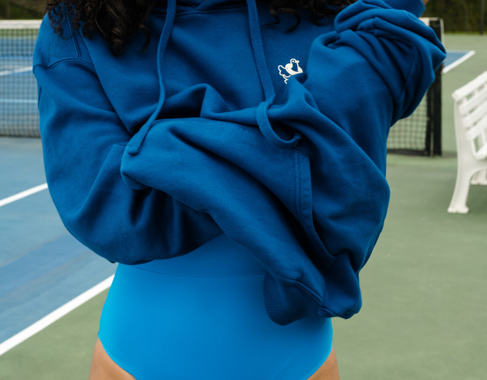
Public Pool’s pigeon symbol is a playful nod to growing up inland. Illustrated with a simple, mono-weight stroke, the pigeon embodies the brand’s connection to city life and public spaces, symbolizing accessibility and inclusivity.
Public Pool’s pigeon symbol is a playful nod to growing up inland. Illustrated with a simple, mono-weight stroke, the pigeon embodies the brand’s connection to city life and public spaces, symbolizing accessibility and inclusivity.
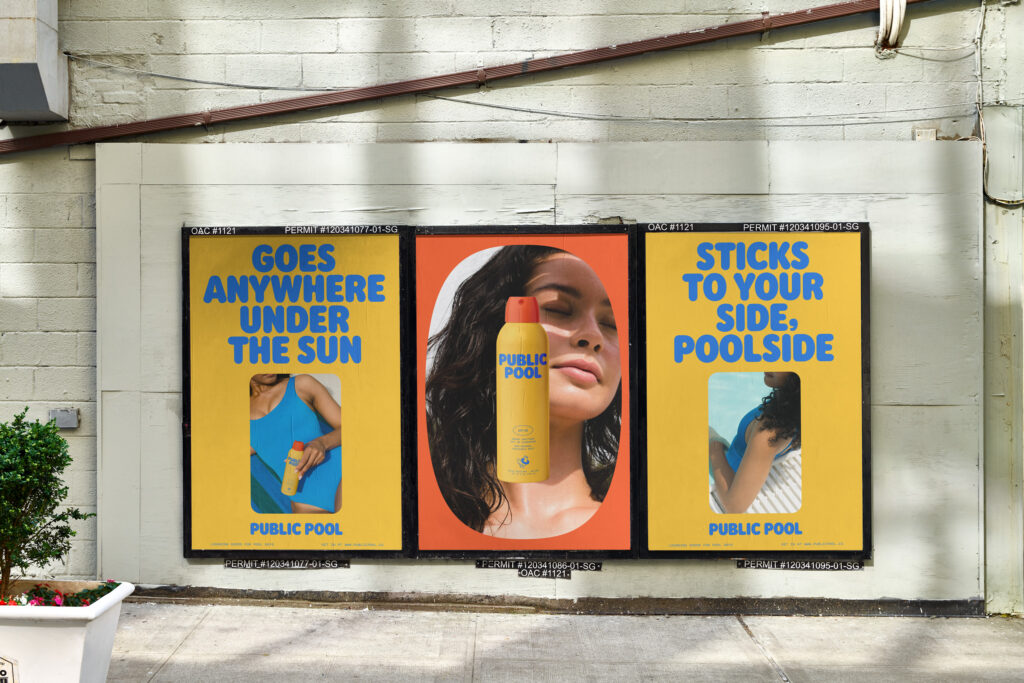
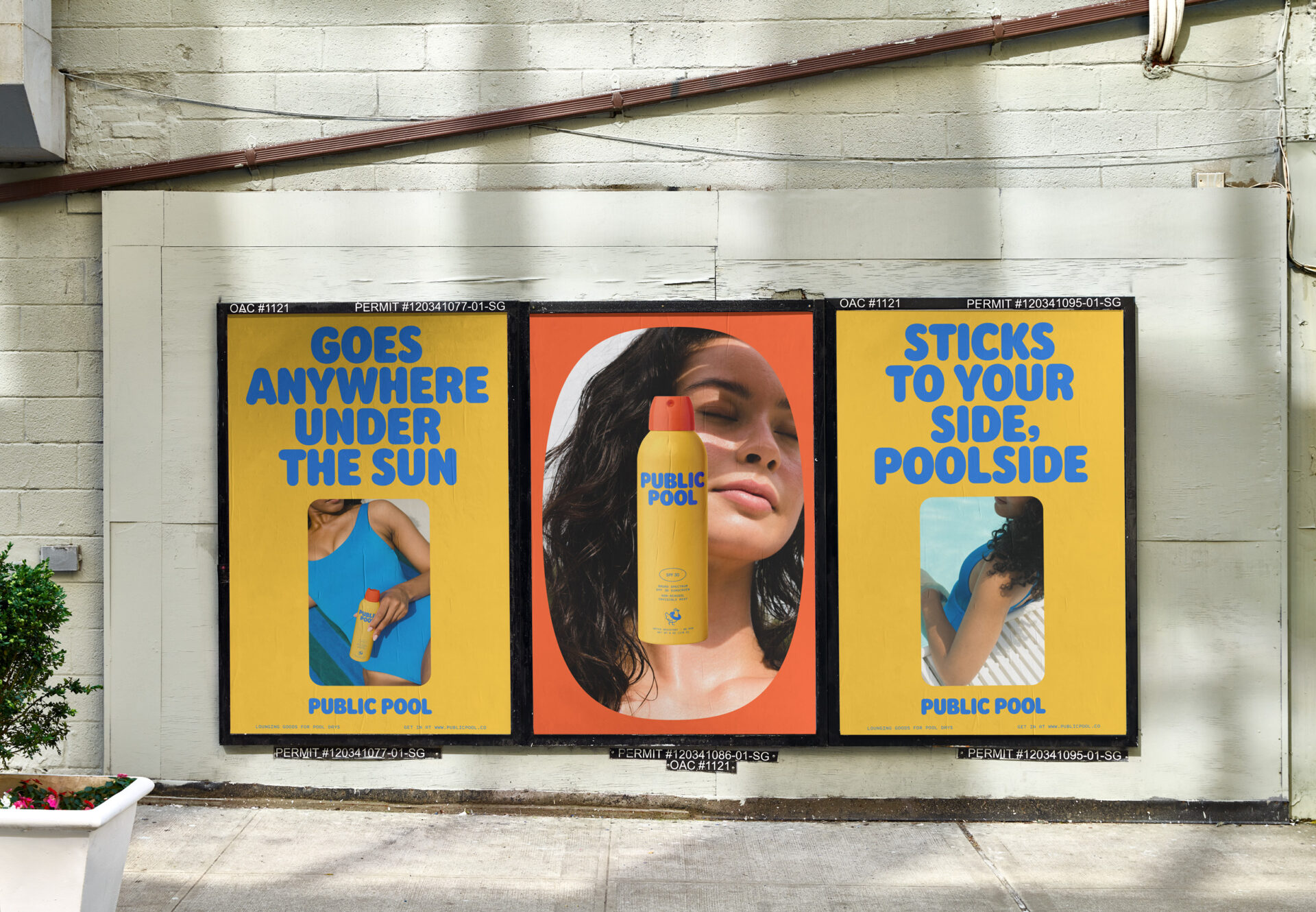
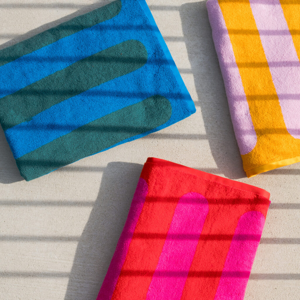
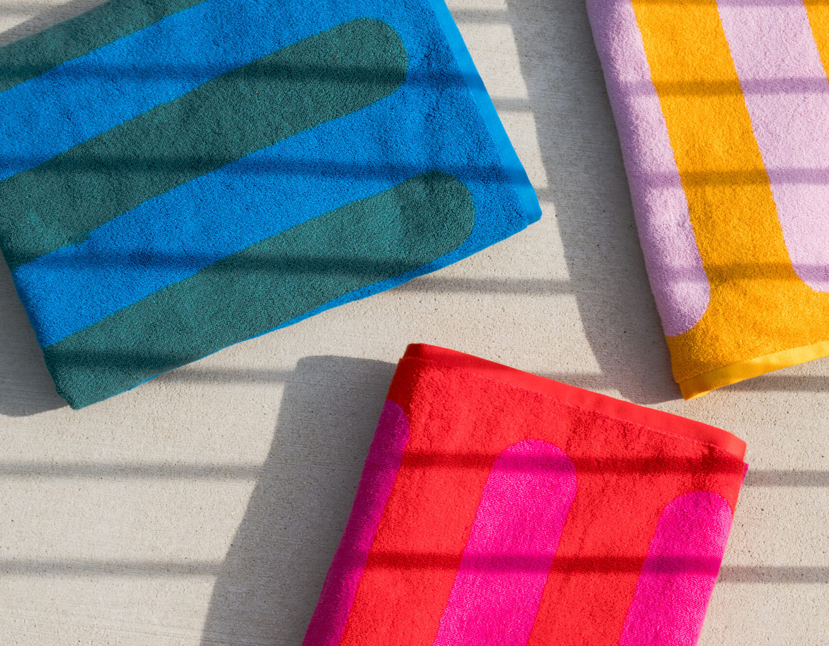
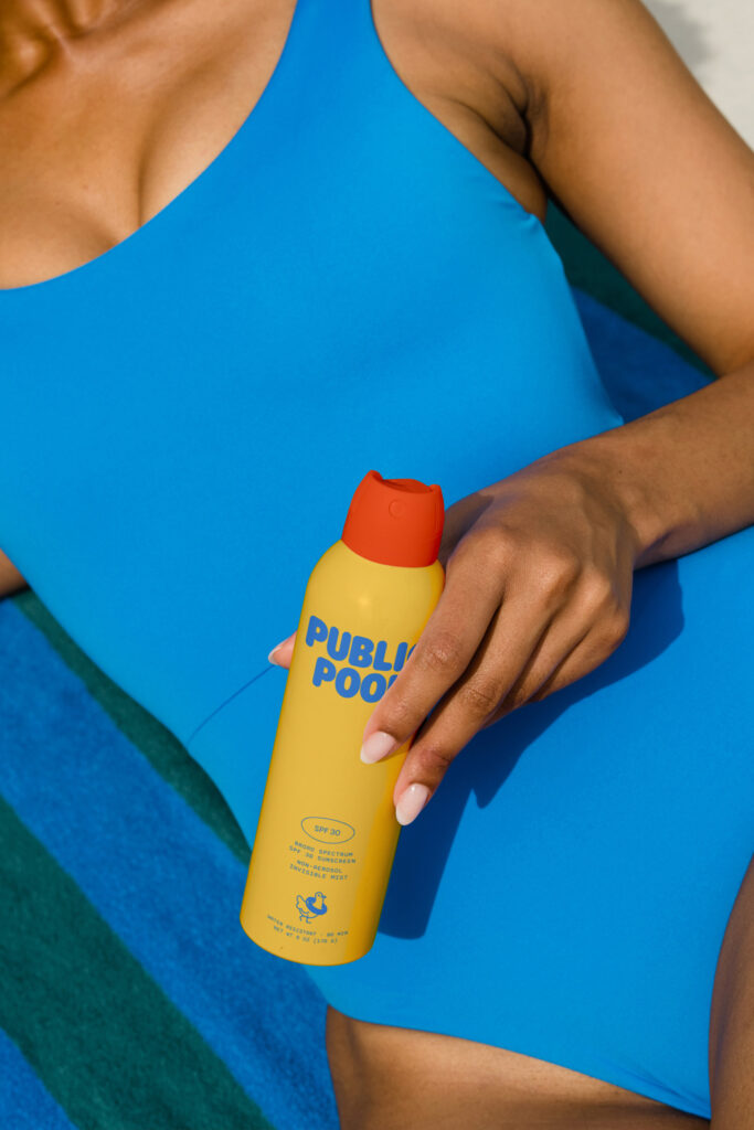
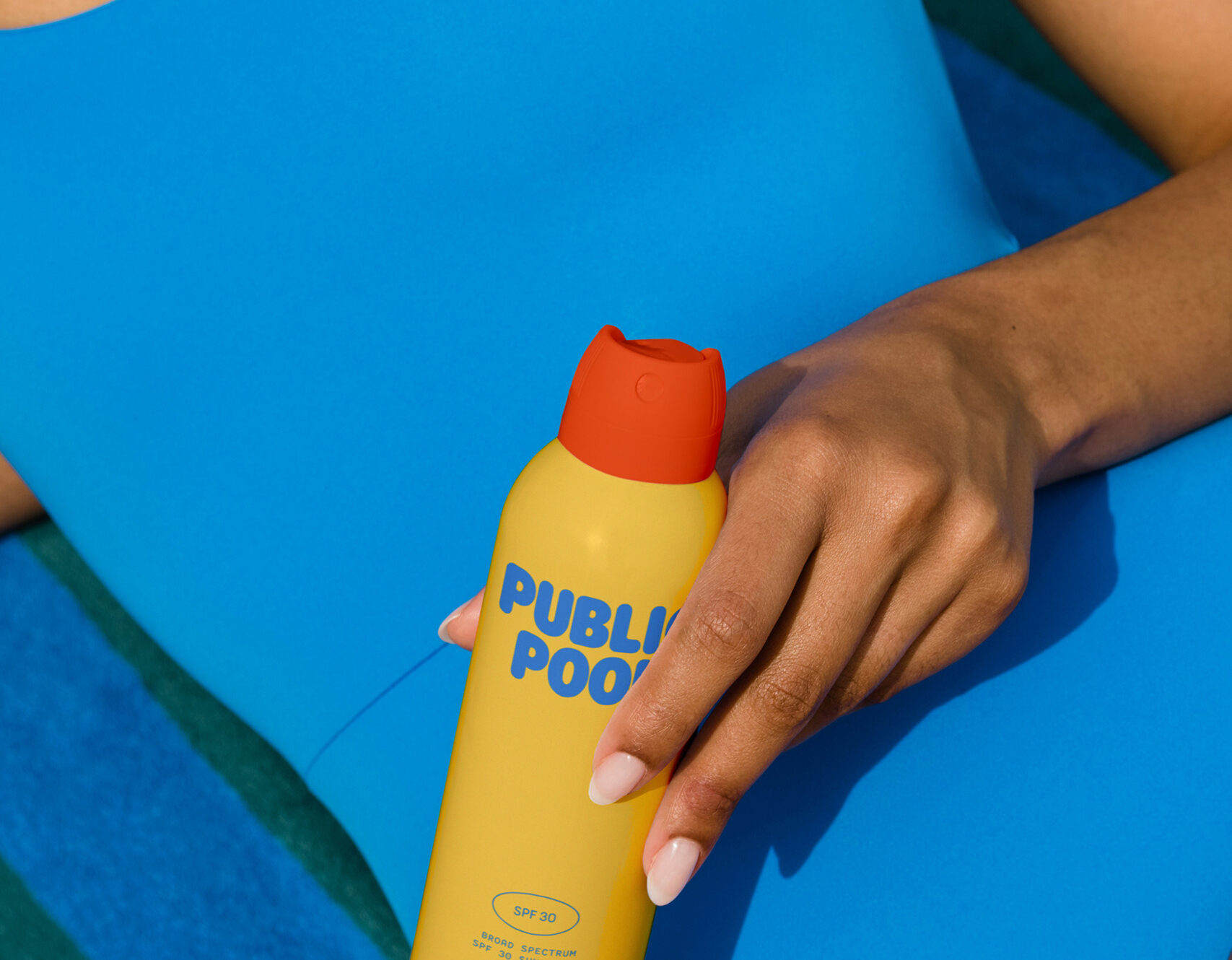
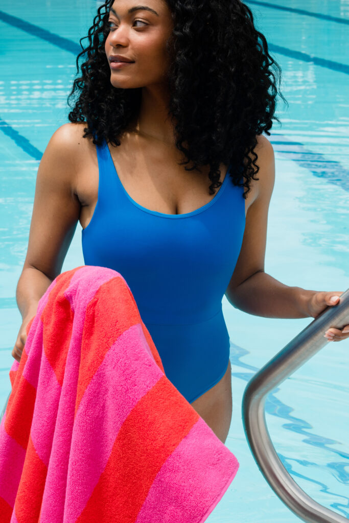

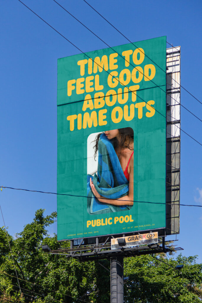
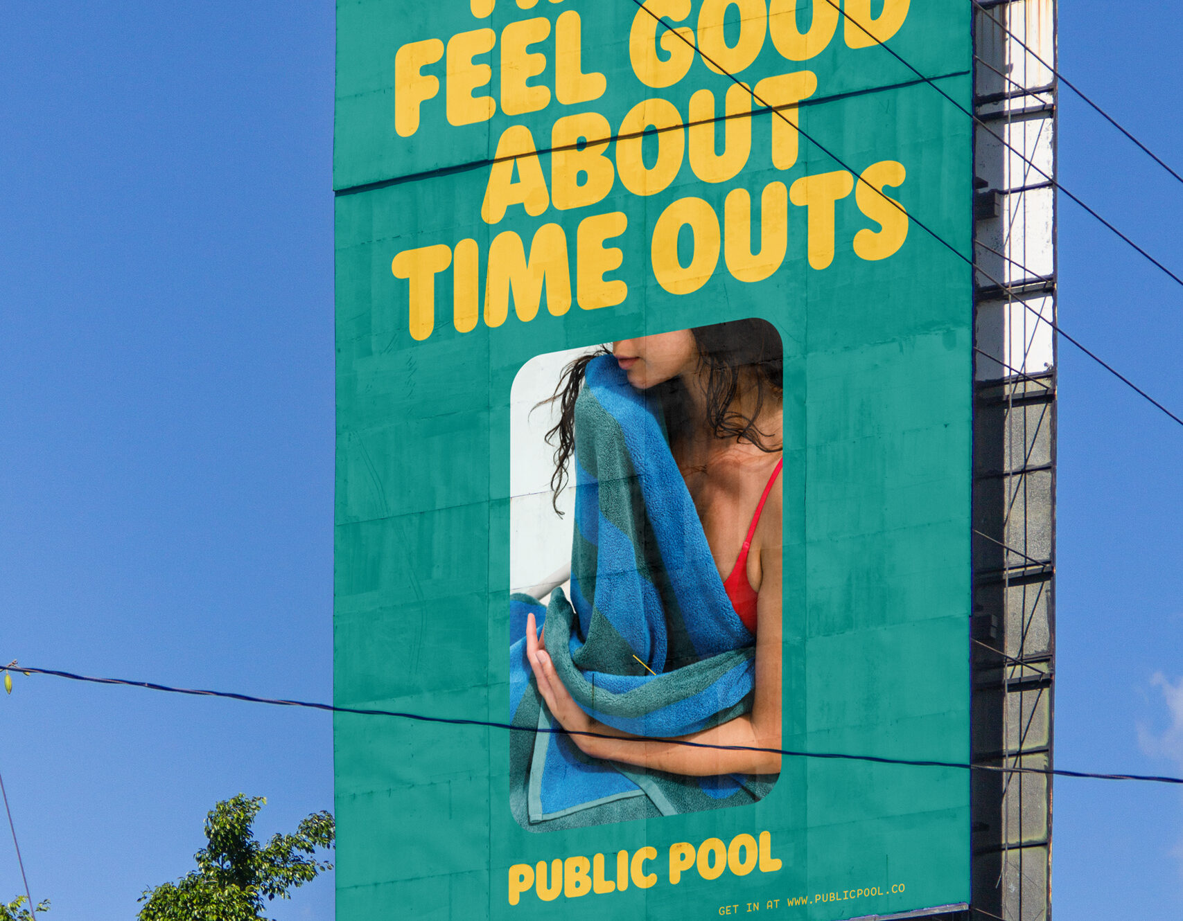
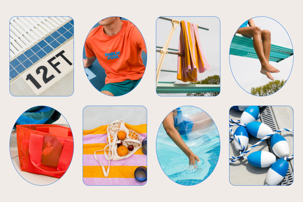
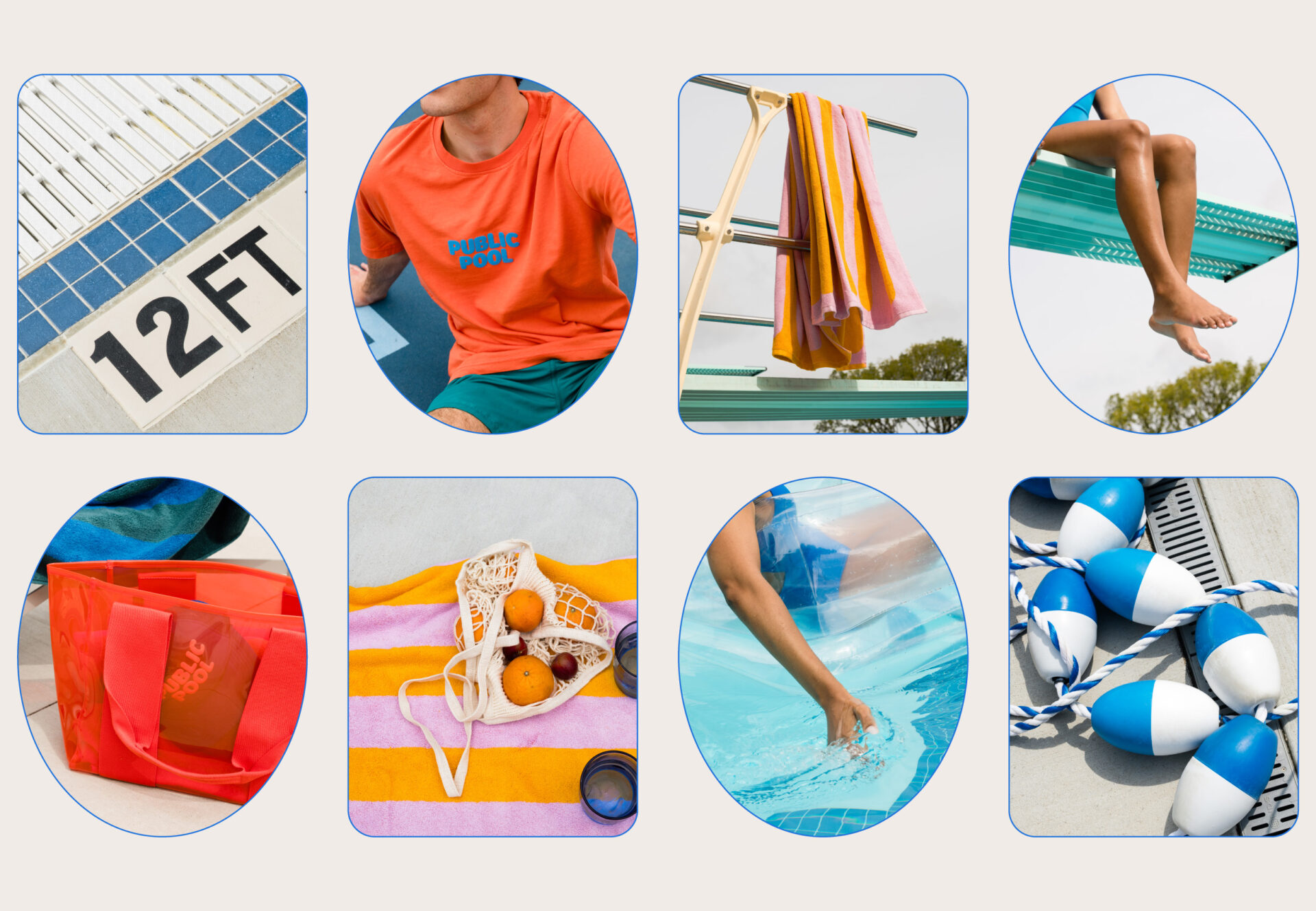
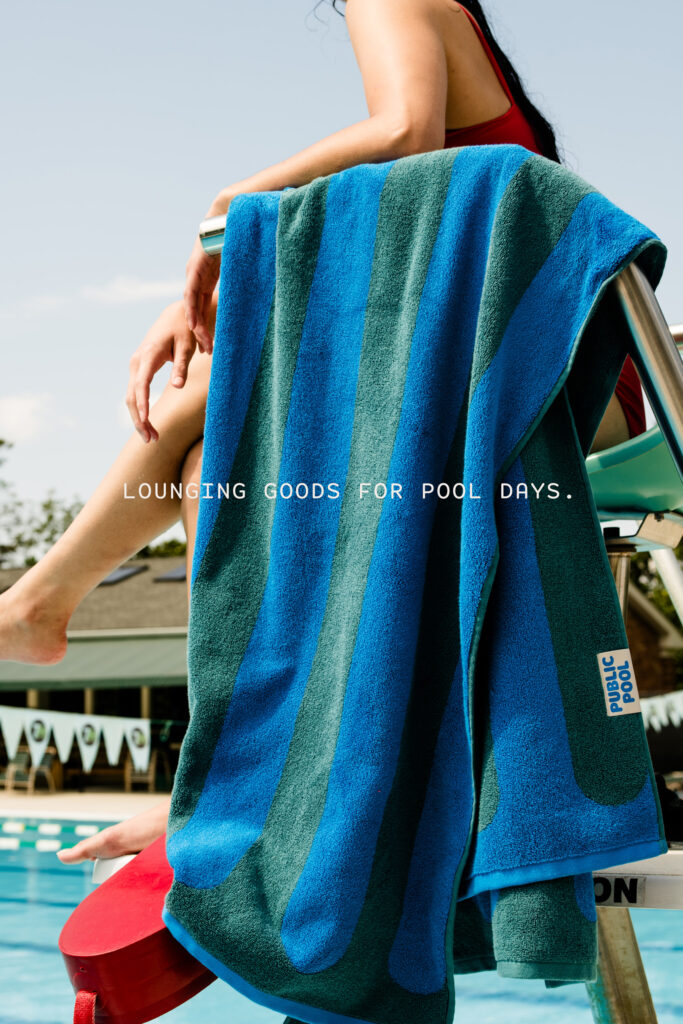
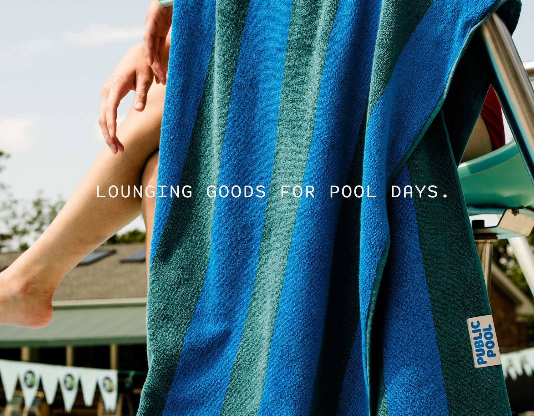
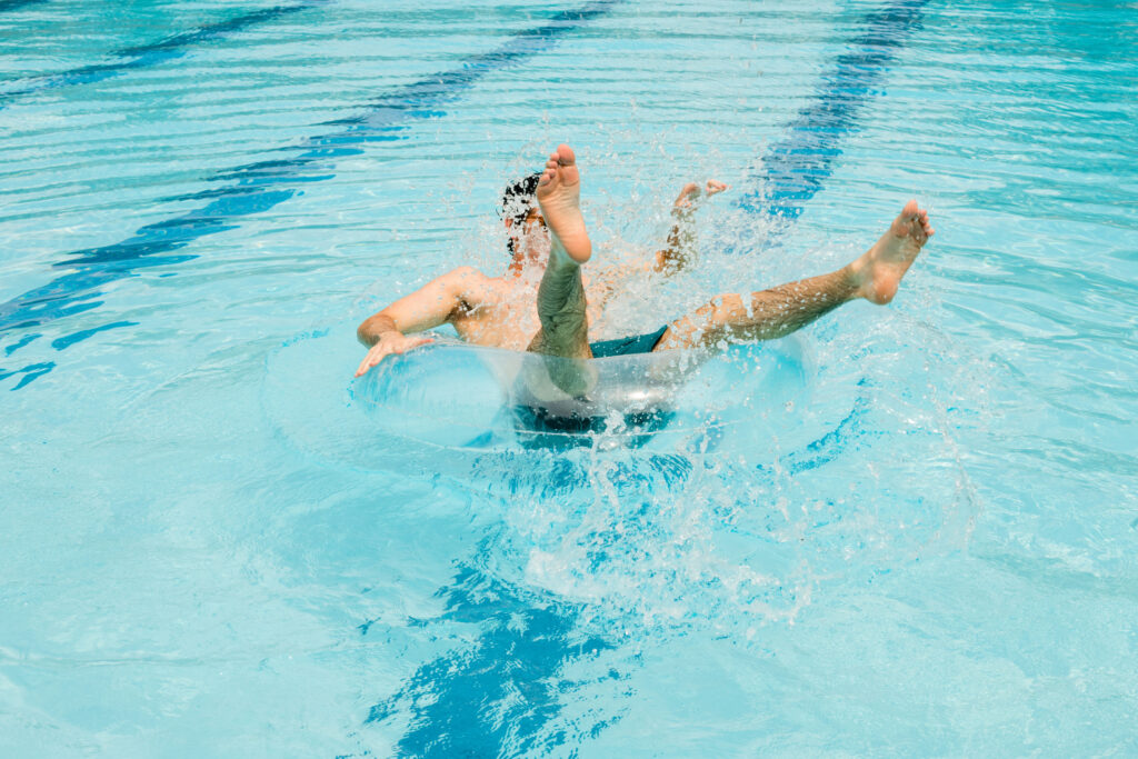
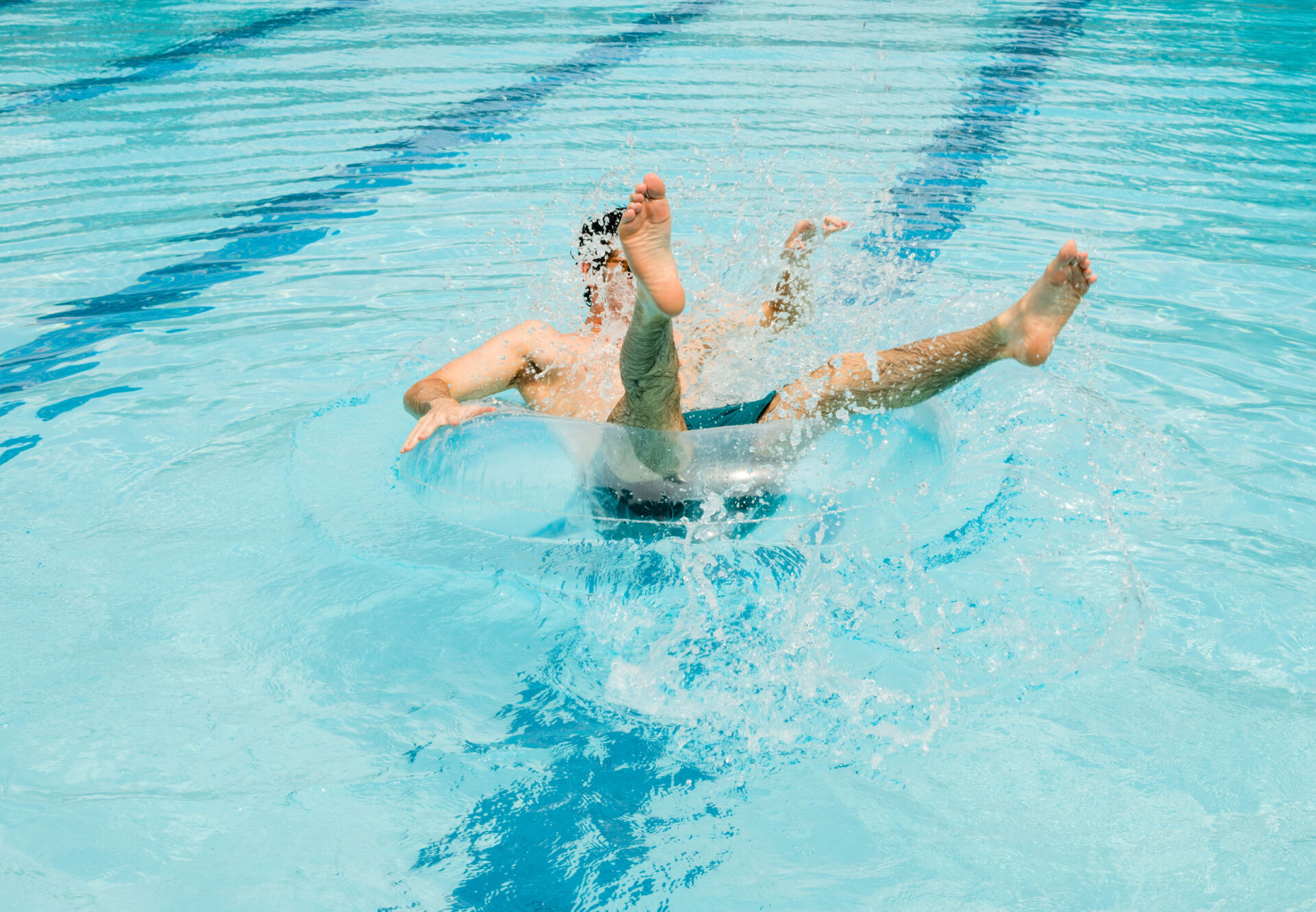
Public Pool imagery utilizes natural, lifelike styling and urban environments, featuring hard shadows from the midday sun and inland details like concrete and deciduous trees. The identity’s design system also incorporates soft pool shapes to creatively frame photography and messaging.
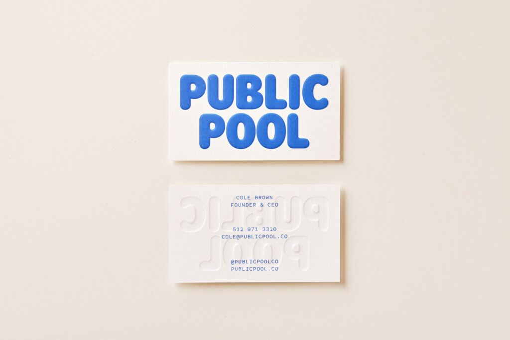
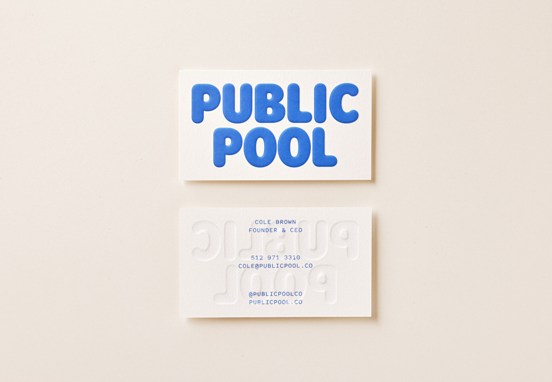
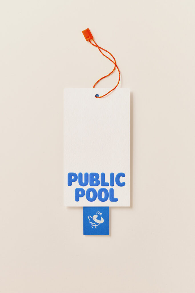
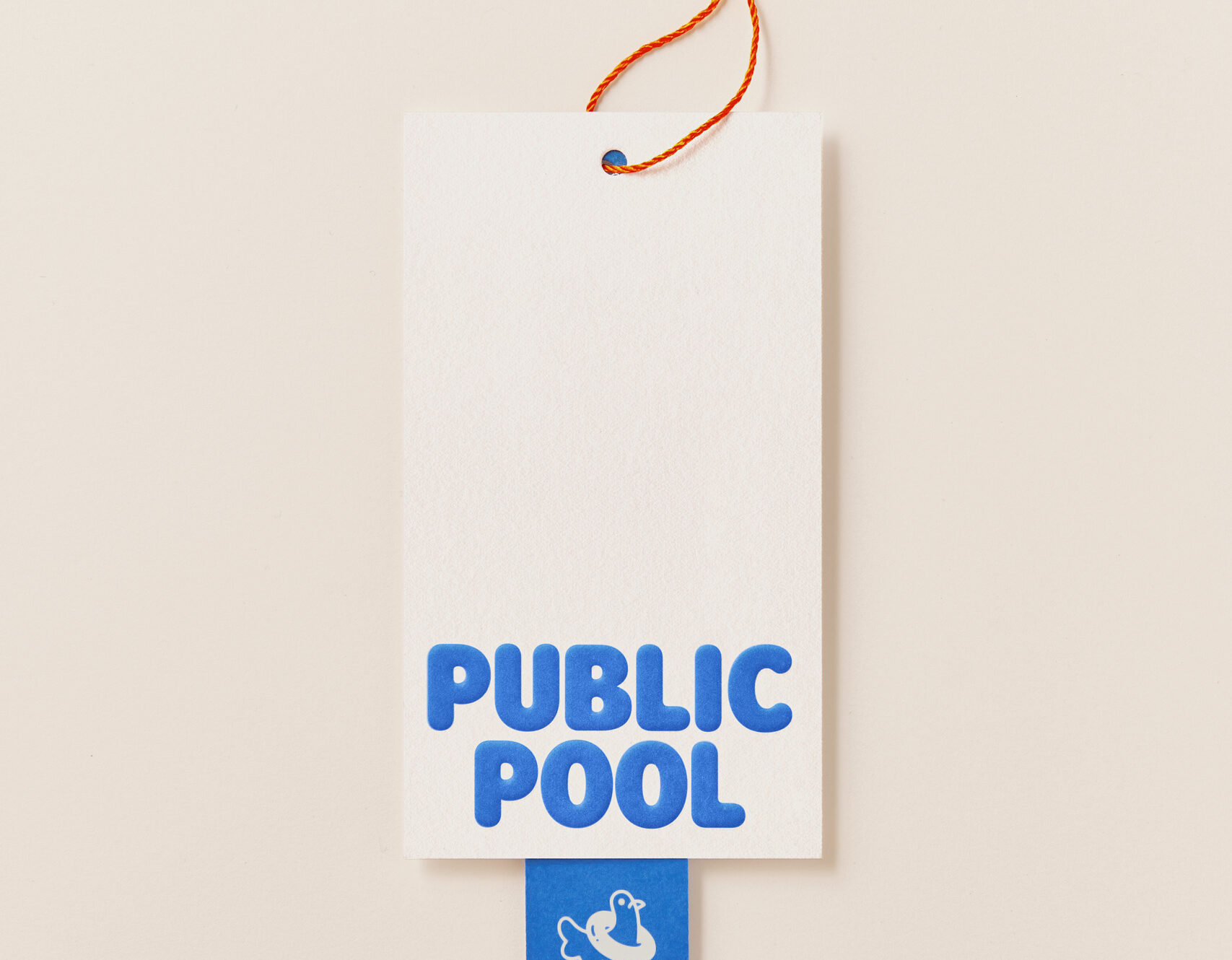
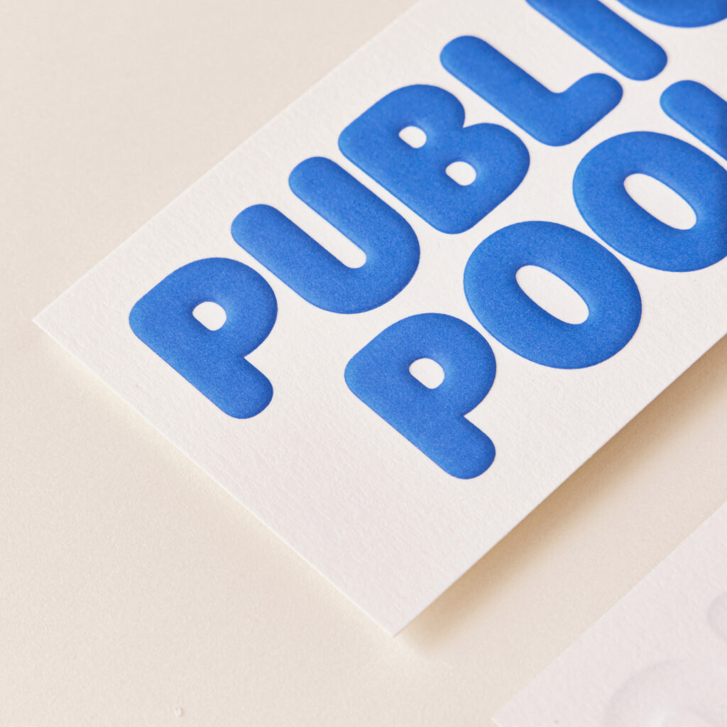
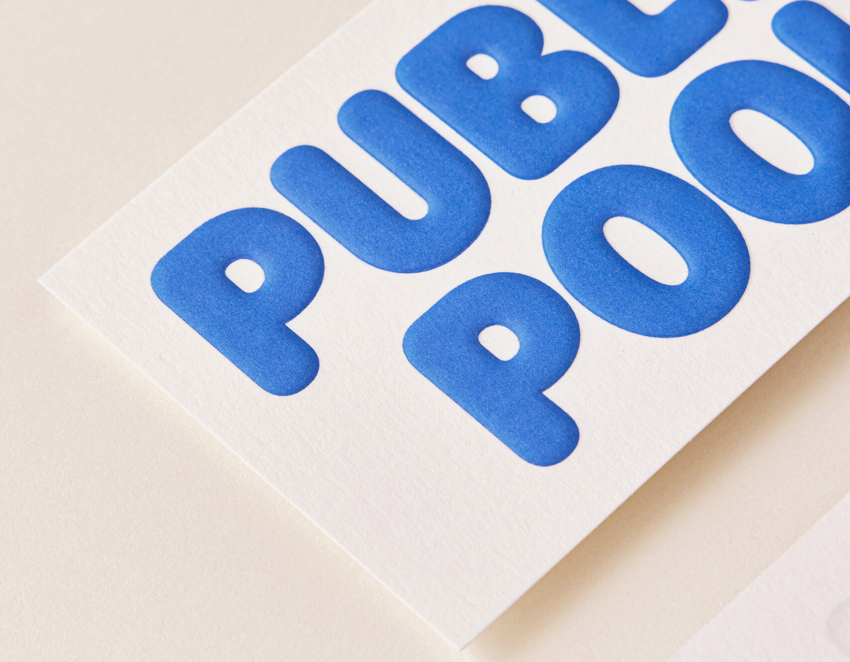
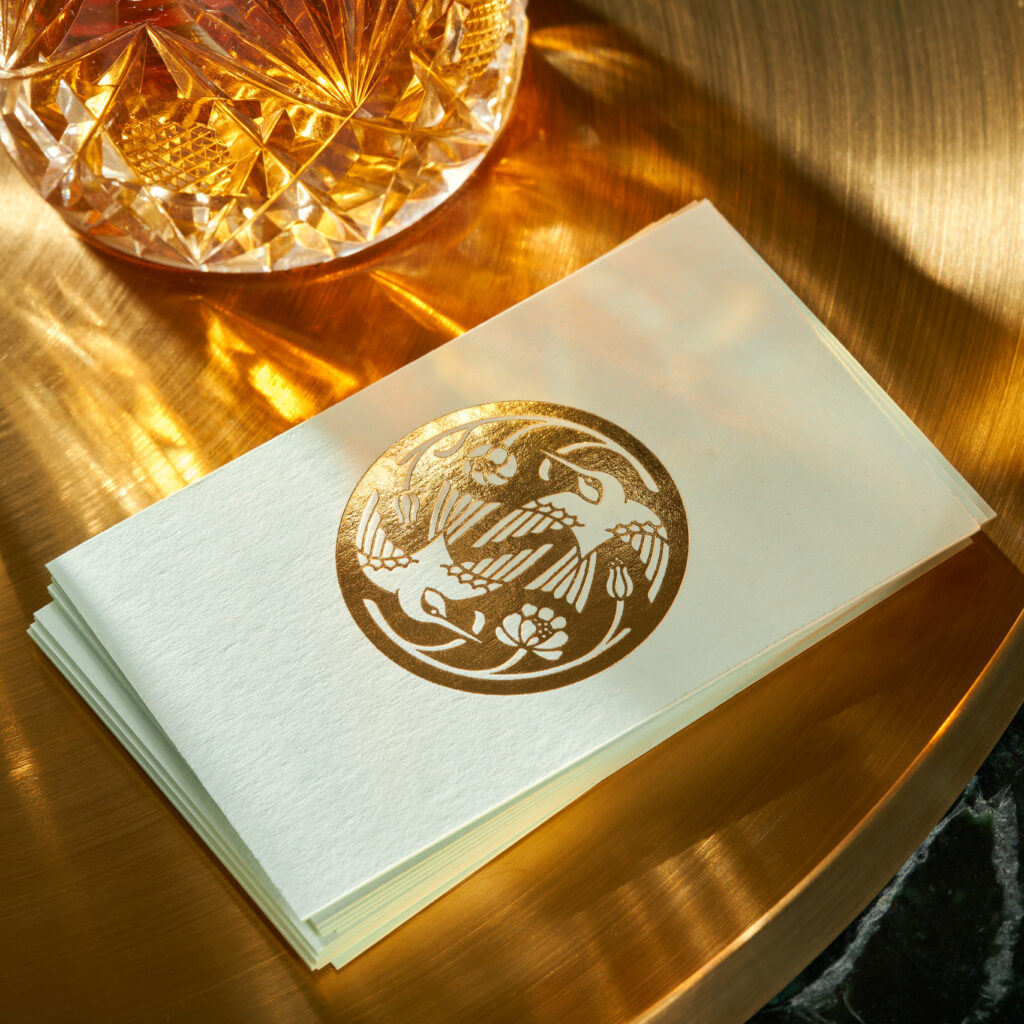
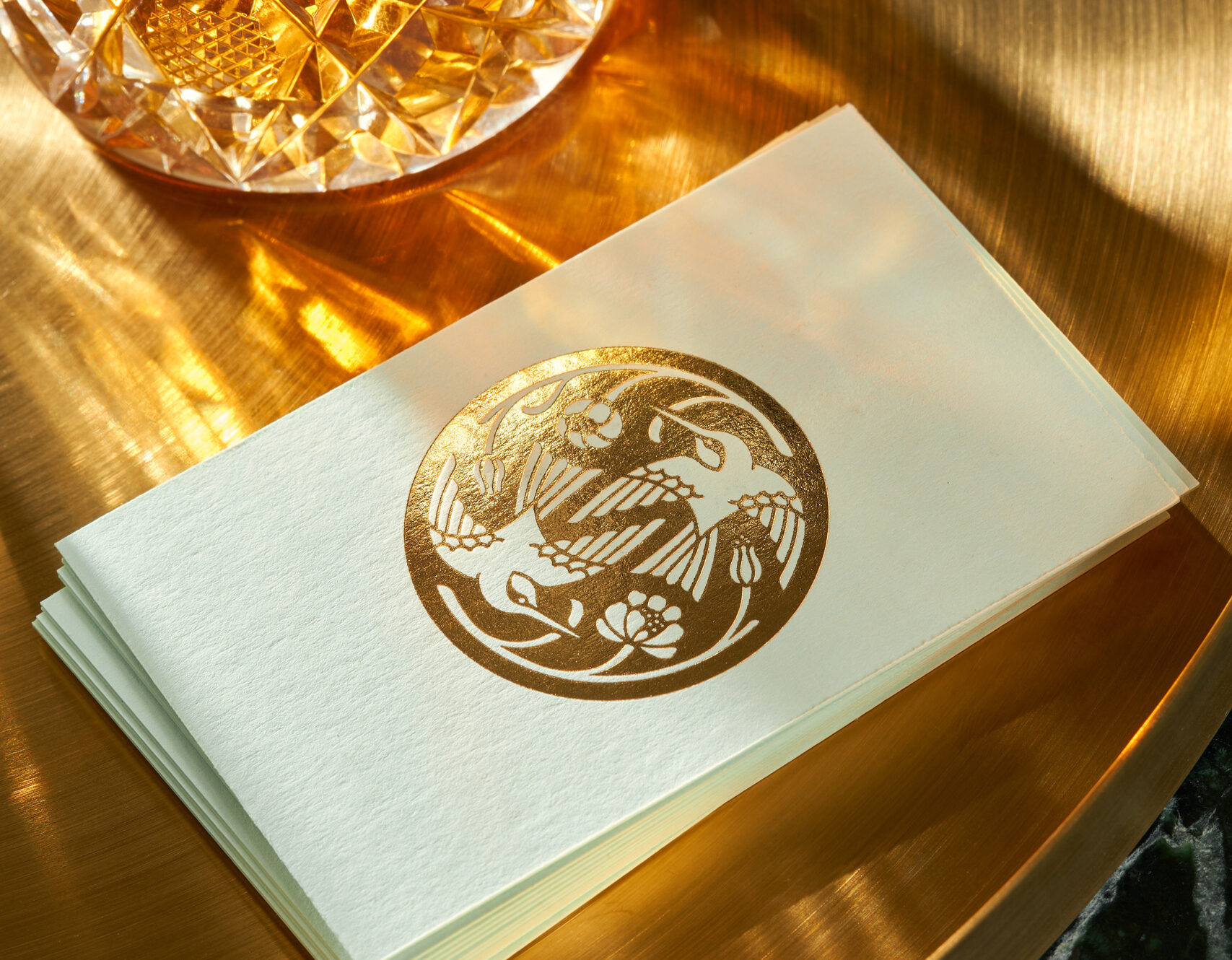
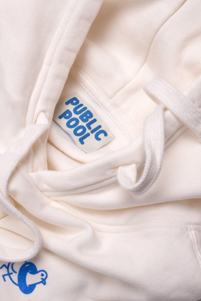
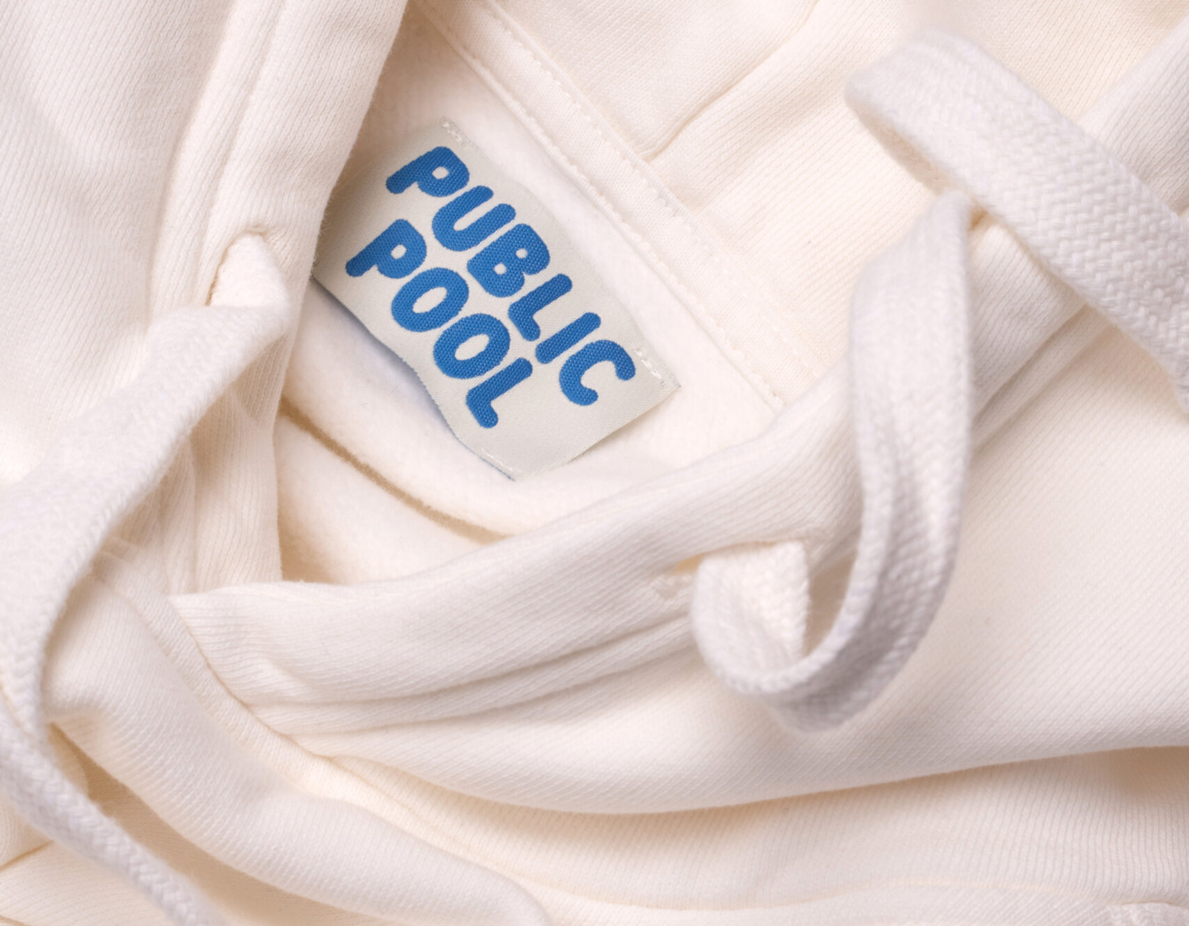
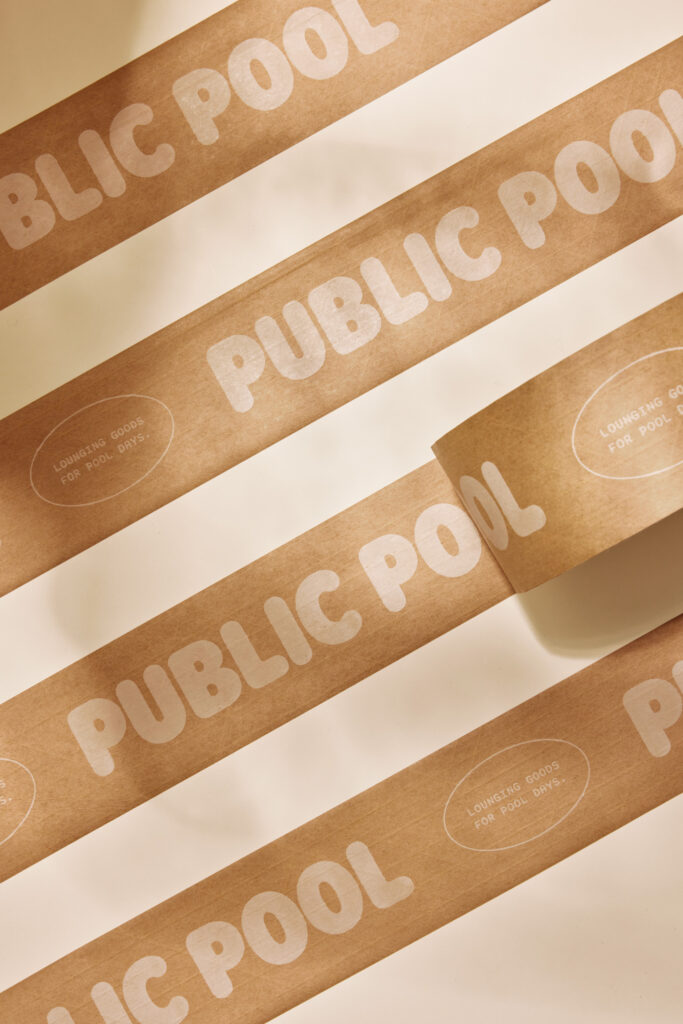
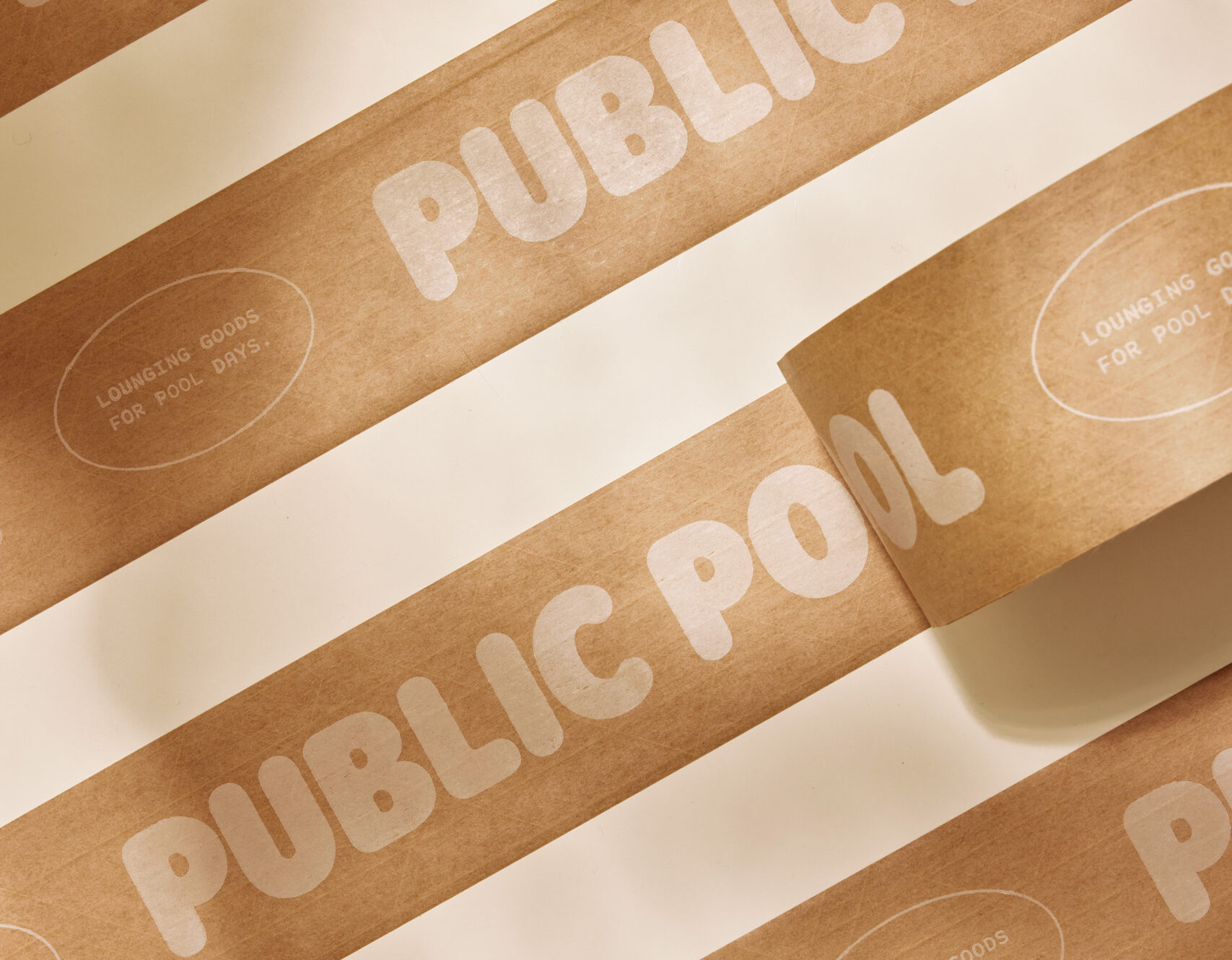
The packaging design is intentionally simple, creating a striking contrast with the playful qualities of Rodger, our brand typeface, and supplemental graphics. The paper materials feature dome-embossed typography, subtly evoking the sensation of floating just above the surface.
Design: Emma Bryant, Caleb Van Dyke, Jeff Perky
Creative Direction: Jeff Perky
Copywriting: Alden Dienthal
Brand Photography: Nicola Harger
Case Study Photography: Ambrose Vargason
Web Development: Keith Thompson