Naming, Brand Identity, Print
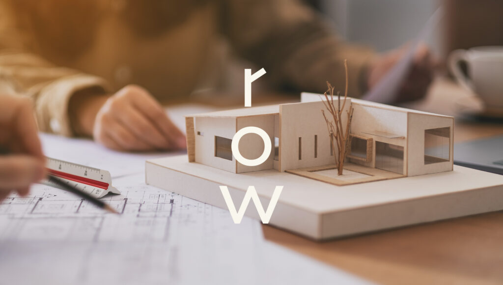
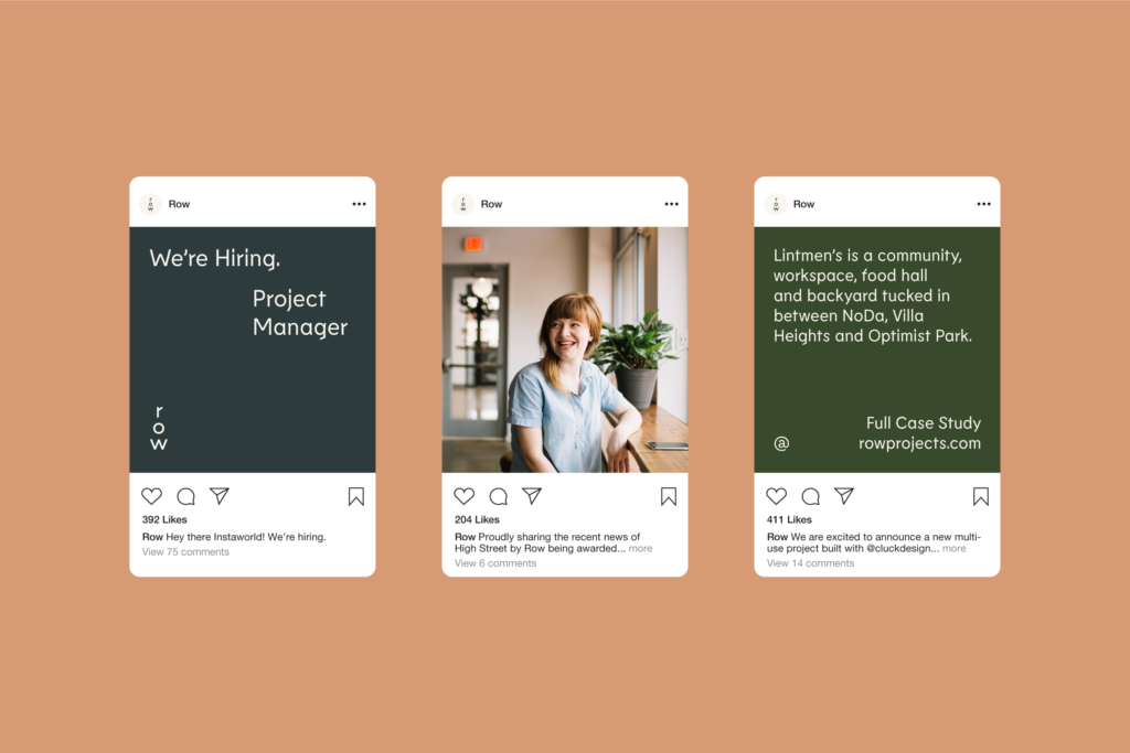
Row is an architecture studio dedicated to creating work that improves the harmony between the built environment and the communities who live and work within. They believe that everything created, no matter the scale, can shape its surroundings for the better. Through collaboration and thoughtful design, Row helps their clients thrive in places they love being.
Harkening back to his southern roots, Principal Paul Kardous emphasized his desire to create a warm and friendly studio—a company that values a purpose-driven, collaborative design process over creative genius. We worked with Paul to develop the name, brand strategy and identity design.
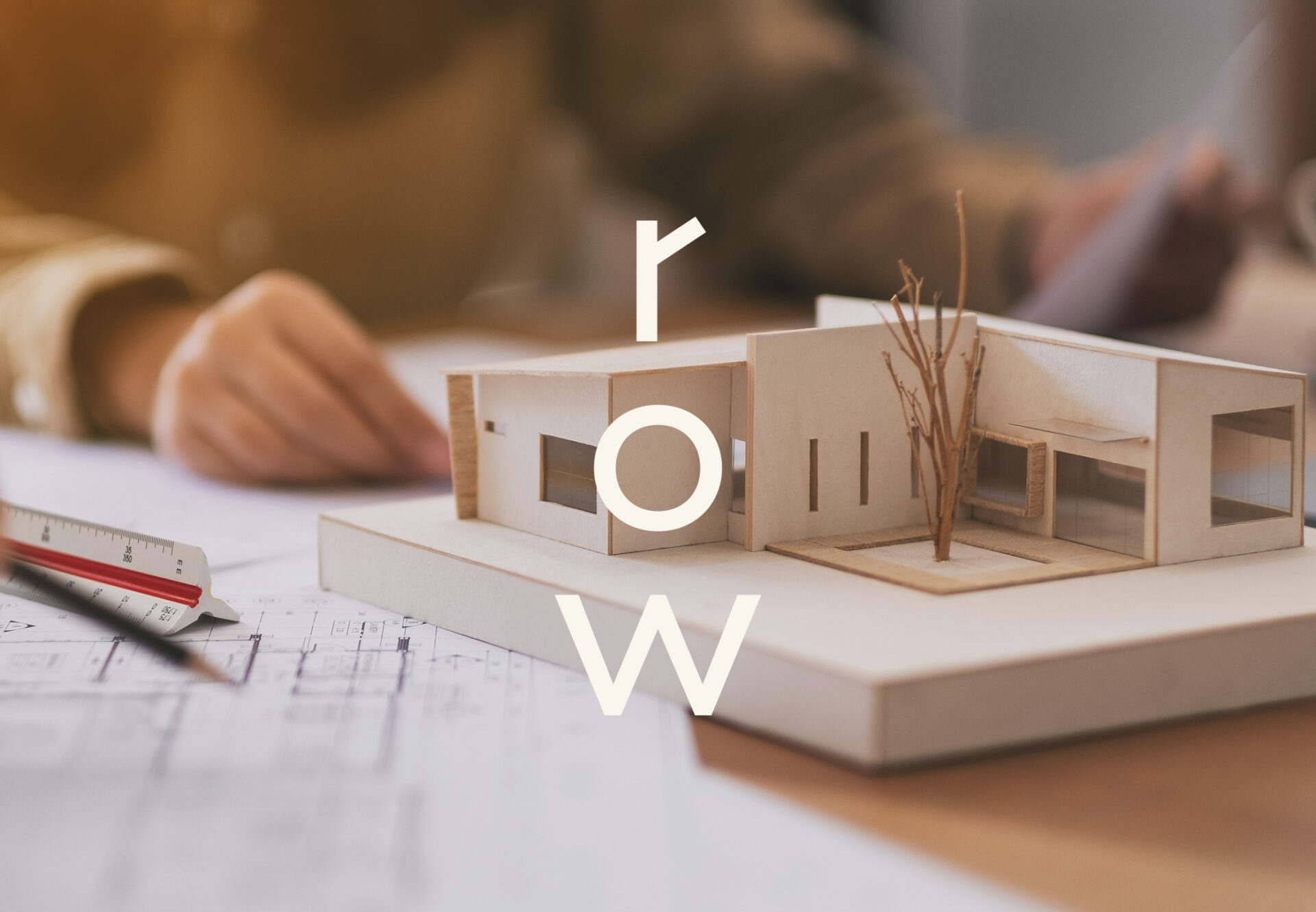
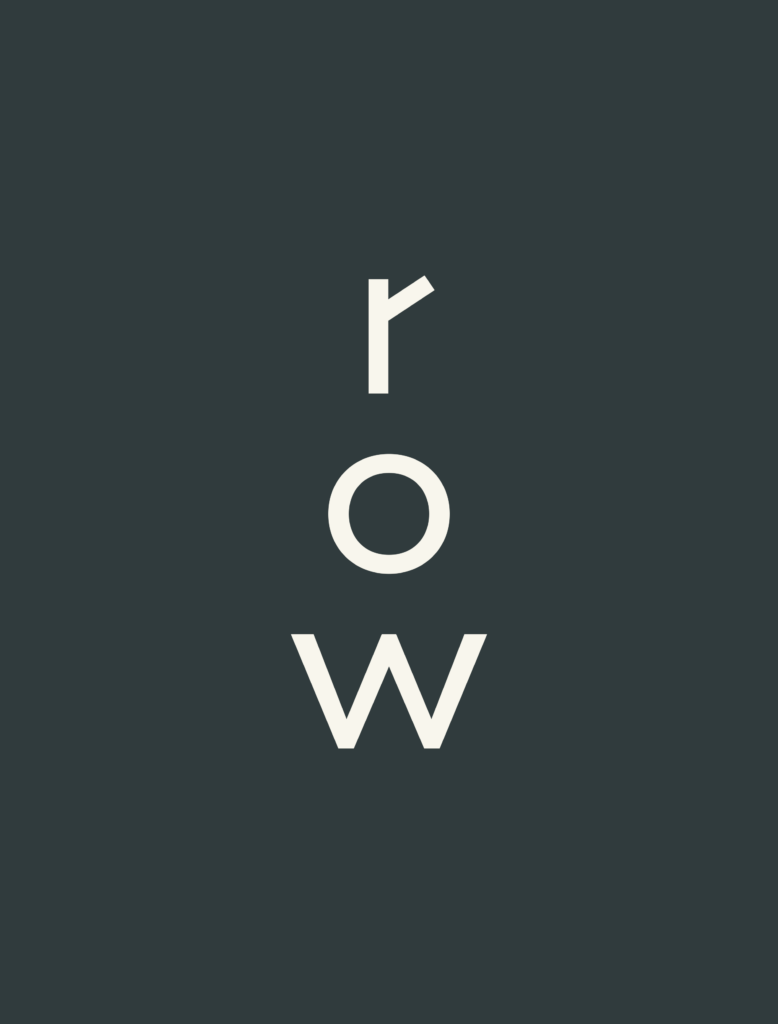
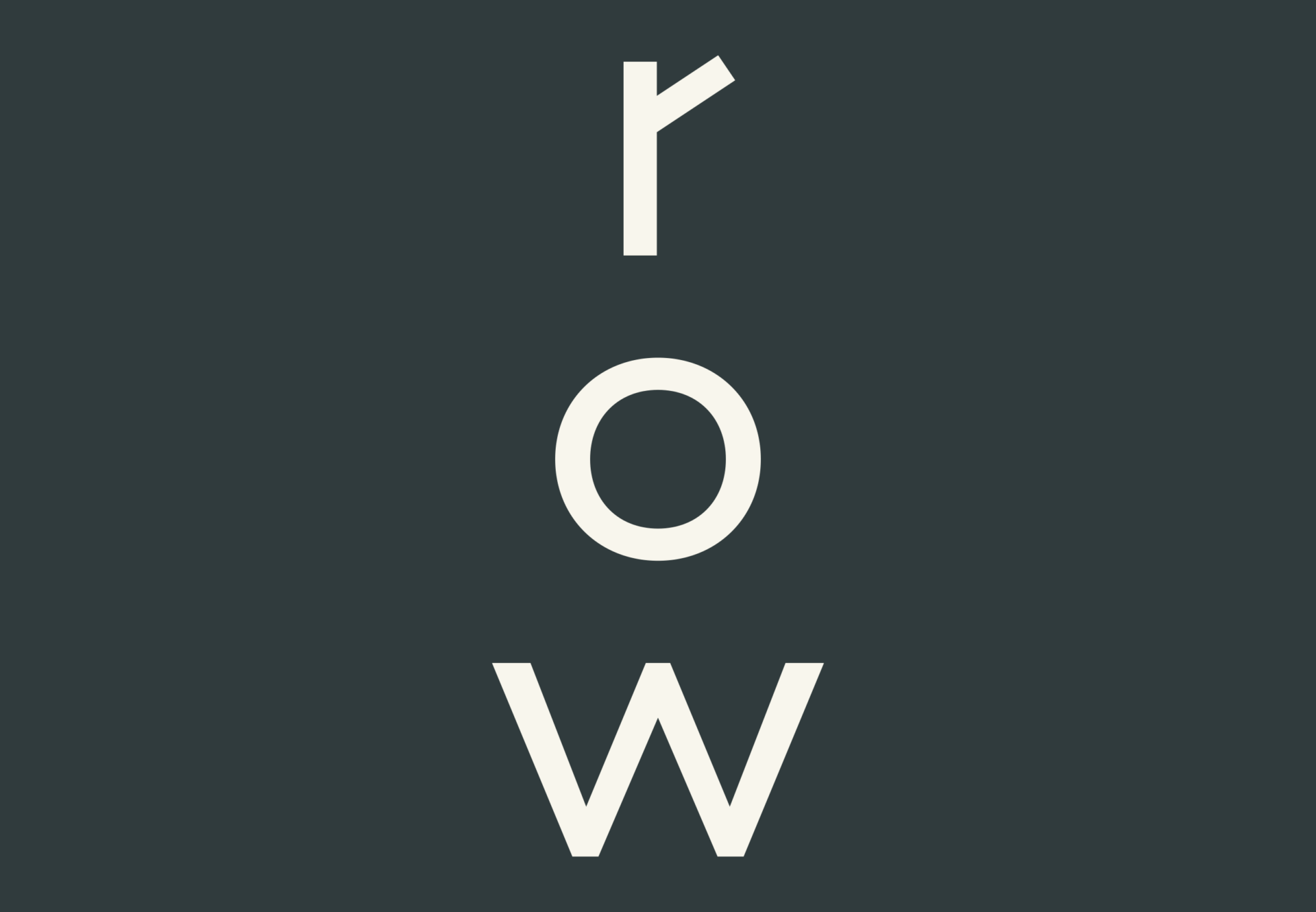
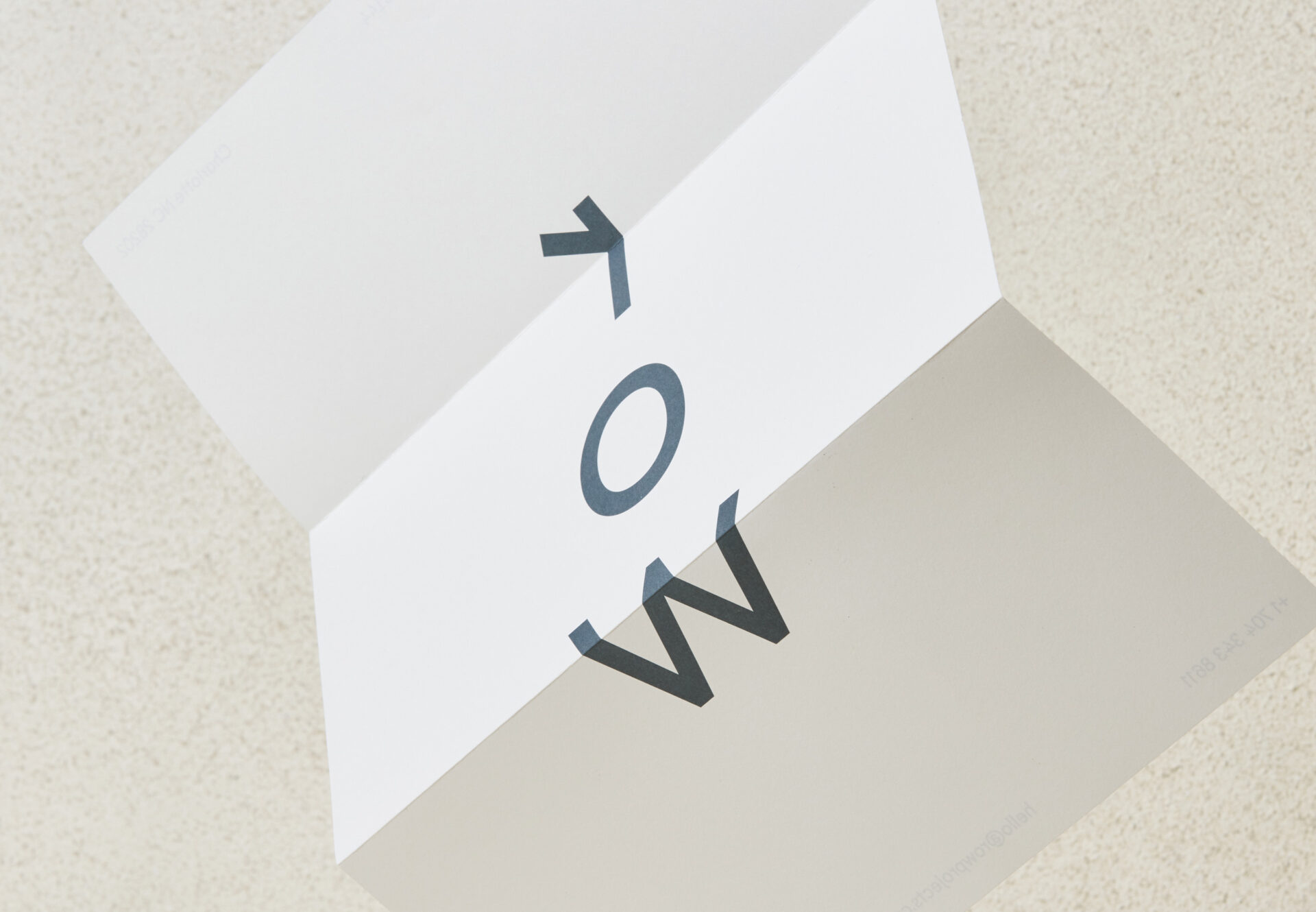
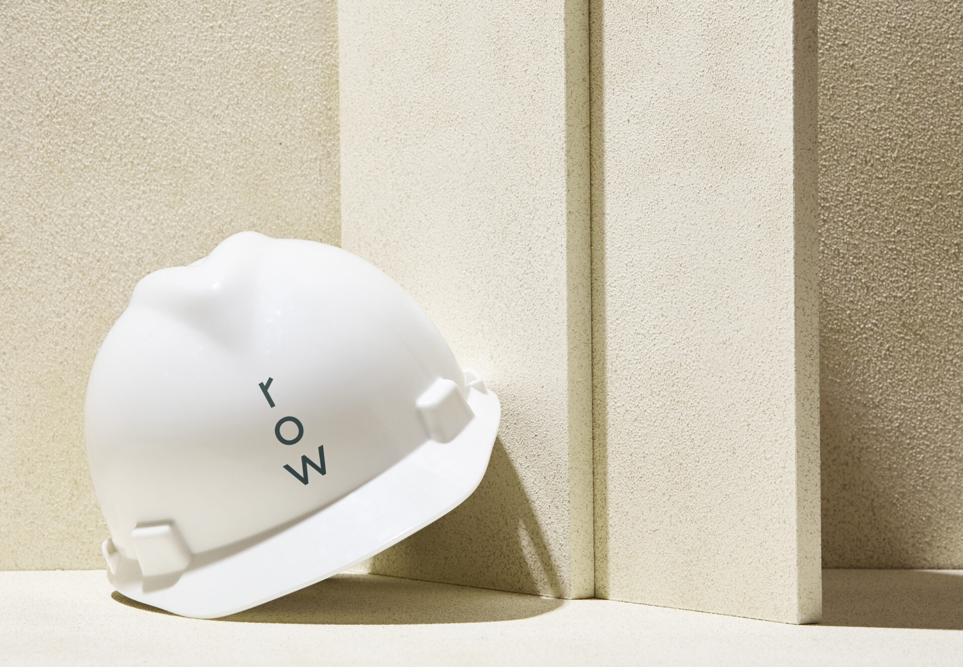
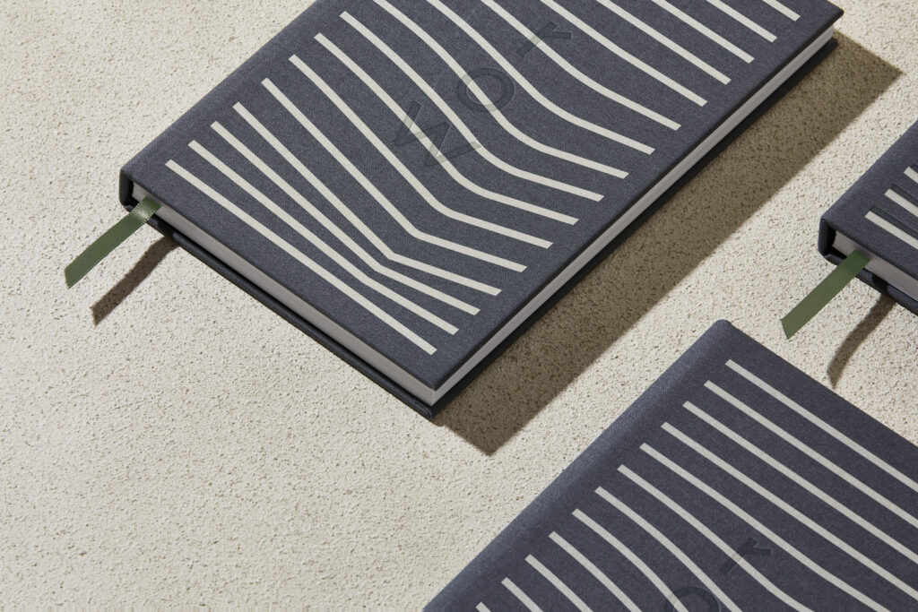
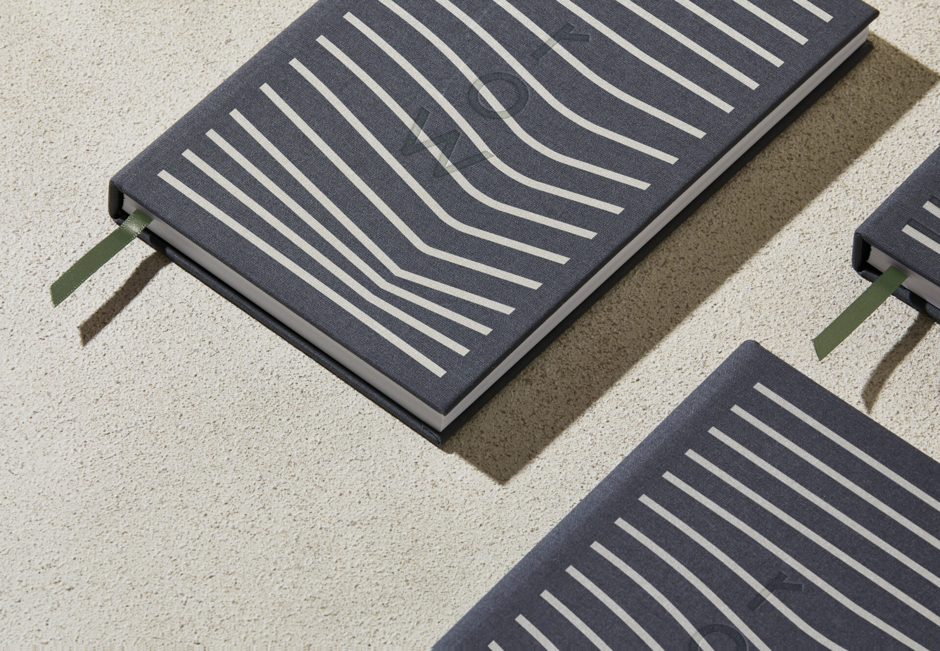
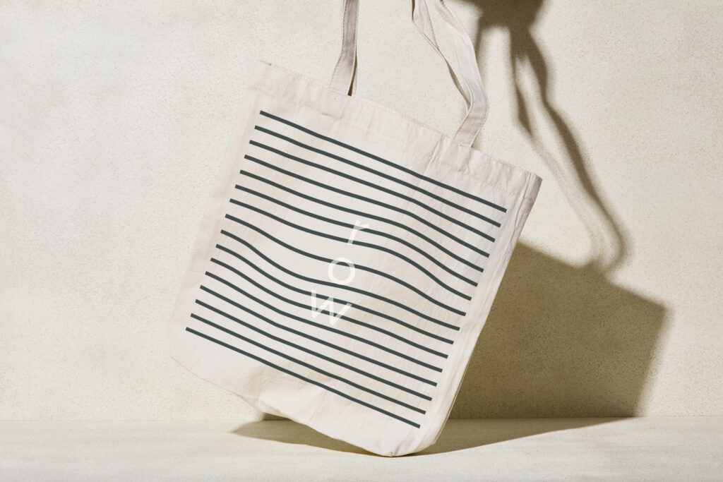
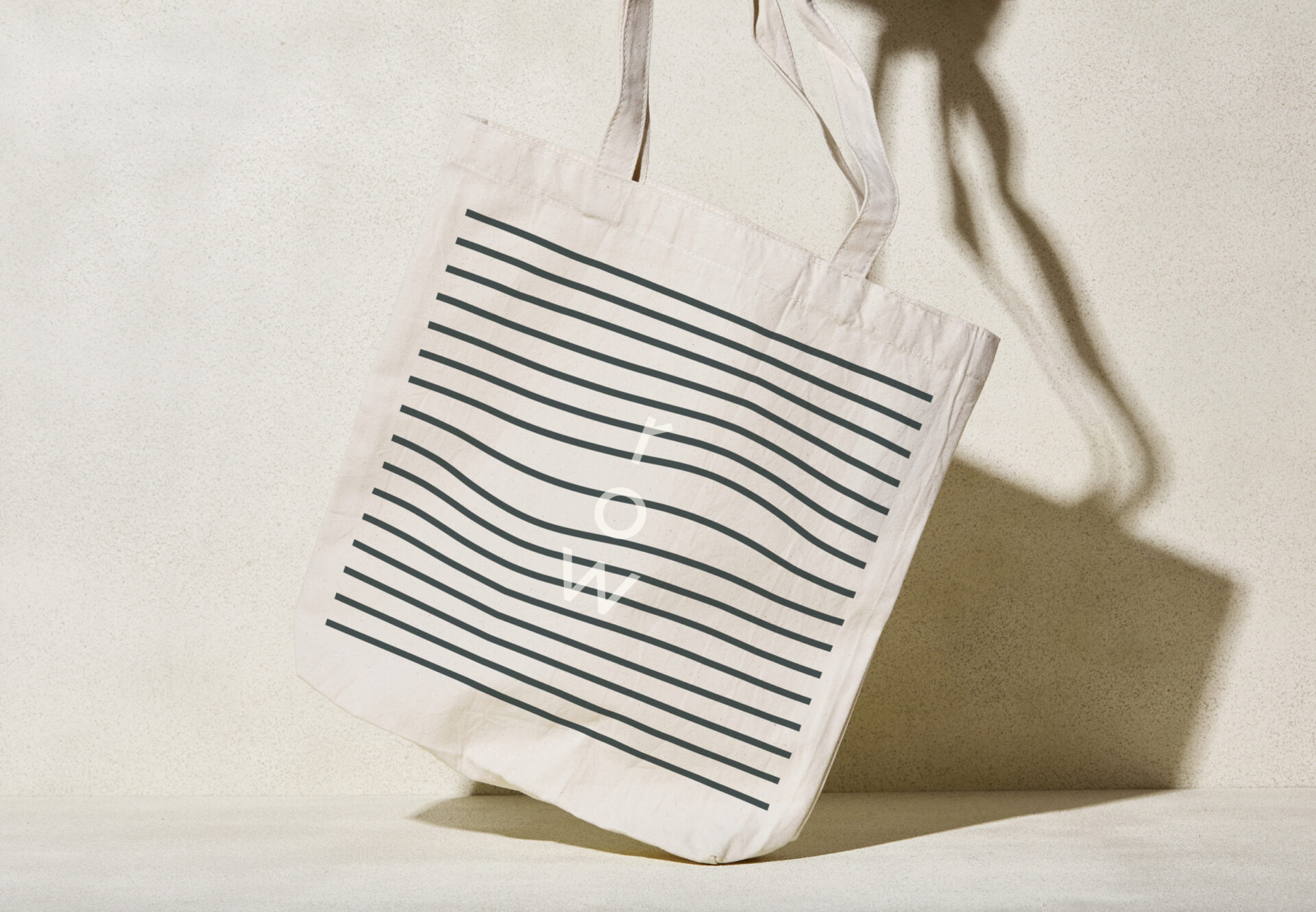
The name Row embodies the studio’s values of organization and effort. When rowing, everyone must be in sync to move in the right direction. For a community or building to thrive, the same must be true. The logo is simple, but distinctive. Its vertical characters and “wake-like” shape are inspired by the aerial view of a crew’s wake as the boat is propelled through the water.
Harkening back to his southern roots, Principal Paul Kardous emphasized his desire to create a warm and friendly studio—a company that values a purpose-driven, collaborative design process over creative genius. We worked with Paul to develop the name, brand strategy and identity design.
The name Row embodies the studio’s values of organization and effort. When rowing, everyone must be in sync to move in the right direction. For a community or building to thrive, the same must be true. The logo is simple, but distinctive. Its vertical characters and “wake-like” shape are inspired by the aerial view of a crew’s wake as the boat is propelled through the water.
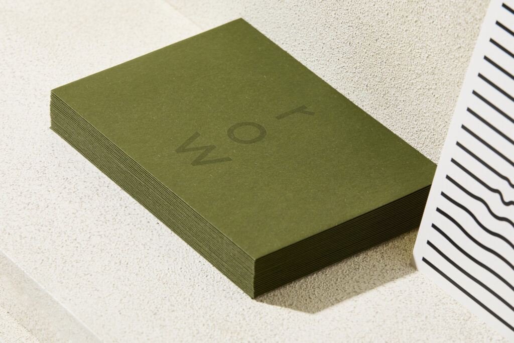
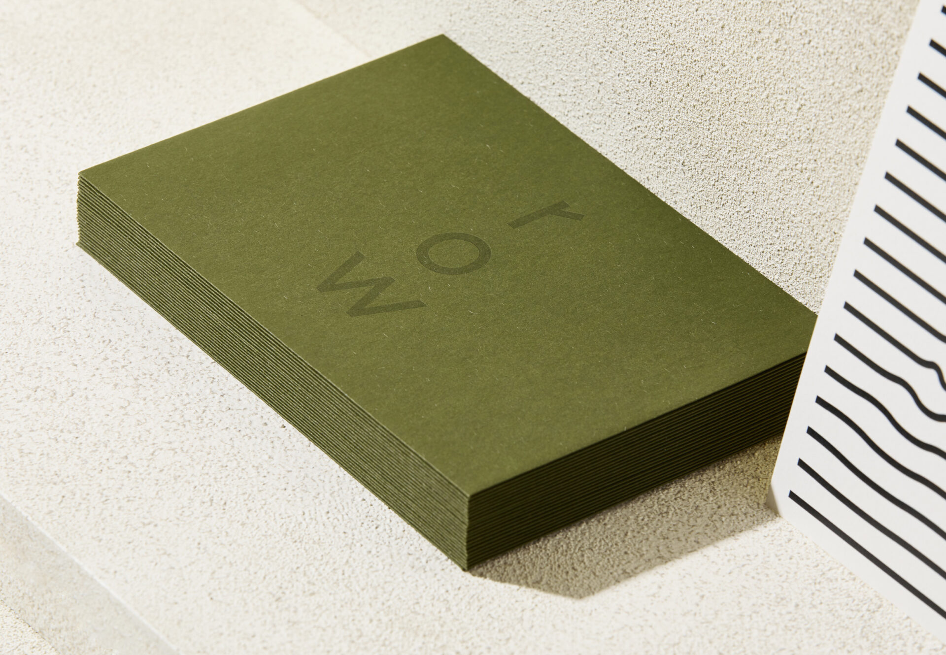
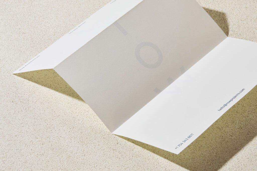
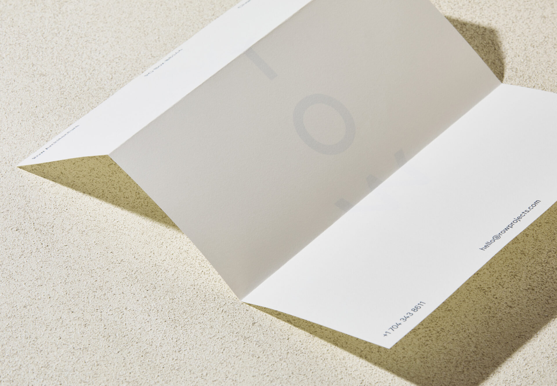
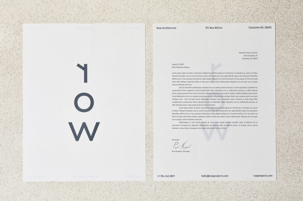
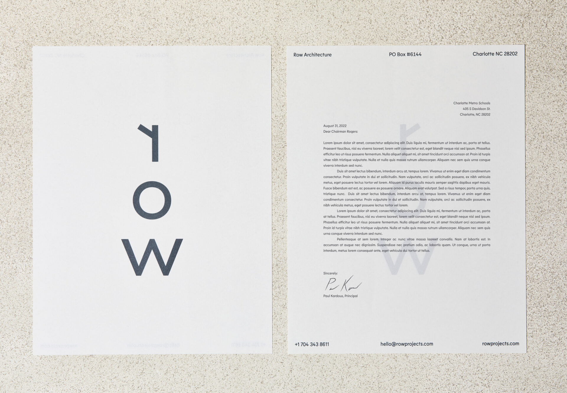
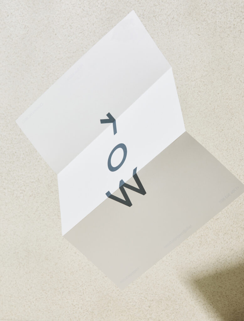
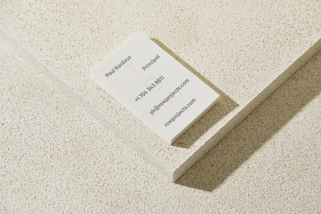
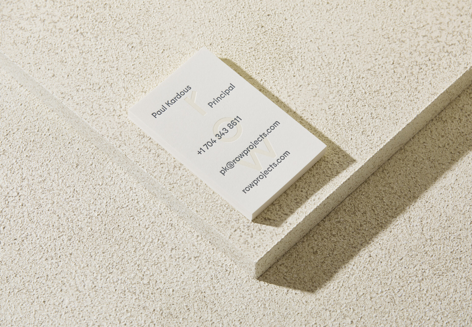
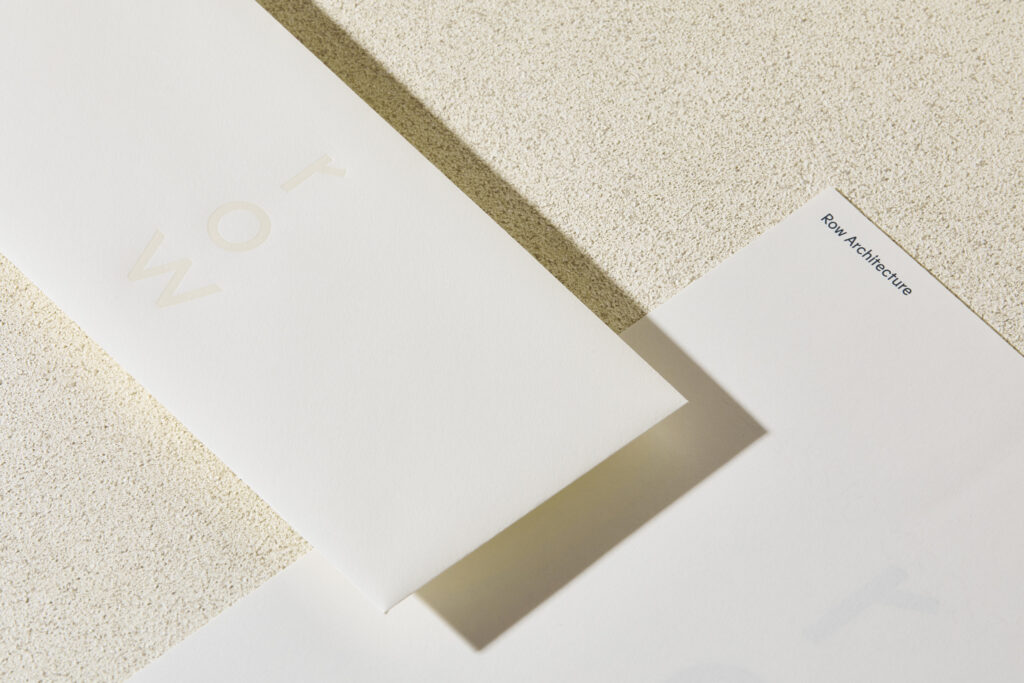
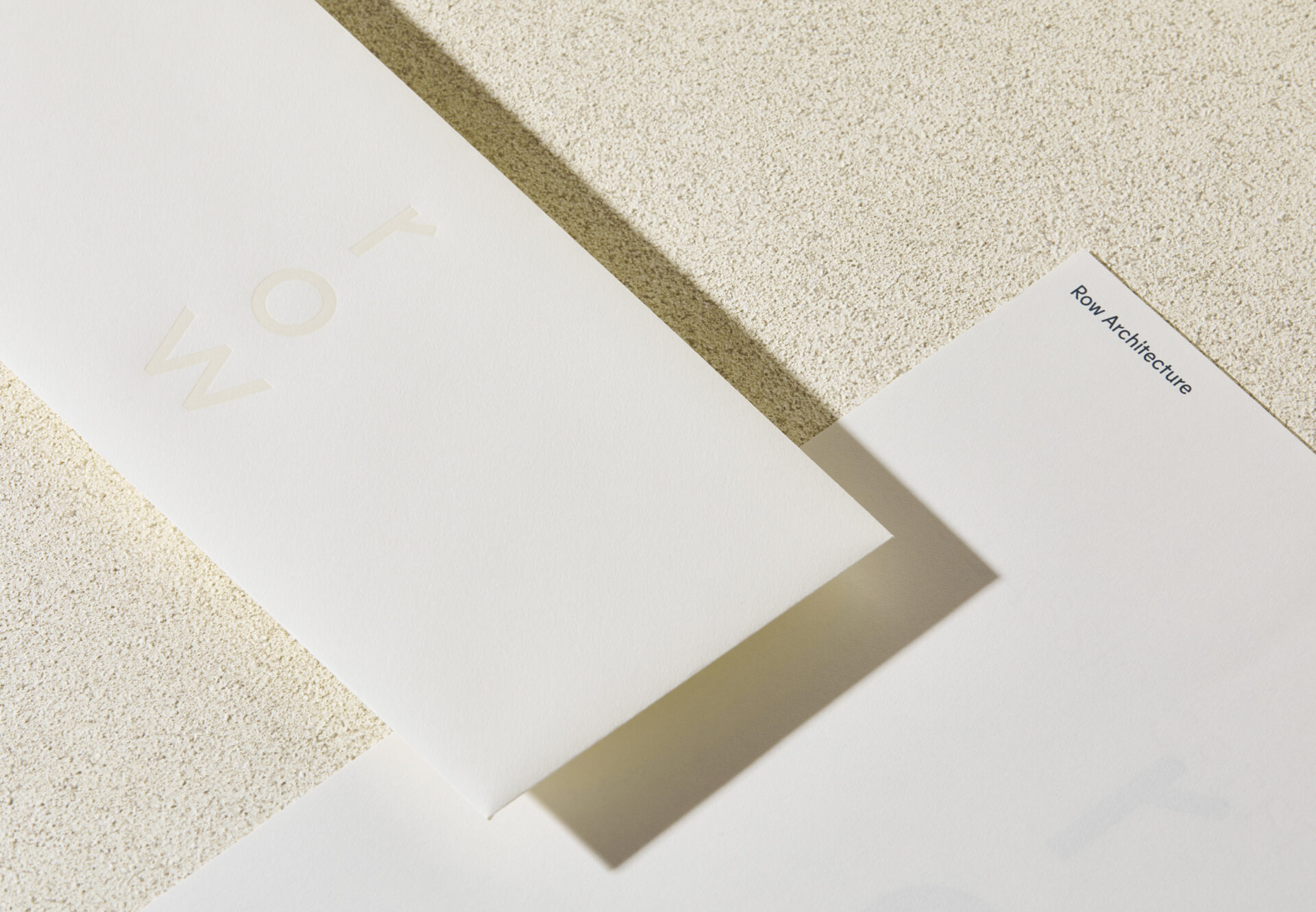
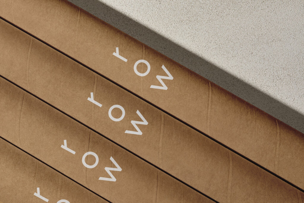
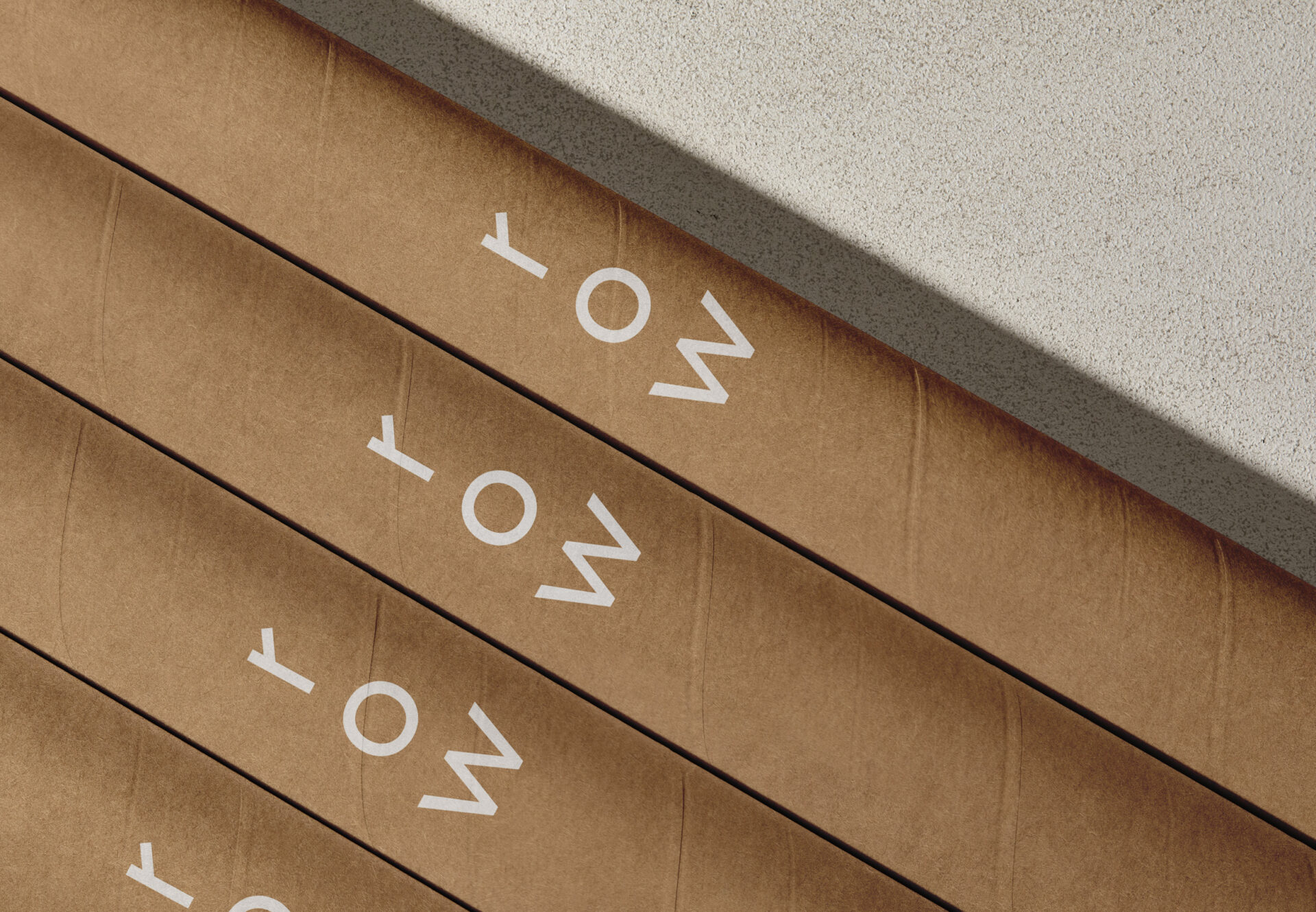
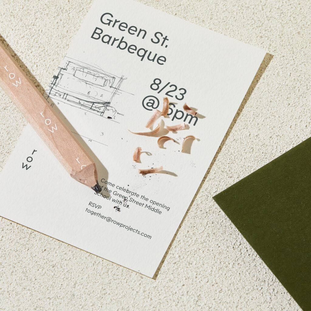
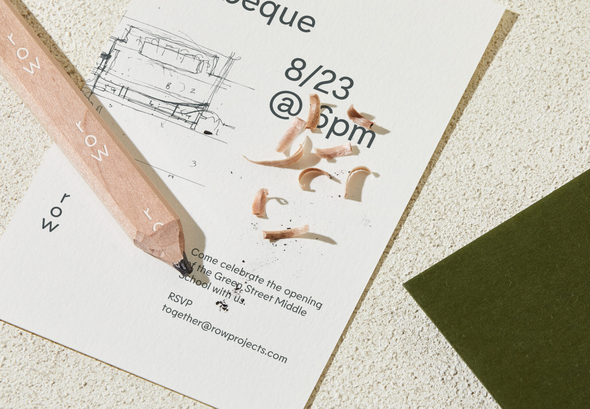
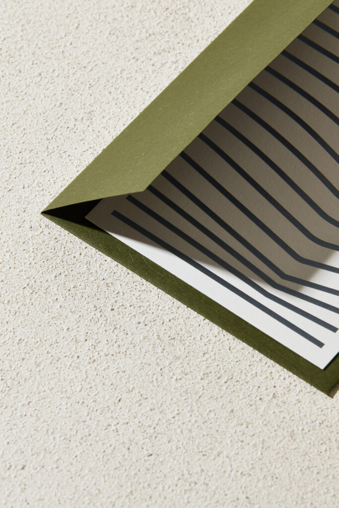
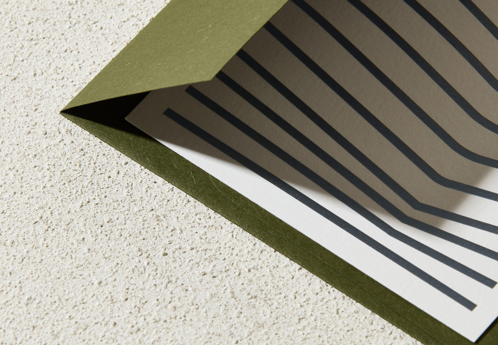
Inspired by the movement of oars propelling a boat through water, the print collateral uses an active typographic layout that shifts alignment from left to right. To reinforce the concept of a vessel in water, the Row mark is often pulled back in hierarchy via a blind stamp or reverse-side “dumb watermark.”
Inspired by the movement of oars propelling a boat through water, the print collateral uses an active typographic layout that shifts alignment from left to right. To reinforce the concept of a vessel in water, the Row mark is often pulled back in hierarchy via a blind stamp or reverse-side “dumb watermark.”
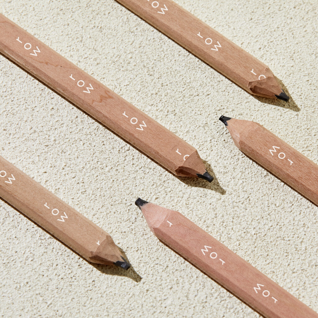
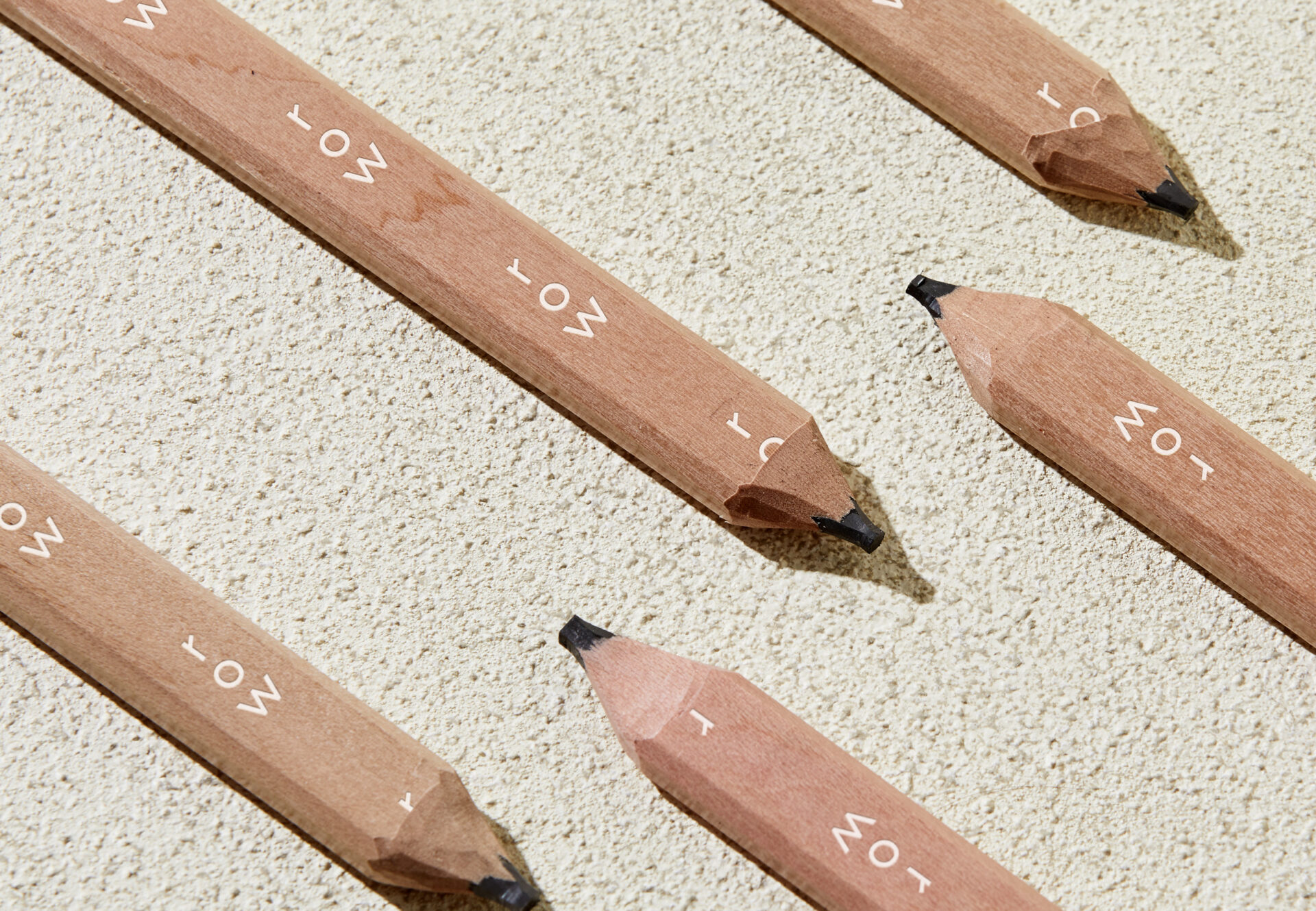
The primary typeface, Lemur, was selected to give the brand’s voice visual distinction. It is a geometric typeface that features angular details which subtly speak to the lines of oars extending from the side of the vessel. The warm, earthy palette feels approachable—a welcome contrast to the stark black and white palettes typically found in architecture studios.
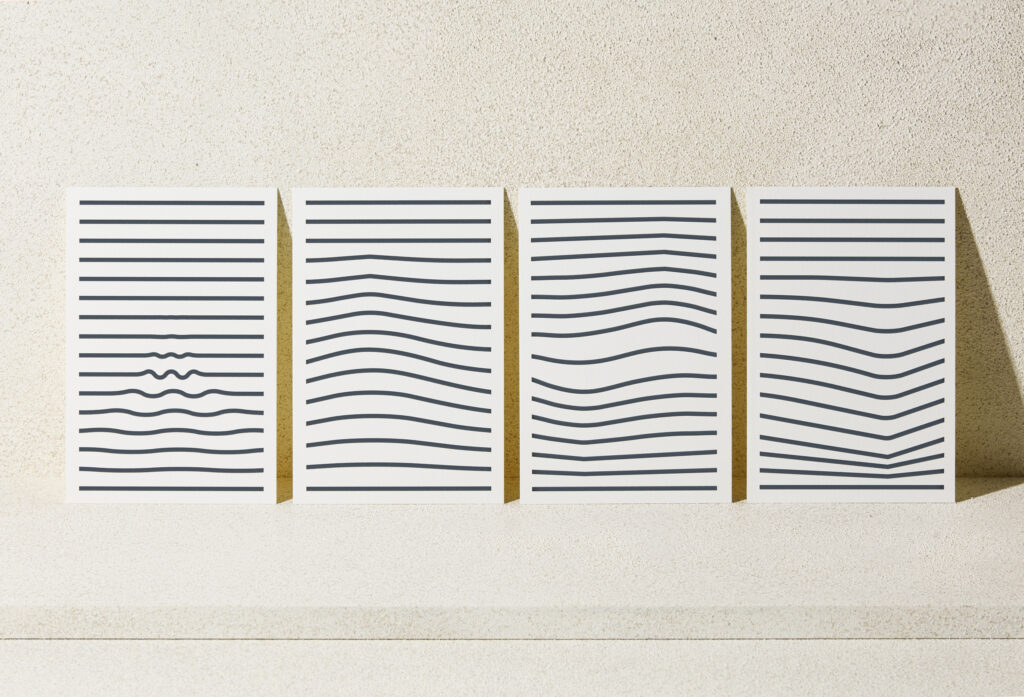
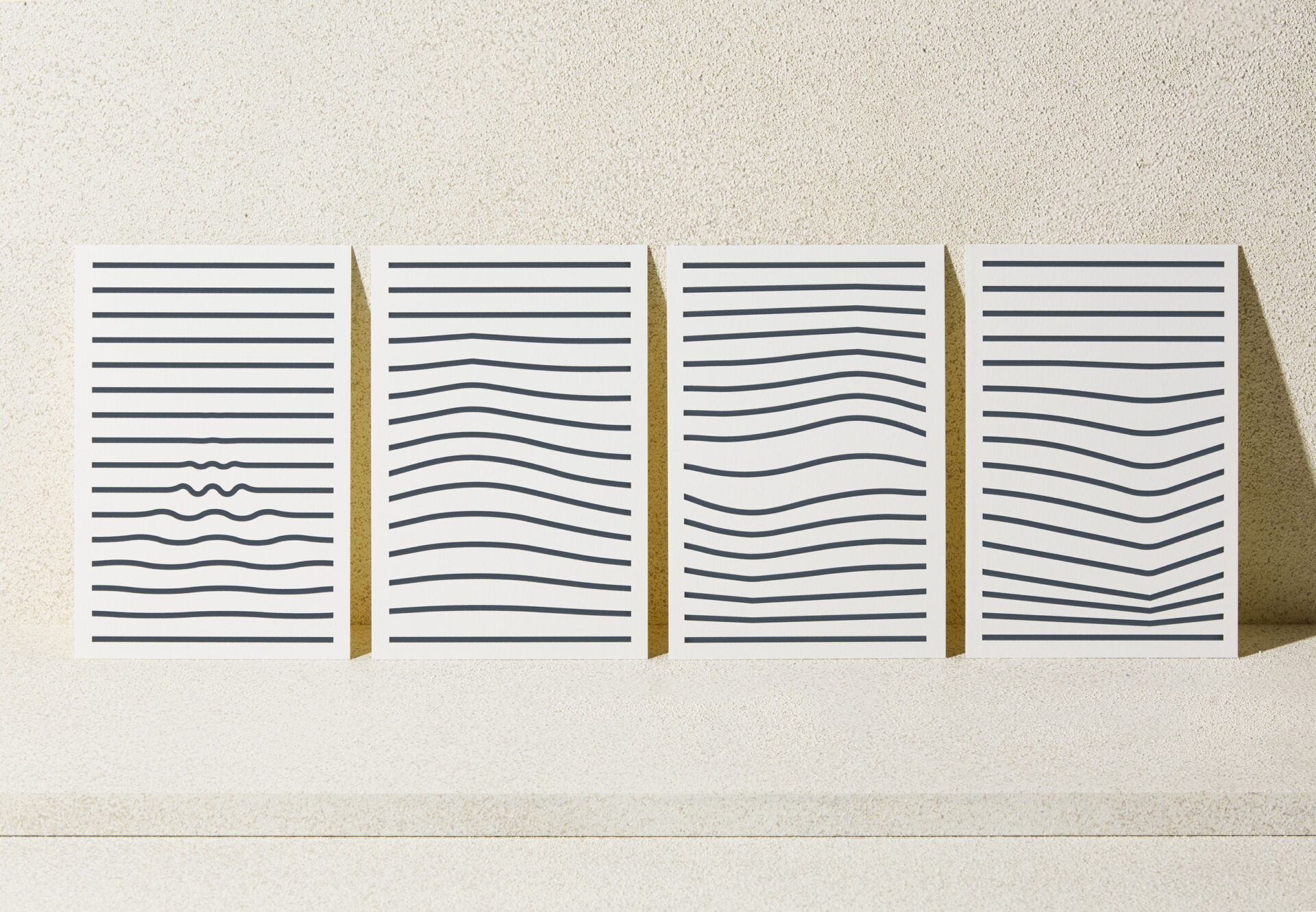
The pattern consists of a series of 15 active line rules inspired by Ekistics, the science of human settlements. Ekistics seeks to understand the relationship between individual inhabitants of a settlement and their physical and sociocultural environments. With each line affecting the next, the constant movement illustrates that any action—however small—reverberates within humankind and can cause true change.
The pattern consists of a series of 15 active line rules inspired by Ekistics, the science of human settlements. Ekistics seeks to understand the relationship between individual inhabitants of a settlement and their physical and sociocultural environments. With each line affecting the next, the constant movement illustrates that any action—however small—reverberates within humankind and can cause true change.

Creative Direction: Jeff Perky
Design: Jeff Perky, Rex Runyeon
Project Management: Alden Dienethal
Project Photography: Brett Warren
Website Development: Brad Good