Brand Identity, Illustration, Web Design
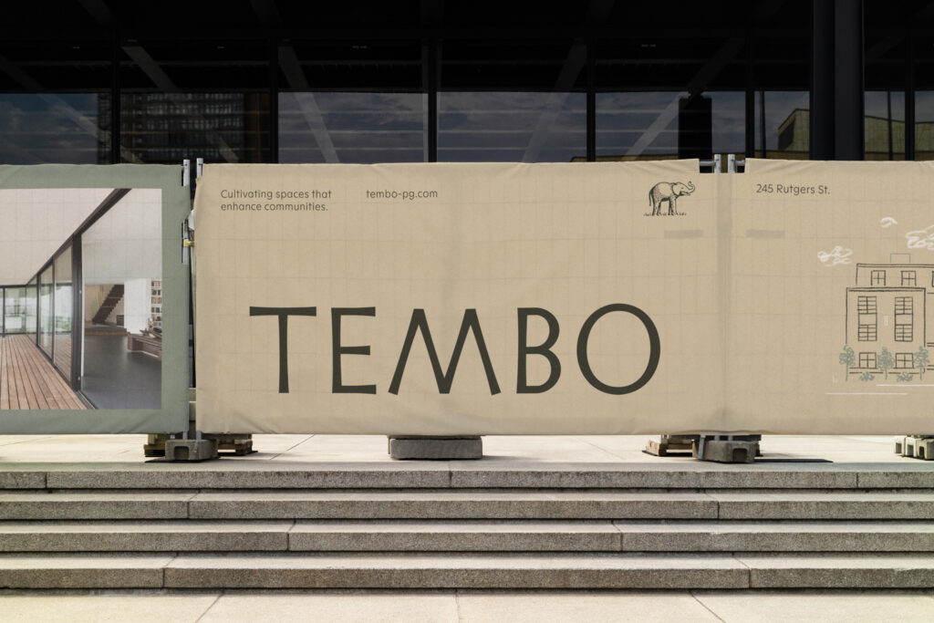
Tembo is a real estate investment firm with a rare trait: patience. Gentle, judicious and family centered, Tembo focuses on growing and cultivating properties — investing in high quality assets that enhance the communities in which they reside.


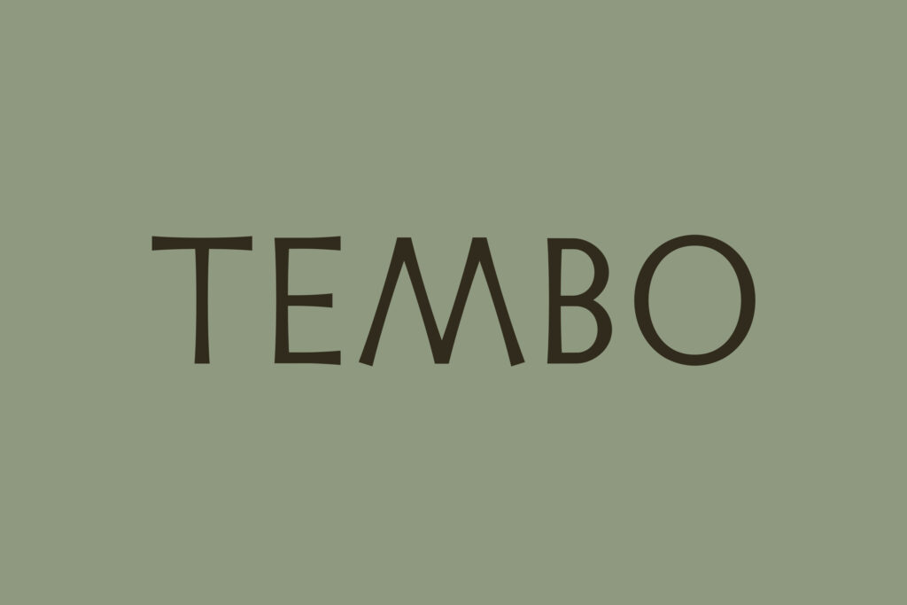
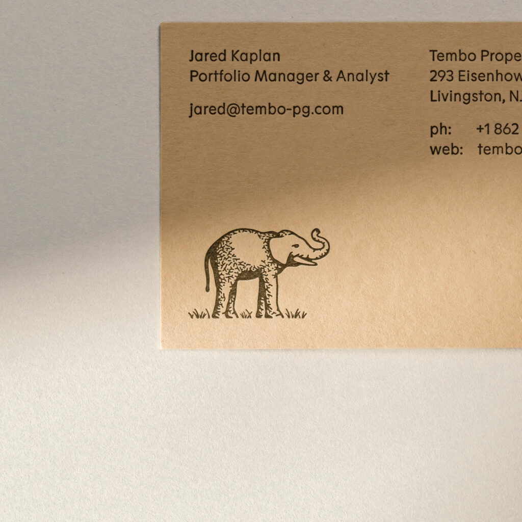
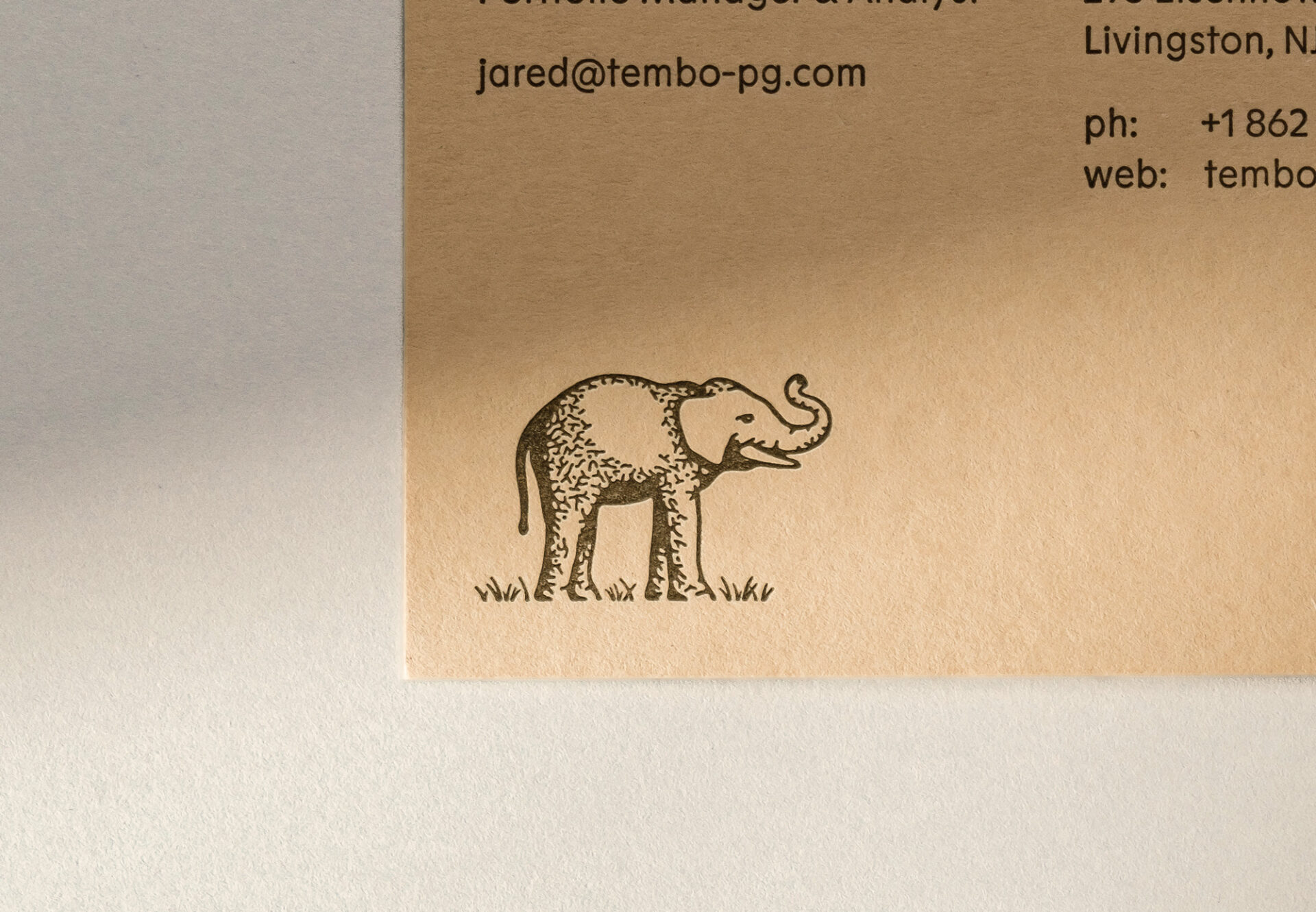
The name Tembo, which means “Elephant” in Swahili, is a nod to the Kaplan family’s South African roots. Imposing, yet gentle, the elephant symbolizes the company’s patient and dignified approach to real estate investment and their belief that every property isn’t just an asset, it’s an addition to their family.
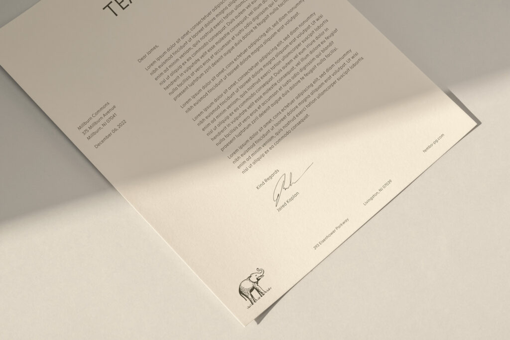
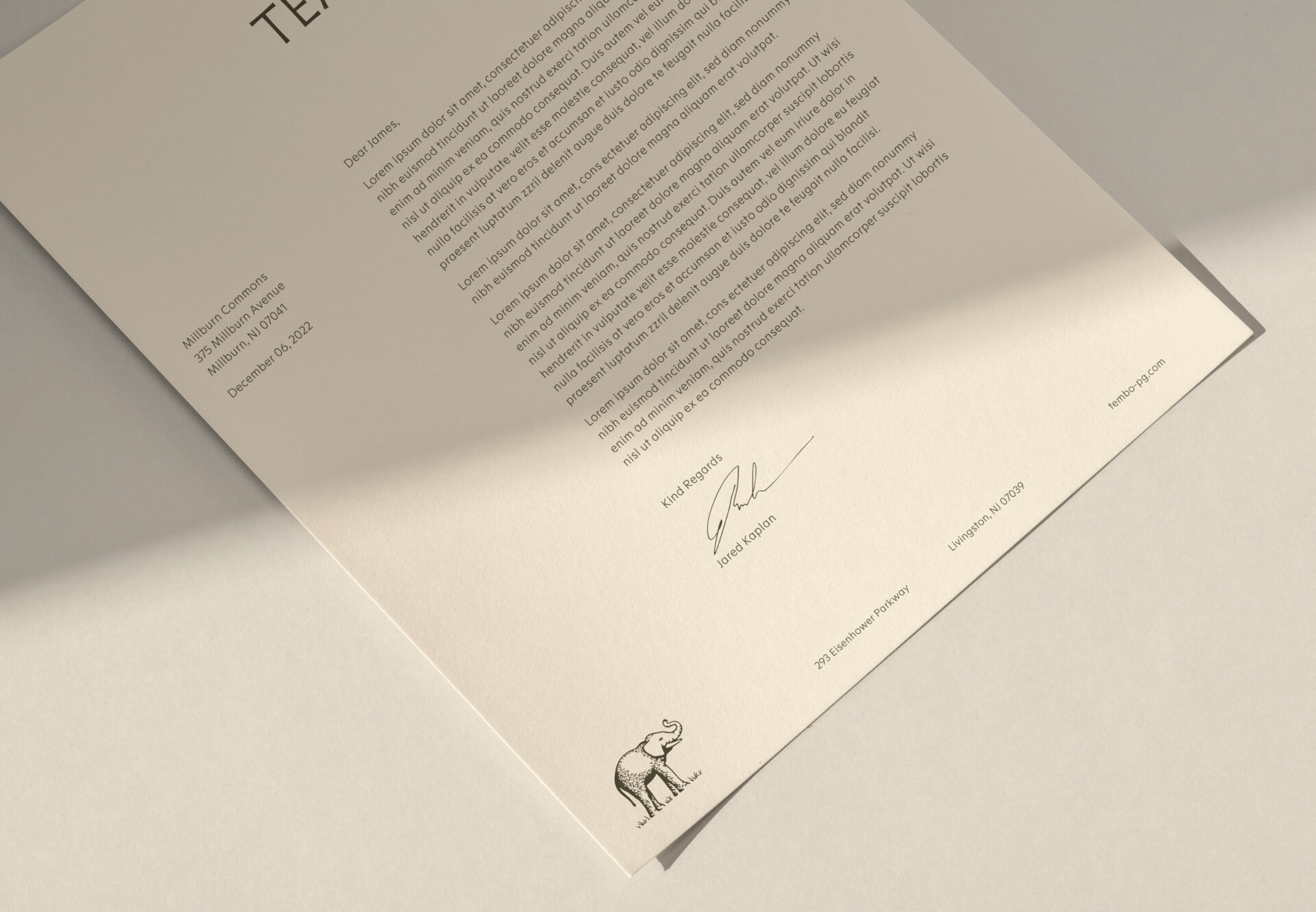
Tembo’s symbol communicates the meaning of the name, but also symbolizes the care with which Tembo selects, develops, and maintains properties. It’s classically illustrated, well-suited to honor past, present and future generations.
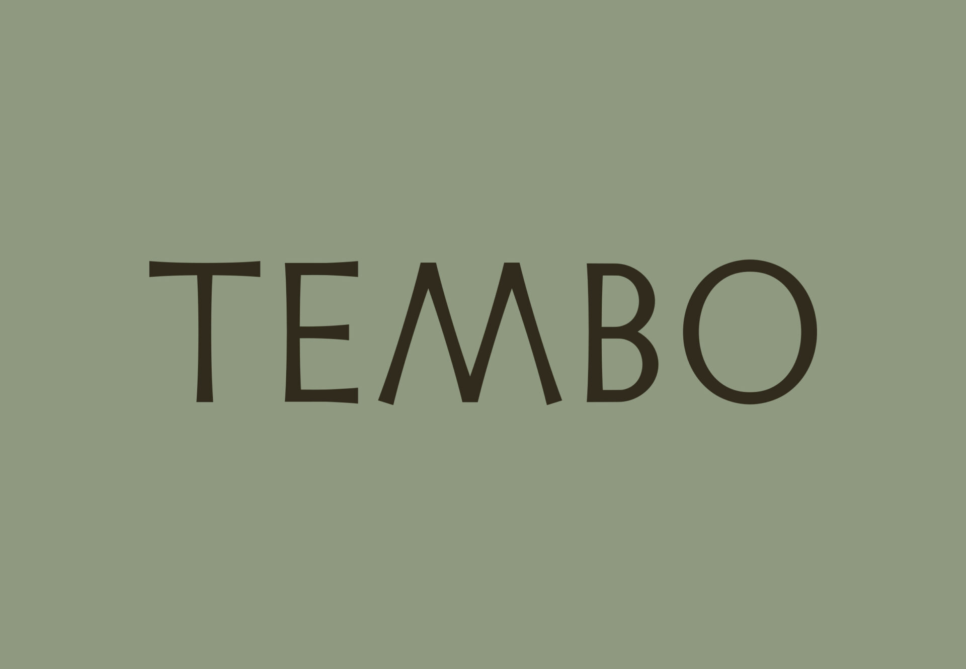
The name Tembo, which means “Elephant” in Swahili, is a nod to the Kaplan family’s South African roots. Imposing, yet gentle, the elephant symbolizes the company’s patient and dignified approach to real estate investment and their belief that every property isn’t just an asset, it’s an addition to their family.
Tembo’s symbol communicates the meaning of the name, but also symbolizes the care with which Tembo selects, develops, and maintains properties. It’s classically illustrated, well-suited to honor past, present and future generations.
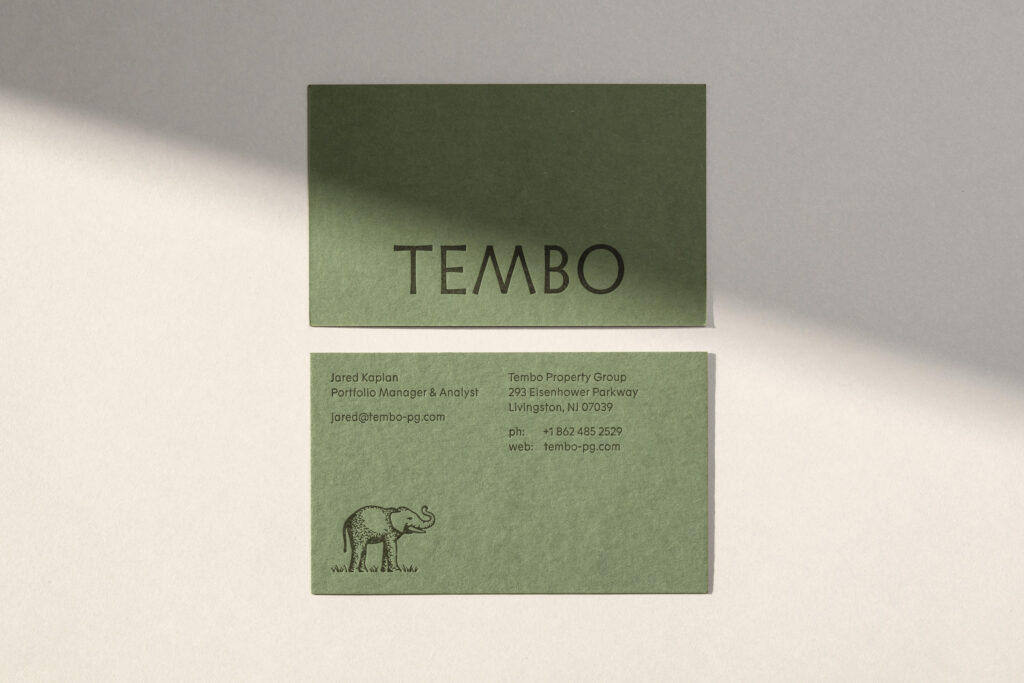
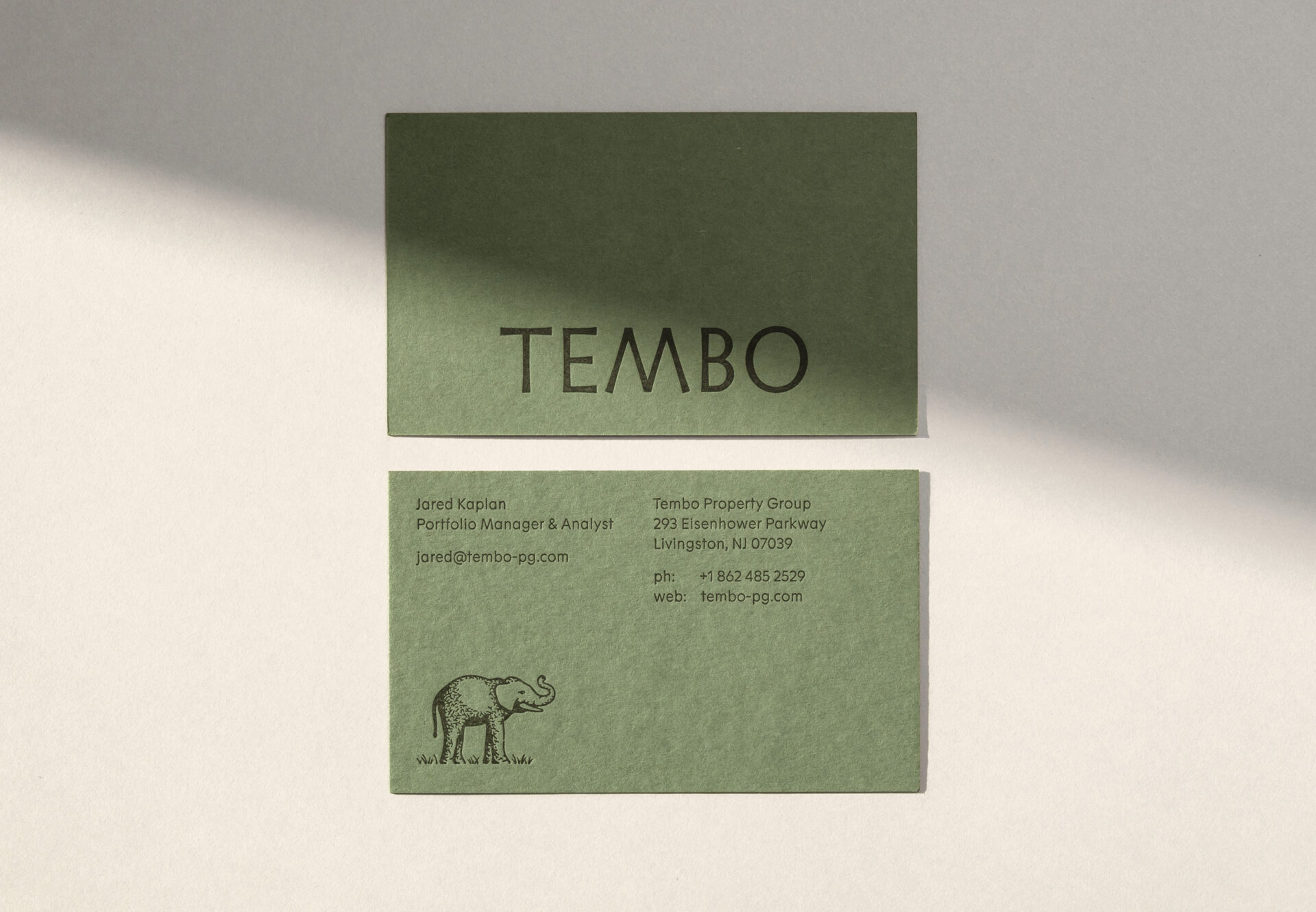
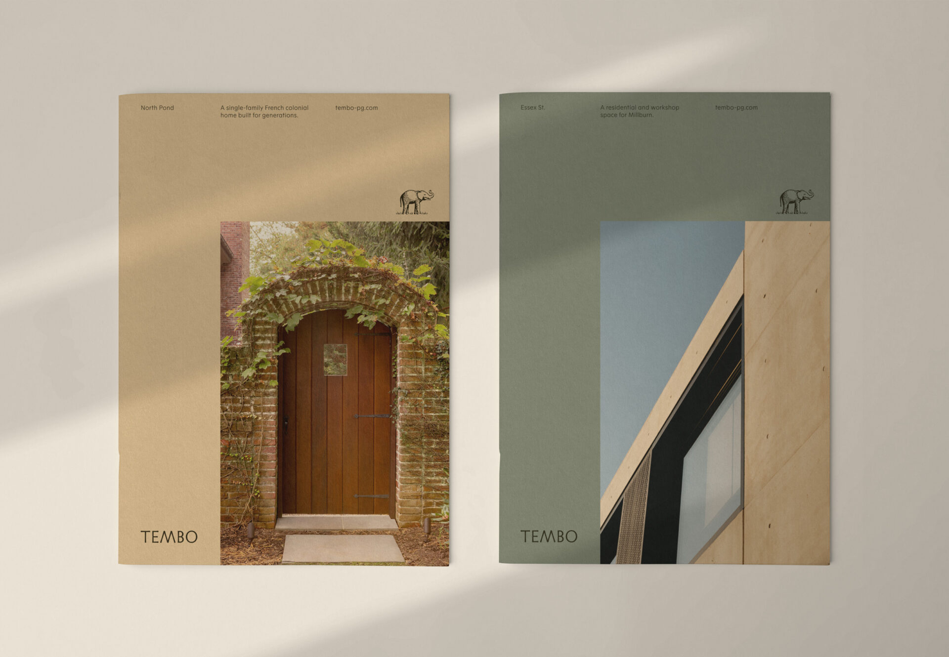
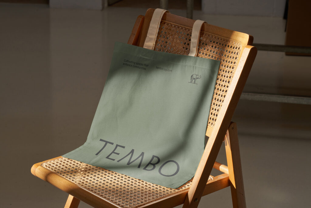
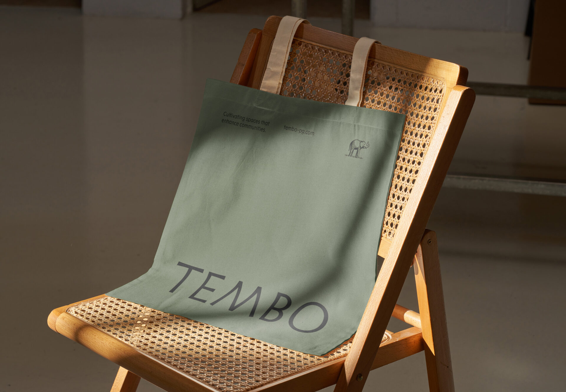
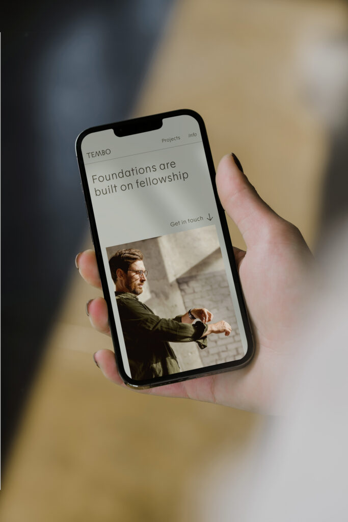
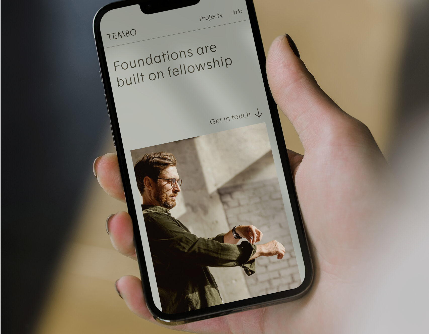
Tembo’s earthy, nuanced palette strikes a balance between refinement and a sense of adventure, while the strict typographic layouts feel capable and thoughtfully restrained. Through every touchpoint, the brand juxtaposes structure and craft, giving the audience a sense of effortless sophistication.
Tembo’s earthy, nuanced palette strikes a balance between refinement and a sense of adventure, while the strict typographic layouts feel capable and thoughtfully restrained. Through every touchpoint, the brand juxtaposes structure and craft, giving the audience a sense of effortless sophistication.

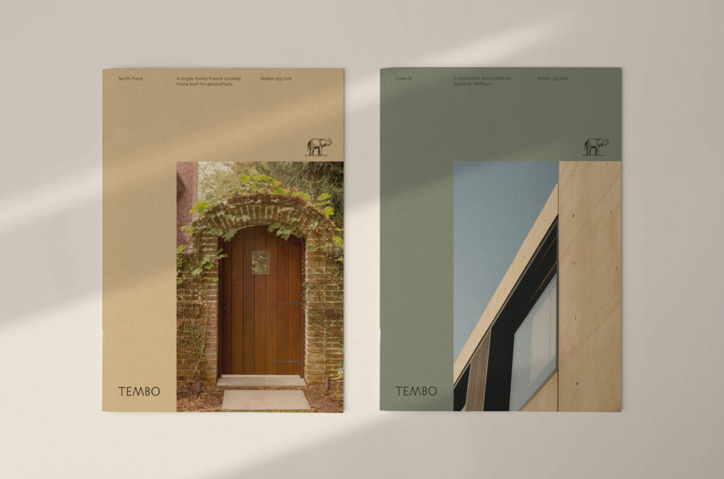
The illustrations are lightly sketched and casual, echoing the natural, effortlessly refined feel of the brand. The minimal, breeze-like movement breathes life into the scenes, calling attention to the environment within and around each building.
Iconography was also created based on the wedge-like strokes from the Tembo logotype.


Creative Direction: Jeff Perky
Design: Elizabeth Hildreth, Jeff Perky, Rex Runyeon
Project Management: Alden Dienethal